The Archive — six volumes, one place
Select a volume. Constants across all six: one author, one season per issue, human-powered documentation, FSC recycled paper, no social media. Everything else evolved.
The Photography — the strongest asset, quietly framed
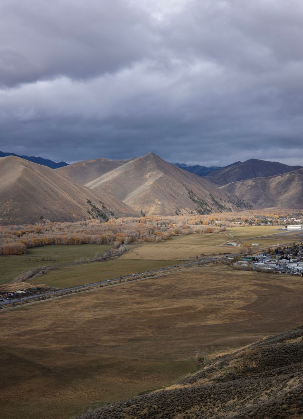
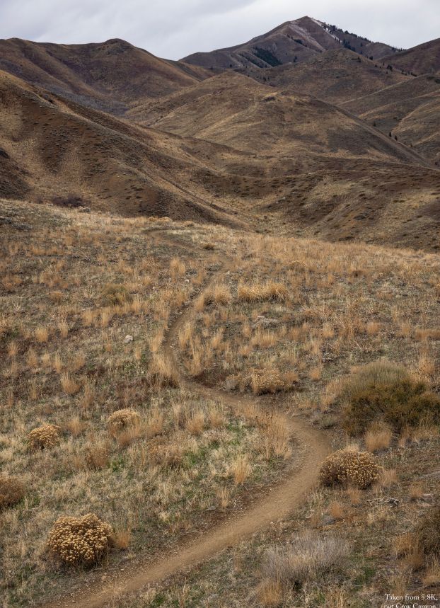
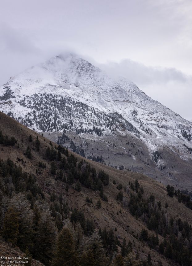
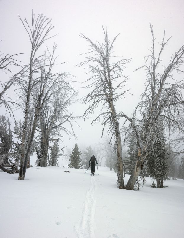
Full-bleed confidence throughout era two; captions reduced to a date alone — the pictures asked to carry the weather story. The hand-made art layer (offset screenprint color, misregistration) has strengthened every volume and is the seed of an ownable illustration language.


The brand wheel — how the phases stack
A brand is built in three concentric layers. The innermost ring — the foundation — defines what the brand believes, how it behaves, and why it exists. The second ring translates that foundation into a visual and verbal identity system. The outer ring applies that system to every touchpoint the audience encounters.
Each layer depends on the one inside it. Nothing in the outer ring should exist that can't be traced back through the middle ring to the core — the dependency chain that separates a brand that holds together from one that fragments under pressure.

Welcome
to Local Studies
A picture-driven weather history of the Central Idaho mountains.
Local Studies is a coffee-table magazine that reflects on the weather history of the Central Idaho mountains — large-format photography, monthly weather data, every photograph taken by a human from the ground, printed on 100% recycled paper. It is made by one person: Local Studies is Sam. This publication is made for friends, with a few copies available in local stores.
Brand Beliefs


POD
Values

Our Character
Tone of Voice
Local Studies may be a magazine about the mountains, but it doesn't sound like an adventure title. The subject is the weather and the land, not the human conquering them — and the voice follows the subject.
The voice is rooted in honest observation — sober, yet warm. It is one person speaking — to friends.

The Friend
Local Studies is speaking to friends. A really broad array of friends — hard to speak to all of them at once, but that is what it has done so far, and the hope is they are more and more on board with the work, all capable of receiving Sam exactly as he is.
Local friends included — though locals here are mostly content with what they have. They don't need inspiration to love this place; they just love it. There are other versions: second-home owners who come less frequently, people hustling with city work who need the reminder to be still here. And tourists who aspire to and revere locals — by the sales data, the most likely to buy the thing.
Which leads back to the start: just focus on sharing what is loved, with friends. That is enough.
This publication is made for friends, with a few copies available in local stores — majority gifting, with the opportunity for serendipity.


Cover + Spine
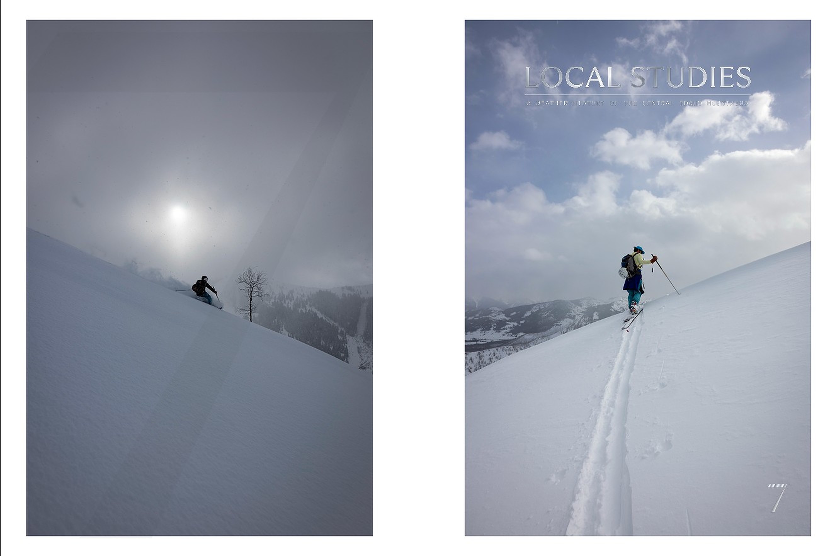
Sam's Volume 7 cover, v1 — the full wrap: back, spine, front — then 20 typographic layouts on the same two photographs. Nothing about the images changes; only where the type sits, how big, and in what voice. Tick to shortlist.
Sam
Steve

LAYOUTS + OVERLAYS + OBJECT STUDIES · PHOTOGRAPHS UNCHANGED (PLACED, CROPPED, NEVER ALTERED) · CONTOUR FIELDS ARE PROCEDURAL VECTOR (OURS, NOT STOCK) · WHERE A VARIATION USES A FOUNDRY FACE (SIGNIFIER, TIEMPOS, ALPINA, EDITORIAL NEW) IT IS SHOWN FOR EXPLORATION AND LICENSED BEFORE USE
Page Design
Volume 7's interior as it stands — the first 43 pages of Sam's v10 file, read for layout rather than content. Every distinct page design, shown once: 11 types across 43 pages. This is the current system, the baseline the page explorations will work from. Where two pages share a layout and differ only in photograph or text, one stands for both.


SOURCE: "LOCAL STUDIES, VOLUME 7 TEXT, 9×12, V10 (FOR STEVE)" · PP. 1–43 · TWO WORKHORSES (SINGLE PHOTO, PHOTO SPREAD) CARRY 33 OF 43 PAGES · NINE OTHER TYPES APPEAR ONCE OR TWICE · VERSO RUNS THE MONTH AS FOOT, RECTO THE PAGE NUMBER
Color Palette
Eight colours, every one sampled from a photograph in Volume 7 — the aurora, the sunsets, the sky, the ground. Nothing invented, nothing adjusted: each swatch is the pixel under the ring in the photograph beside it, chosen for the boldest and most diverse set the book already contains. The palette is the magazine's own light, named. Drag any ring to re-sample — the swatch and the strip follow, and the move is kept for next time.


SOURCE: "LOCAL STUDIES, VOLUME 7 TEXT, 9×12, V10 (FOR STEVE)" · SAMPLED FROM THE PHOTOGRAPHS AS PRINTED IN THE FILE · WHITE RING = SAMPLE POINT, DRAGGABLE · HEX AND RGB ARE THE SAMPLED VALUES (3×3 PIXEL MEAN), UNRETOUCHED · PHOTOGRAPHS UNCHANGED
New Page Design
Every page type from Volume 7, redrawn ten or more ways. Each group starts with Sam's current page and the references it draws on, then ten layouts built from his own photographs and words — the colour pages take their grounds from the eight sampled colours. Typography is pushed on purpose: Fraunces, Bodoni Moda, Instrument Serif, Archivo Narrow, Syne, Space Grotesk, mono. Click any page to see it large. Tick to shortlist — picks are shared.
Sam
Steve
Design by Steve Tam
Weather support from JP at Central Idaho Mountain Weather
INTRO
— writing
is hard
— a tool for
my continued
unfolding
— With hope
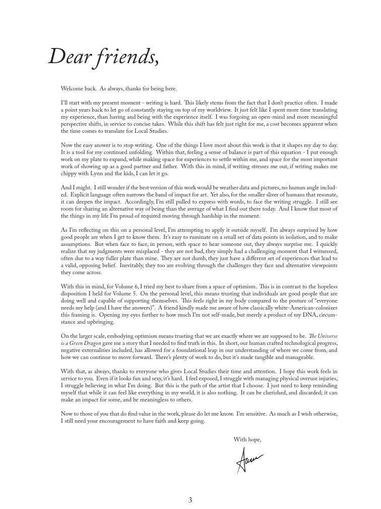
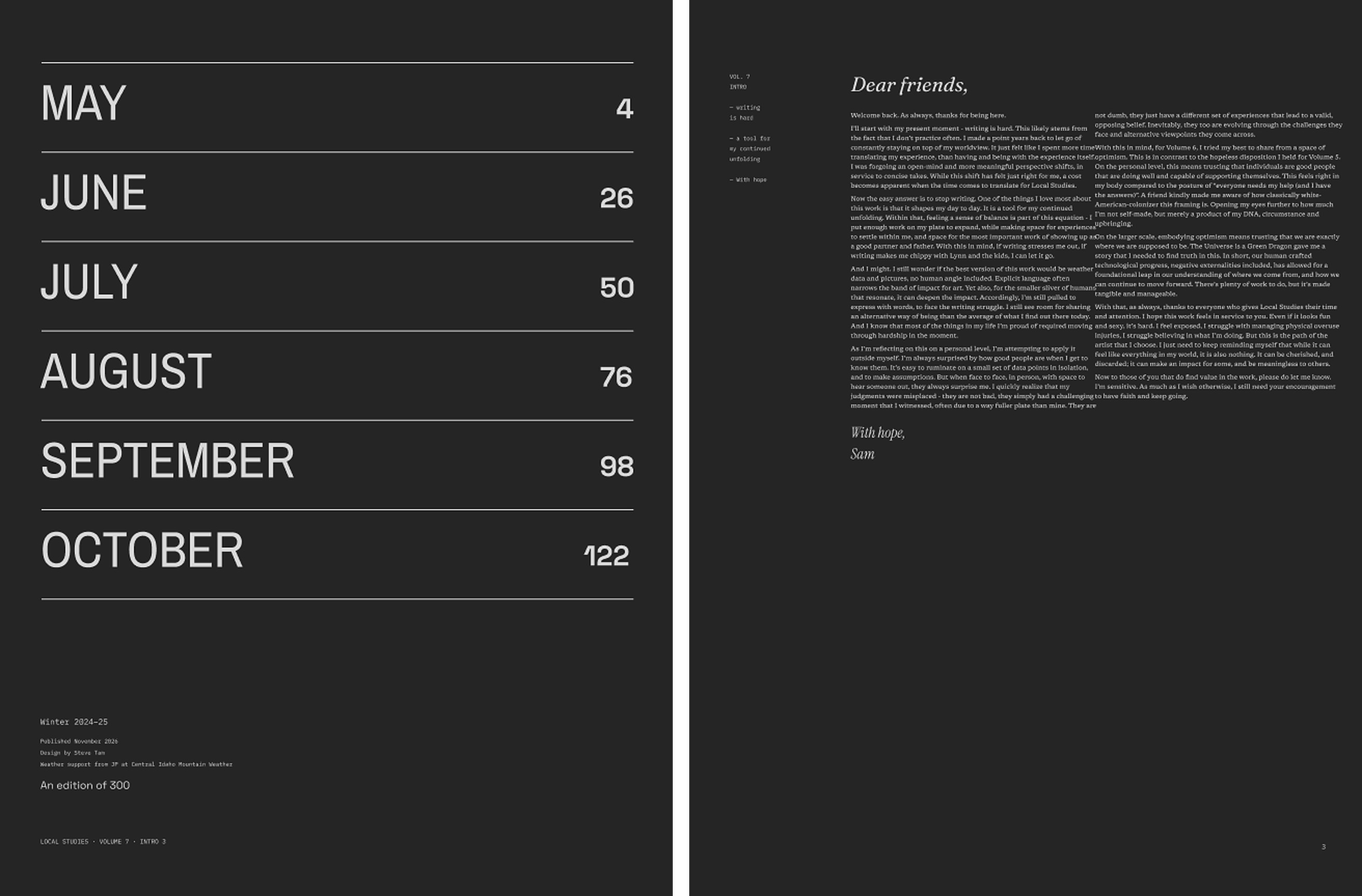
Welcome back. As always, thanks for being here.
I’ll start with my present moment - writing is hard. This likely stems from the fact that I don’t practice often. I made a point years back to let go of constantly staying on top of my worldview. It just felt like I spent more time translating my experience, than having and being with the experience itself. I was forgoing an open-mind and more meaningful perspective shifts, in service to concise takes. While this shift has felt just right for me, a cost becomes apparent when the time comes to translate for Local Studies.
Now the easy answer is to stop writing. One of the things I love most about this work is that it shapes my day to day. It is a tool for my continued unfolding. Within that, feeling a sense of balance is part of this equation - I put enough work on my plate to expand, while making space for experiences to settle within me, and space for the most important work of showing up as a good partner and father. With this in mind, if writing stresses me out, if writing makes me chippy with Lynn and the kids, I can let it go.
And I might. I still wonder if the best version of this work would be weather data and pictures, no human angle included. Explicit language often narrows the band of impact for art. Yet also, for the smaller sliver of humans that resonate, it can deepen the impact. Accordingly, I’m still pulled to express with words, to face the writing struggle. I still see room for sharing an alternative way of being than the average of what I find out there today. And I know that most of the things in my life I’m proud of required moving through hardship in the moment.
As I’m reflecting on this on a personal level, I’m attempting to apply it outside myself. I’m always surprised by how good people are when I get to know them. It’s easy to ruminate on a small set of data points in isolation, and to make assumptions. But when face to face, in person, with space to hear someone out, they always surprise me. I quickly realize that my judgments were misplaced - they are not bad, they simply had a challenging moment that I witnessed, often due to a way fuller plate than mine. They are not dumb, they just have a different set of experiences that lead to a valid, opposing belief. Inevitably, they too are evolving through the challenges they face and alternative viewpoints they come across.
With this in mind, for Volume 6, I tried my best to share from a space of optimism. This is in contrast to the hopeless disposition I held for Volume 5. On the personal level, this means trusting that individuals are good people that are doing well and capable of supporting themselves. This feels right in my body compared to the posture of “everyone needs my help (and I have the answers)”. A friend kindly made me aware of how classically white-American-colonizer this framing is. Opening my eyes further to how much I’m not self-made, but merely a product of my DNA, circumstance and upbringing.
On the larger scale, embodying optimism means trusting that we are exactly where we are supposed to be. The Universe is a Green Dragon gave me a story that I needed to find truth in this. In short, our human crafted technological progress, negative externalities included, has allowed for a foundational leap in our understanding of where we come from, and how we can continue to move forward. There’s plenty of work to do, but it’s made tangible and manageable.
With that, as always, thanks to everyone who gives Local Studies their time and attention. I hope this work feels in service to you. Even if it looks fun and sexy, it’s hard. I feel exposed, I struggle with managing physical overuse injuries, I struggle believing in what I’m doing. But this is the path of the artist that I choose. I just need to keep reminding myself that while it can feel like everything in my world, it is also nothing. It can be cherished, and discarded; it can make an impact for some, and be meaningless to others.
Now to those of you that do find value in the work, please do let me know. I’m sensitive. As much as I wish otherwise, I still need your encouragement to have faith and keep going.
Sam

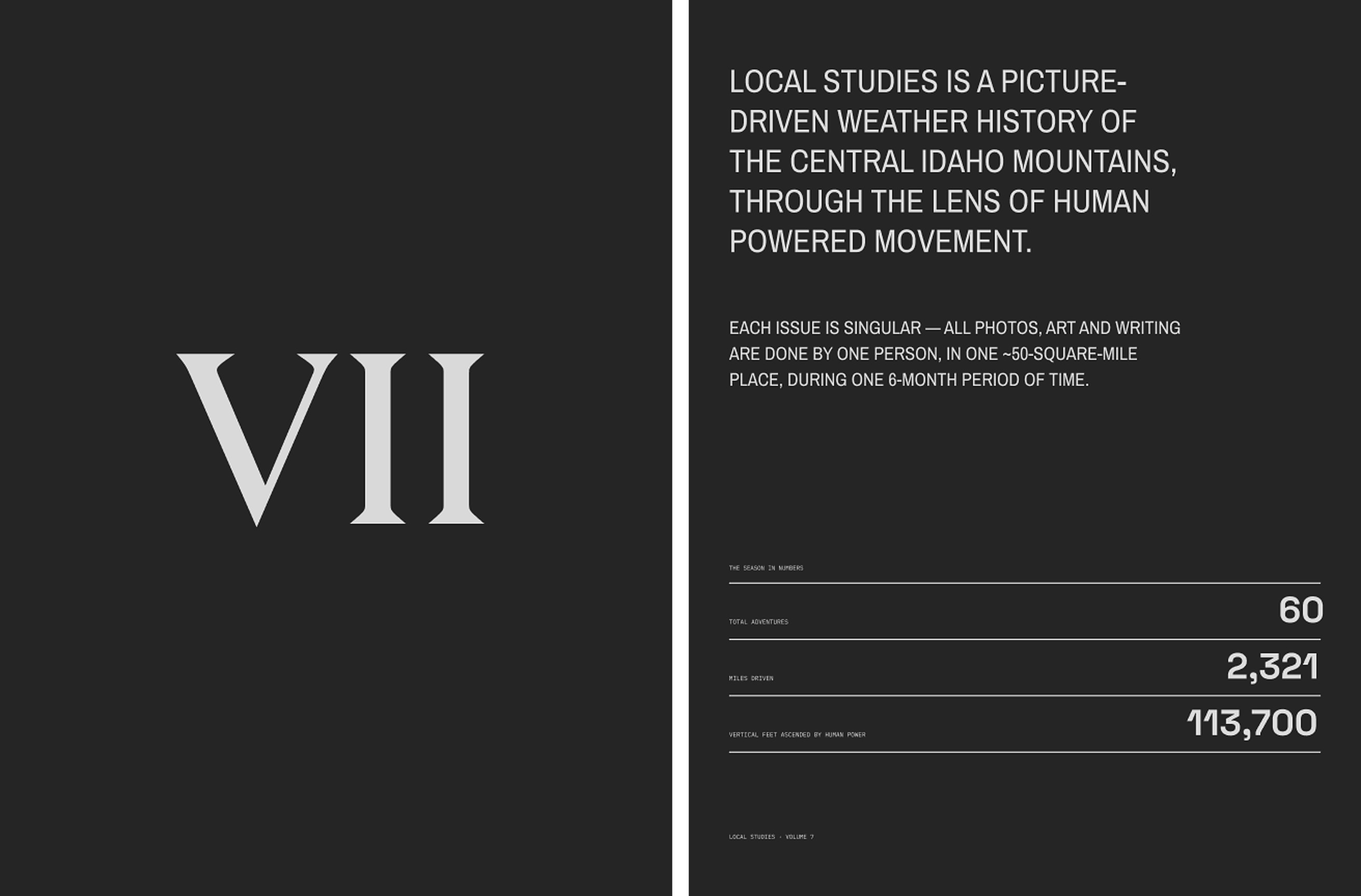
LOCAL STUDIES is a picture-driven weather history of the Central Idaho mountains, through the lens of human powered movement. Each issue is singular – all photos, art and writing are done by one person, in one ~50-square-mile place, during one 6-month period of time.
The photos in Volume 7 were shot over 60 adventures, which required 113,700 feet of human powered ascent and 2,321 miles of driving. No music or podcasts were consumed during any of the adventures, and no wearables were worn to collect health data.
This issue is printed on FSC certified paper made of 100% recycled material. Outside of sharing with family and friends, distribution is focused locally, with the majority of issues going out thanks to the help of local stores. No online marketing or social media is used to promote this work.
Design by Steve Tam
Weather support from JP at Central Idaho Mountain Weather
friends,
Welcome back. As always, thanks for being here.
I’ll start with my present moment - writing is hard. This likely stems from the fact that I don’t practice often. I made a point years back to let go of constantly staying on top of my worldview. It just felt like I spent more time translating my experience, than having and being with the experience itself. I was forgoing an open-mind and more meaningful perspective shifts, in service to concise takes. While this shift has felt just right for me, a cost becomes apparent when the time comes to translate for Local Studies.
Now the easy answer is to stop writing. One of the things I love most about this work is that it shapes my day to day. It is a tool for my continued unfolding. Within that, feeling a sense of balance is part of this equation - I put enough work on my plate to expand, while making space for experiences to settle within me, and space for the most important work of showing up as a good partner and father. With this in mind, if writing stresses me out, if writing makes me chippy with Lynn and the kids, I can let it go.
And I might. I still wonder if the best version of this work would be weather data and pictures, no human angle included. Explicit language often narrows the band of impact for art. Yet also, for the smaller sliver of humans that resonate, it can deepen the impact. Accordingly, I’m still pulled to express with words, to face the writing struggle. I still see room for sharing an alternative way of being than the average of what I find out there today. And I know that most of the things in my life I’m proud of required moving through hardship in the moment.
As I’m reflecting on this on a personal level, I’m attempting to apply it outside myself. I’m always surprised by how good people are when I get to know them. It’s easy to ruminate on a small set of data points in isolation, and to make assumptions. But when face to face, in person, with space to hear someone out, they always surprise me. I quickly realize that my judgments were misplaced - they are not bad, they simply had a challenging moment that I witnessed, often due to a way fuller plate than mine. They are not dumb, they just have a different set of experiences that lead to a valid, opposing belief. Inevitably, they too are evolving through the challenges they face and alternative viewpoints they come across.
With this in mind, for Volume 6, I tried my best to share from a space of optimism. This is in contrast to the hopeless disposition I held for Volume 5. On the personal level, this means trusting that individuals are good people that are doing well and capable of supporting themselves. This feels right in my body compared to the posture of “everyone needs my help (and I have the answers)”. A friend kindly made me aware of how classically white-American-colonizer this framing is. Opening my eyes further to how much I’m not self-made, but merely a product of my DNA, circumstance and upbringing.
On the larger scale, embodying optimism means trusting that we are exactly where we are supposed to be. The Universe is a Green Dragon gave me a story that I needed to find truth in this. In short, our human crafted technological progress, negative externalities included, has allowed for a foundational leap in our understanding of where we come from, and how we can continue to move forward. There’s plenty of work to do, but it’s made tangible and manageable.
With that, as always, thanks to everyone who gives Local Studies their time and attention. I hope this work feels in service to you. Even if it looks fun and sexy, it’s hard. I feel exposed, I struggle with managing physical overuse injuries, I struggle believing in what I’m doing. But this is the path of the artist that I choose. I just need to keep reminding myself that while it can feel like everything in my world, it is also nothing. It can be cherished, and discarded; it can make an impact for some, and be meaningless to others.
Now to those of you that do find value in the work, please do let me know. I’m sensitive. As much as I wish otherwise, I still need your encouragement to have faith and keep going.
Sam

LOCAL STUDIES is a picture-driven weather history of the Central Idaho mountains, through the lens of human powered movement. Each issue is singular – all photos, art and writing are done by one person, in one ~50-square-mile place, during one 6-month period of time.
The photos in Volume 7 were shot over 60 adventures, which required 113,700 feet of human powered ascent and 2,321 miles of driving. No music or podcasts were consumed during any of the adventures, and no wearables were worn to collect health data.
This issue is printed on FSC certified paper made of 100% recycled material. Outside of sharing with family and friends, distribution is focused locally, with the majority of issues going out thanks to the help of local stores. No online marketing or social media is used to promote this work.
Design by Steve Tam
Weather support from JP at Central Idaho Mountain Weather
friends,
Welcome back. As always, thanks for being here.
I’ll start with my present moment - writing is hard. This likely stems from the fact that I don’t practice often. I made a point years back to let go of constantly staying on top of my worldview. It just felt like I spent more time translating my experience, than having and being with the experience itself. I was forgoing an open-mind and more meaningful perspective shifts, in service to concise takes. While this shift has felt just right for me, a cost becomes apparent when the time comes to translate for Local Studies.
Now the easy answer is to stop writing. One of the things I love most about this work is that it shapes my day to day. It is a tool for my continued unfolding. Within that, feeling a sense of balance is part of this equation - I put enough work on my plate to expand, while making space for experiences to settle within me, and space for the most important work of showing up as a good partner and father. With this in mind, if writing stresses me out, if writing makes me chippy with Lynn and the kids, I can let it go.
And I might. I still wonder if the best version of this work would be weather data and pictures, no human angle included. Explicit language often narrows the band of impact for art. Yet also, for the smaller sliver of humans that resonate, it can deepen the impact. Accordingly, I’m still pulled to express with words, to face the writing struggle. I still see room for sharing an alternative way of being than the average of what I find out there today. And I know that most of the things in my life I’m proud of required moving through hardship in the moment.
As I’m reflecting on this on a personal level, I’m attempting to apply it outside myself. I’m always surprised by how good people are when I get to know them. It’s easy to ruminate on a small set of data points in isolation, and to make assumptions. But when face to face, in person, with space to hear someone out, they always surprise me. I quickly realize that my judgments were misplaced - they are not bad, they simply had a challenging moment that I witnessed, often due to a way fuller plate than mine. They are not dumb, they just have a different set of experiences that lead to a valid, opposing belief. Inevitably, they too are evolving through the challenges they face and alternative viewpoints they come across.
With this in mind, for Volume 6, I tried my best to share from a space of optimism. This is in contrast to the hopeless disposition I held for Volume 5. On the personal level, this means trusting that individuals are good people that are doing well and capable of supporting themselves. This feels right in my body compared to the posture of “everyone needs my help (and I have the answers)”. A friend kindly made me aware of how classically white-American-colonizer this framing is. Opening my eyes further to how much I’m not self-made, but merely a product of my DNA, circumstance and upbringing.
On the larger scale, embodying optimism means trusting that we are exactly where we are supposed to be. The Universe is a Green Dragon gave me a story that I needed to find truth in this. In short, our human crafted technological progress, negative externalities included, has allowed for a foundational leap in our understanding of where we come from, and how we can continue to move forward. There’s plenty of work to do, but it’s made tangible and manageable.
With that, as always, thanks to everyone who gives Local Studies their time and attention. I hope this work feels in service to you. Even if it looks fun and sexy, it’s hard. I feel exposed, I struggle with managing physical overuse injuries, I struggle believing in what I’m doing. But this is the path of the artist that I choose. I just need to keep reminding myself that while it can feel like everything in my world, it is also nothing. It can be cherished, and discarded; it can make an impact for some, and be meaningless to others.
Now to those of you that do find value in the work, please do let me know. I’m sensitive. As much as I wish otherwise, I still need your encouragement to have faith and keep going.
Sam
LOCAL STUDIES is a picture-driven weather history of the Central Idaho mountains, through the lens of human powered movement. Each issue is singular – all photos, art and writing are done by one person, in one ~50-square-mile place, during one 6-month period of time.
The photos in Volume 7 were shot over 60 adventures, which required 113,700 feet of human powered ascent and 2,321 miles of driving. No music or podcasts were consumed during any of the adventures, and no wearables were worn to collect health data.
This issue is printed on FSC certified paper made of 100% recycled material. Outside of sharing with family and friends, distribution is focused locally, with the majority of issues going out thanks to the help of local stores. No online marketing or social media is used to promote this work.
LOCAL STUDIES is a picture-driven weather history of the Central Idaho mountains, through the lens of human powered movement. Each issue is singular – all photos, art and writing are done by one person, in one ~50-square-mile place, during one 6-month period of time.
The photos in Volume 7 were shot over 60 adventures, which required 113,700 feet of human powered ascent and 2,321 miles of driving. No music or podcasts were consumed during any of the adventures, and no wearables were worn to collect health data.
This issue is printed on FSC certified paper made of 100% recycled material. Outside of sharing with family and friends, distribution is focused locally, with the majority of issues going out thanks to the help of local stores. No online marketing or social media is used to promote this work.
LOCAL STUDIES is a picture-driven weather history of the Central Idaho mountains, through the lens of human powered movement. Each issue is singular – all photos, art and writing are done by one person, in one ~50-square-mile place, during one 6-month period of time.
The photos in Volume 7 were shot over 60 adventures, which required 113,700 feet of human powered ascent and 2,321 miles of driving. No music or podcasts were consumed during any of the adventures, and no wearables were worn to collect health data.
This issue is printed on FSC certified paper made of 100% recycled material. Outside of sharing with family and friends, distribution is focused locally, with the majority of issues going out thanks to the help of local stores. No online marketing or social media is used to promote this work.
LOCAL STUDIES is a picture-driven weather history of the Central Idaho mountains, through the lens of human powered movement. Each issue is singular – all photos, art and writing are done by one person, in one ~50-square-mile place, during one 6-month period of time.
This issue is printed on FSC certified paper made of 100% recycled material. Outside of sharing with family and friends, distribution is focused locally, with the majority of issues going out thanks to the help of local stores. No online marketing or social media is used to promote this work.
LOCAL STUDIES is a picture-driven weather history of the Central Idaho mountains, through the lens of human powered movement. Each issue is singular – all photos, art and writing are done by one person, in one ~50-square-mile place, during one 6-month period of time.
The photos in Volume 7 were shot over 60 adventures, which required 113,700 feet of human powered ascent and 2,321 miles of driving. No music or podcasts were consumed during any of the adventures, and no wearables were worn to collect health data.
LOCAL STUDIES is a picture-driven weather history of the Central Idaho mountains, through the lens of human powered movement. Each issue is singular – all photos, art and writing are done by one person, in one ~50-square-mile place, during one 6-month period of time.
The photos in Volume 7 were shot over 60 adventures, which required 113,700 feet of human powered ascent and 2,321 miles of driving. No music or podcasts were consumed during any of the adventures, and no wearables were worn to collect health data.
This issue is printed on FSC certified paper made of 100% recycled material. Outside of sharing with family and friends, distribution is focused locally, with the majority of issues going out thanks to the help of local stores. No online marketing or social media is used to promote this work.
This issue is printed on FSC certified paper made of 100% recycled material. Outside of sharing with family and friends, distribution is focused locally, with the majority of issues going out thanks to the help of local stores. No online marketing or social media is used to promote this work.
LOCAL STUDIES is a picture-driven weather history of the Central Idaho mountains, through the lens of human powered movement. Each issue is singular – all photos, art and writing are done by one person, in one ~50-square-mile place, during one 6-month period of time.
June 26 sharing
July 50 process
August 76 other updates
September 98
October 122
Welcome back. As always, thanks for being here.
I’ll start with my present moment – writing is hard. This likely stems from the fact that I don’t practice often. I made a point years back to let go of constantly staying on top of my worldview. It just felt like I spent more time translating my experience, than having and being with the experience itself.
Now the easy answer is to stop writing. One of the things I love most about this work is that it shapes my day to day. It is a tool for my continued unfolding. Within that, feeling a sense of balance is part of this equation – enough work to expand, and space for experiences to settle, and for the most important work of showing up as a good partner and father.
And I might. I still wonder if the best version of this work would be neither these pictures nor these words – just being out there, being with it.
Sam
Welcome back. As always, thanks for being here.
I’ll start with my present moment – writing is hard. This likely stems from the fact that I don’t practice often. I made a point years back to let go of constantly staying on top of my worldview. It just felt like I spent more time translating my experience, than having and being with the experience itself.
Now the easy answer is to stop writing. One of the things I love most about this work is that it shapes my day to day. It is a tool for my continued unfolding. Within that, feeling a sense of balance is part of this equation – enough work to expand, and space for experiences to settle, and for the most important work of showing up as a good partner and father.
And I might. I still wonder if the best version of this work would be neither these pictures nor these words – just being out there, being with it.
Sam
friends,
Welcome back. As always, thanks for being here.
I’ll start with my present moment – writing is hard. This likely stems from the fact that I don’t practice often. I made a point years back to let go of constantly staying on top of my worldview. It just felt like I spent more time translating my experience, than having and being with the experience itself.
Now the easy answer is to stop writing. One of the things I love most about this work is that it shapes my day to day. It is a tool for my continued unfolding. Within that, feeling a sense of balance is part of this equation – enough work to expand, and space for experiences to settle, and for the most important work of showing up as a good partner and father.
Sam
Welcome back. As always, thanks for being here.
I’ll start with my present moment – writing is hard. This likely stems from the fact that I don’t practice often. I made a point years back to let go of constantly staying on top of my worldview. It just felt like I spent more time translating my experience, than having and being with the experience itself.
Now the easy answer is to stop writing. One of the things I love most about this work is that it shapes my day to day. It is a tool for my continued unfolding. Within that, feeling a sense of balance is part of this equation – enough work to expand, and space for experiences to settle, and for the most important work of showing up as a good partner and father.
And I might. I still wonder if the best version of this work would be neither these pictures nor these words – just being out there, being with it.
Sam
Welcome back. As always, thanks for being here.
I’ll start with my present moment – writing is hard. This likely stems from the fact that I don’t practice often. I made a point years back to let go of constantly staying on top of my worldview. It just felt like I spent more time translating my experience, than having and being with the experience itself.
Now the easy answer is to stop writing. One of the things I love most about this work is that it shapes my day to day. It is a tool for my continued unfolding. Within that, feeling a sense of balance is part of this equation – enough work to expand, and space for experiences to settle, and for the most important work of showing up as a good partner and father.
Welcome back. As always, thanks for being here.
I’ll start with my present moment – writing is hard. This likely stems from the fact that I don’t practice often. I made a point years back to let go of constantly staying on top of my worldview. It just felt like I spent more time translating my experience, than having and being with the experience itself.
Now the easy answer is to stop writing. One of the things I love most about this work is that it shapes my day to day. It is a tool for my continued unfolding. Within that, feeling a sense of balance is part of this equation – enough work to expand, and space for experiences to settle, and for the most important work of showing up as a good partner and father.
And I might. I still wonder if the best version of this work would be neither these pictures nor these words – just being out there, being with it.
With hope,
Sam
Welcome back. As always, thanks for being here.
I’ll start with my present moment – writing is hard. This likely stems from the fact that I don’t practice often. I made a point years back to let go of constantly staying on top of my worldview. It just felt like I spent more time translating my experience, than having and being with the experience itself.
Now the easy answer is to stop writing. One of the things I love most about this work is that it shapes my day to day. It is a tool for my continued unfolding. Within that, feeling a sense of balance is part of this equation – enough work to expand, and space for experiences to settle, and for the most important work of showing up as a good partner and father.
And I might. I still wonder if the best version of this work would be neither these pictures nor these words – just being out there, being with it.
Sam
Welcome back. As always, thanks for being here.
I’ll start with my present moment – writing is hard. This likely stems from the fact that I don’t practice often. I made a point years back to let go of constantly staying on top of my worldview. It just felt like I spent more time translating my experience, than having and being with the experience itself.
Now the easy answer is to stop writing. One of the things I love most about this work is that it shapes my day to day. It is a tool for my continued unfolding. Within that, feeling a sense of balance is part of this equation – enough work to expand, and space for experiences to settle, and for the most important work of showing up as a good partner and father.
And I might. I still wonder if the best version of this work would be neither these pictures nor these words – just being out there, being with it.
Sam
INTRO
— writing
is hard
— a tool for
my continued
unfolding
— With hope,
Sam
Welcome back. As always, thanks for being here.
I’ll start with my present moment – writing is hard. This likely stems from the fact that I don’t practice often. I made a point years back to let go of constantly staying on top of my worldview. It just felt like I spent more time translating my experience, than having and being with the experience itself.
Now the easy answer is to stop writing. One of the things I love most about this work is that it shapes my day to day. It is a tool for my continued unfolding. Within that, feeling a sense of balance is part of this equation – enough work to expand, and space for experiences to settle, and for the most important work of showing up as a good partner and father.
Dear friends, I’ll start with my present moment – writing is hard. This likely stems from the fact that I don’t practice often. I made a point years back to let go of constantly staying on top of my worldview. It just felt like I spent more time translating my experience, than having and being with the experience itself.
Now the easy answer is to stop writing. One of the things I love most about this work is that it shapes my day to day. It is a tool for my continued unfolding. Within that, feeling a sense of balance is part of this equation – enough work to expand, and space for experiences to settle, and for the most important work of showing up as a good partner and father.
And I might. I still wonder if the best version of this work would be neither these pictures nor these words – just being out there, being with it.
Sam
EM
BER
VEM
BER
VE
MB
ER
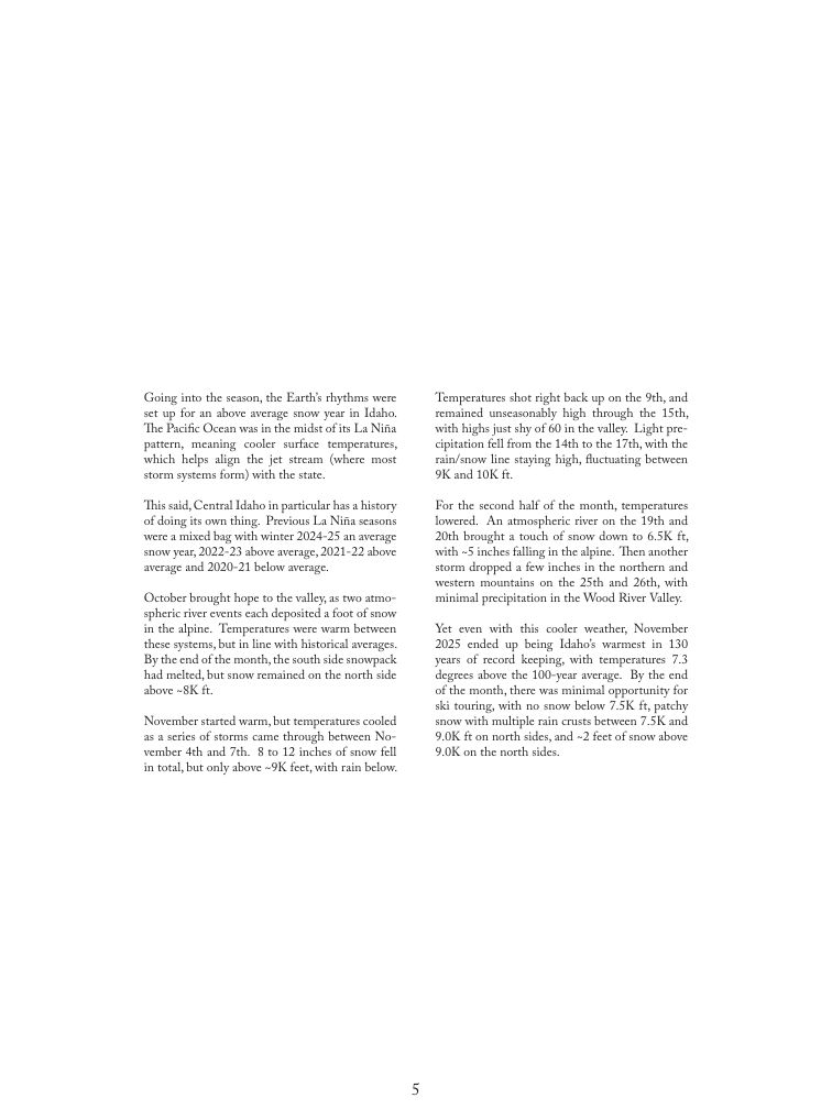
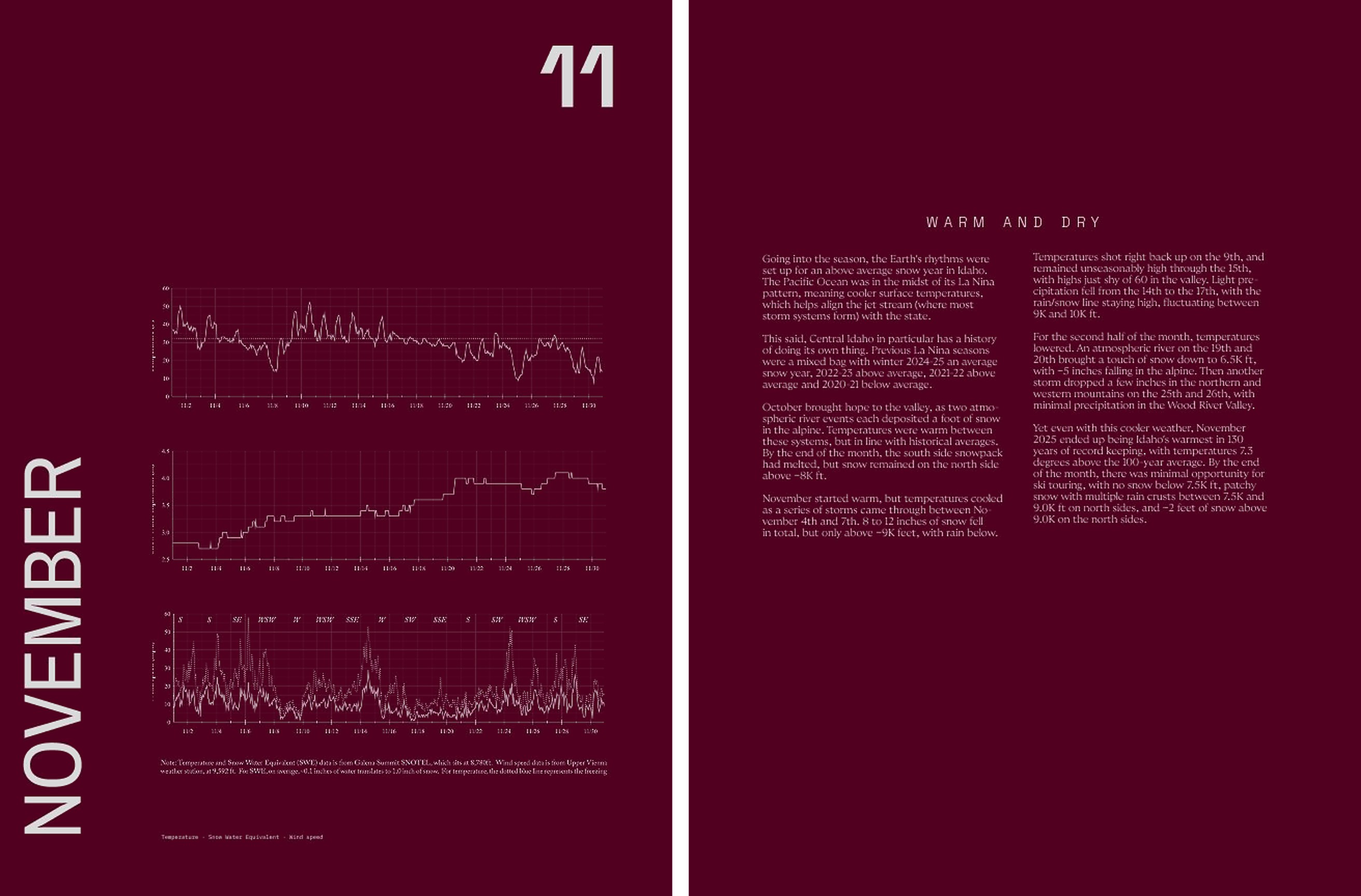
November — Going into the season, the Earth’s rhythms were set up for an above average snow year in Idaho. The Pacific Ocean was in the midst of its La Niña pattern, meaning cooler surface temperatures, which helps align the jet stream (where most storm systems form) with the state.
This said, Central Idaho in particular has a history of doing its own thing. Previous La Niña seasons were a mixed bag with winter 2024-25 an average snow year, 2022-23 above average, 2021-22 above average and 2020-21 below average.
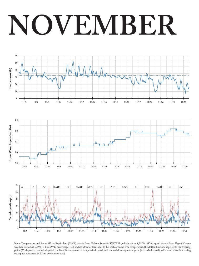
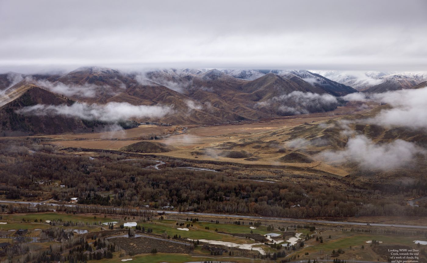
Temperatures shot right back up on the 9th, and remained unseasonably high through the 15th, with highs just shy of 60 in the valley. Light precipitation fell from the 14th to the 17th, with the rain/snow line staying high, fluctuating between 9K and 10K ft.
For the second half of the month, temperatures lowered. An atmospheric river on the 19th and 20th brought a touch of snow down to 6.5K ft, with ~5 inches falling in the alpine. Then another storm dropped a few inches in the northern and western mountains on the 25th and 26th, with minimal precipitation in the Wood River Valley.
Going into the season, the Earth’s rhythms were set up for an above average snow year in Idaho. The Pacific Ocean was in the midst of its La Niña pattern, meaning cooler surface temperatures, which helps align the jet stream (where most storm systems form) with the state.
This said, Central Idaho in particular has a history of doing its own thing. Previous La Niña seasons were a mixed bag with winter 2024-25 an average snow year, 2022-23 above average, 2021-22 above average and 2020-21 below average.
Temperatures shot right back up on the 9th, and remained unseasonably high through the 15th, with highs just shy of 60 in the valley. Light precipitation fell from the 14th to the 17th, with the rain/snow line staying high, fluctuating between 9K and 10K ft.
For the second half of the month, temperatures lowered. An atmospheric river on the 19th and 20th brought a touch of snow down to 6.5K ft, with ~5 inches falling in the alpine. Then another storm dropped a few inches in the northern and western mountains on the 25th and 26th, with minimal precipitation in the Wood River Valley.
Going into the season, the Earth’s rhythms were set up for an above average snow year in Idaho. The Pacific Ocean was in the midst of its La Niña pattern, meaning cooler surface temperatures, which helps align the jet stream (where most storm systems form) with the state.
This said, Central Idaho in particular has a history of doing its own thing. Previous La Niña seasons were a mixed bag with winter 2024-25 an average snow year, 2022-23 above average, 2021-22 above average and 2020-21 below average.
Temperatures shot right back up on the 9th, and remained unseasonably high through the 15th, with highs just shy of 60 in the valley. Light precipitation fell from the 14th to the 17th, with the rain/snow line staying high, fluctuating between 9K and 10K ft.
For the second half of the month, temperatures lowered. An atmospheric river on the 19th and 20th brought a touch of snow down to 6.5K ft, with ~5 inches falling in the alpine. Then another storm dropped a few inches in the northern and western mountains on the 25th and 26th, with minimal precipitation in the Wood River Valley.
This said, Central Idaho in particular has a history of doing its own thing. Previous La Niña seasons were a mixed bag with winter 2024-25 an average snow year, 2022-23 above average, 2021-22 above average and 2020-21 below average.
Temperatures shot right back up on the 9th, and remained unseasonably high through the 15th, with highs just shy of 60 in the valley. Light precipitation fell from the 14th to the 17th, with the rain/snow line staying high, fluctuating between 9K and 10K ft.
For the second half of the month, temperatures lowered. An atmospheric river on the 19th and 20th brought a touch of snow down to 6.5K ft, with ~5 inches falling in the alpine. Then another storm dropped a few inches in the northern and western mountains on the 25th and 26th, with minimal precipitation in the Wood River Valley.
Going into the season, the Earth’s rhythms were set up for an above average snow year in Idaho. The Pacific Ocean was in the midst of its La Niña pattern, meaning cooler surface temperatures, which helps align the jet stream (where most storm systems form) with the state.
This said, Central Idaho in particular has a history of doing its own thing. Previous La Niña seasons were a mixed bag with winter 2024-25 an average snow year, 2022-23 above average, 2021-22 above average and 2020-21 below average.
Temperatures shot right back up on the 9th, and remained unseasonably high through the 15th, with highs just shy of 60 in the valley. Light precipitation fell from the 14th to the 17th, with the rain/snow line staying high, fluctuating between 9K and 10K ft.
For the second half of the month, temperatures lowered. An atmospheric river on the 19th and 20th brought a touch of snow down to 6.5K ft, with ~5 inches falling in the alpine. Then another storm dropped a few inches in the northern and western mountains on the 25th and 26th, with minimal precipitation in the Wood River Valley.
Going into the season, the Earth’s rhythms were set up for an above average snow year in Idaho. The Pacific Ocean was in the midst of its La Niña pattern, meaning cooler surface temperatures, which helps align the jet stream (where most storm systems form) with the state.
This said, Central Idaho in particular has a history of doing its own thing. Previous La Niña seasons were a mixed bag with winter 2024-25 an average snow year, 2022-23 above average, 2021-22 above average and 2020-21 below average.
Temperatures shot right back up on the 9th, and remained unseasonably high through the 15th, with highs just shy of 60 in the valley. Light precipitation fell from the 14th to the 17th, with the rain/snow line staying high, fluctuating between 9K and 10K ft.
For the second half of the month, temperatures lowered. An atmospheric river on the 19th and 20th brought a touch of snow down to 6.5K ft, with ~5 inches falling in the alpine. Then another storm dropped a few inches in the northern and western mountains on the 25th and 26th, with minimal precipitation in the Wood River Valley.
Going into the season, the Earth’s rhythms were set up for an above average snow year in Idaho. The Pacific Ocean was in the midst of its La Niña pattern, meaning cooler surface temperatures, which helps align the jet stream (where most storm systems form) with the state.
This said, Central Idaho in particular has a history of doing its own thing. Previous La Niña seasons were a mixed bag with winter 2024-25 an average snow year, 2022-23 above average, 2021-22 above average and 2020-21 below average.
Temperatures shot right back up on the 9th, and remained unseasonably high through the 15th, with highs just shy of 60 in the valley. Light precipitation fell from the 14th to the 17th, with the rain/snow line staying high, fluctuating between 9K and 10K ft.
For the second half of the month, temperatures lowered. An atmospheric river on the 19th and 20th brought a touch of snow down to 6.5K ft, with ~5 inches falling in the alpine. Then another storm dropped a few inches in the northern and western mountains on the 25th and 26th, with minimal precipitation in the Wood River Valley.
Going into the season, the Earth’s rhythms were set up for an above average snow year in Idaho. The Pacific Ocean was in the midst of its La Niña pattern, meaning cooler surface temperatures, which helps align the jet stream (where most storm systems form) with the state.
This said, Central Idaho in particular has a history of doing its own thing. Previous La Niña seasons were a mixed bag with winter 2024-25 an average snow year, 2022-23 above average, 2021-22 above average and 2020-21 below average.
Temperatures shot right back up on the 9th, and remained unseasonably high through the 15th, with highs just shy of 60 in the valley. Light precipitation fell from the 14th to the 17th, with the rain/snow line staying high, fluctuating between 9K and 10K ft.
For the second half of the month, temperatures lowered. An atmospheric river on the 19th and 20th brought a touch of snow down to 6.5K ft, with ~5 inches falling in the alpine. Then another storm dropped a few inches in the northern and western mountains on the 25th and 26th, with minimal precipitation in the Wood River Valley.
Going into the season, the Earth’s rhythms were set up for an above average snow year in Idaho. The Pacific Ocean was in the midst of its La Niña pattern, meaning cooler surface temperatures, which helps align the jet stream (where most storm systems form) with the state.
This said, Central Idaho in particular has a history of doing its own thing. Previous La Niña seasons were a mixed bag with winter 2024-25 an average snow year, 2022-23 above average, 2021-22 above average and 2020-21 below average.
Temperatures shot right back up on the 9th, and remained unseasonably high through the 15th, with highs just shy of 60 in the valley. Light precipitation fell from the 14th to the 17th, with the rain/snow line staying high, fluctuating between 9K and 10K ft.
For the second half of the month, temperatures lowered. An atmospheric river on the 19th and 20th brought a touch of snow down to 6.5K ft, with ~5 inches falling in the alpine. Then another storm dropped a few inches in the northern and western mountains on the 25th and 26th, with minimal precipitation in the Wood River Valley.
through
the 15th
of the month
Going into the season, the Earth’s rhythms were set up for an above average snow year in Idaho. The Pacific Ocean was in the midst of its La Niña pattern, meaning cooler surface temperatures, which helps align the jet stream (where most storm systems form) with the state.
This said, Central Idaho in particular has a history of doing its own thing. Previous La Niña seasons were a mixed bag with winter 2024-25 an average snow year, 2022-23 above average, 2021-22 above average and 2020-21 below average.
Temperatures shot right back up on the 9th, and remained unseasonably high through the 15th, with highs just shy of 60 in the valley. Light precipitation fell from the 14th to the 17th, with the rain/snow line staying high, fluctuating between 9K and 10K ft.
For the second half of the month, temperatures lowered. An atmospheric river on the 19th and 20th brought a touch of snow down to 6.5K ft, with ~5 inches falling in the alpine. Then another storm dropped a few inches in the northern and western mountains on the 25th and 26th, with minimal precipitation in the Wood River Valley.
This said, Central Idaho in particular has a history of doing its own thing. Previous La Niña seasons were a mixed bag with winter 2024-25 an average snow year, 2022-23 above average, 2021-22 above average and 2020-21 below average.
Temperatures shot right back up on the 9th, and remained unseasonably high through the 15th, with highs just shy of 60 in the valley. Light precipitation fell from the 14th to the 17th, with the rain/snow line staying high, fluctuating between 9K and 10K ft.
For the second half of the month, temperatures lowered. An atmospheric river on the 19th and 20th brought a touch of snow down to 6.5K ft, with ~5 inches falling in the alpine. Then another storm dropped a few inches in the northern and western mountains on the 25th and 26th, with minimal precipitation in the Wood River Valley.
EMBER
Going into the season, the Earth’s rhythms were set up for an above average snow year in Idaho. The Pacific Ocean was in the midst of its La Niña pattern, meaning cooler surface temperatures, which helps align the jet stream (where most storm systems form) with the state.
This said, Central Idaho in particular has a history of doing its own thing. Previous La Niña seasons were a mixed bag with winter 2024-25 an average snow year, 2022-23 above average, 2021-22 above average and 2020-21 below average.
Going into the season, the Earth’s rhythms were set up for an above average snow year in Idaho. The Pacific Ocean was in the midst of its La Niña pattern, meaning cooler surface temperatures, which helps align the jet stream (where most storm systems form) with the state.
For the second half of the month, temperatures lowered. An atmospheric river on the 19th and 20th brought a touch of snow down to 6.5K ft, with ~5 inches falling in the alpine. Then another storm dropped a few inches in the northern and western mountains on the 25th and 26th, with minimal precipitation in the Wood River Valley.
Going into the season, the Earth’s rhythms were set up for an above average snow year in Idaho. The Pacific Ocean was in the midst of its La Niña pattern, meaning cooler surface temperatures, which helps align the jet stream (where most storm systems form) with the state.
This said, Central Idaho in particular has a history of doing its own thing. Previous La Niña seasons were a mixed bag with winter 2024-25 an average snow year, 2022-23 above average, 2021-22 above average and 2020-21 below average.
Temperatures shot right back up on the 9th, and remained unseasonably high through the 15th, with highs just shy of 60 in the valley. Light precipitation fell from the 14th to the 17th, with the rain/snow line staying high, fluctuating between 9K and 10K ft.
This said, Central Idaho in particular has a history of doing its own thing. Previous La Niña seasons were a mixed bag with winter 2024-25 an average snow year, 2022-23 above average, 2021-22 above average and 2020-21 below average.
VEM
BER
Going into the season, the Earth’s rhythms were set up for an above average snow year in Idaho. The Pacific Ocean was in the midst of its La Niña pattern, meaning cooler surface temperatures, which helps align the jet stream (where most storm systems form) with the state.
This said, Central Idaho in particular has a history of doing its own thing. Previous La Niña seasons were a mixed bag with winter 2024-25 an average snow year, 2022-23 above average, 2021-22 above average and 2020-21 below average.
Going into the season, the Earth’s rhythms were set up for an above average snow year in Idaho. The Pacific Ocean was in the midst of its La Niña pattern, meaning cooler surface temperatures, which helps align the jet stream (where most storm systems form) with the state.
This said, Central Idaho in particular has a history of doing its own thing. Previous La Niña seasons were a mixed bag with winter 2024-25 an average snow year, 2022-23 above average, 2021-22 above average and 2020-21 below average.
Temperatures shot right back up on the 9th, and remained unseasonably high through the 15th, with highs just shy of 60 in the valley. Light precipitation fell from the 14th to the 17th, with the rain/snow line staying high, fluctuating between 9K and 10K ft.
For the second half of the month, temperatures lowered. An atmospheric river on the 19th and 20th brought a touch of snow down to 6.5K ft, with ~5 inches falling in the alpine. Then another storm dropped a few inches in the northern and western mountains on the 25th and 26th, with minimal precipitation in the Wood River Valley.
EMBER
Going into the season, the Earth’s rhythms were set up for an above average snow year in Idaho. The Pacific Ocean was in the midst of its La Niña pattern, meaning cooler surface temperatures, which helps align the jet stream (where most storm systems form) with the state.
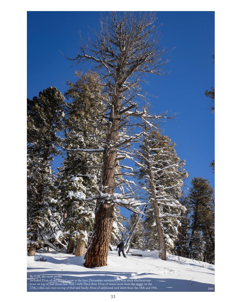
17th
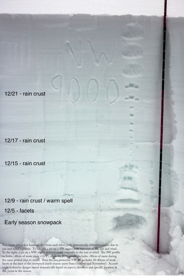
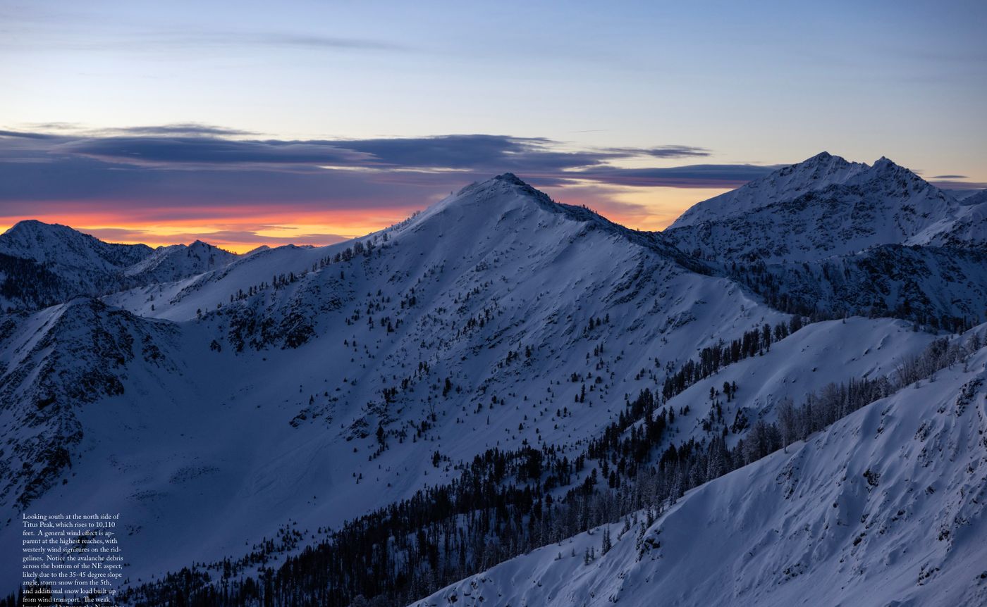
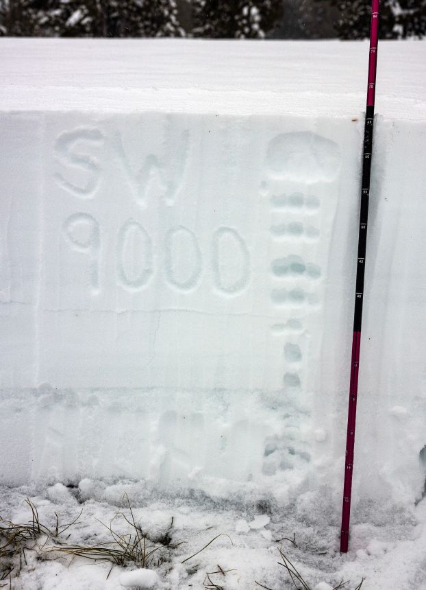
Two snow pits, a few hundred feet from each other, with dramatically different profiles due to sun and wind exposure. The SW profile includes ~40cm of snow since ~12/15, while the NW profile includes ~80cm during the same period (due to wind).
Accordingly, avalanche danger varied dramatically based on aspect, elevation and specific location at this point in the season.
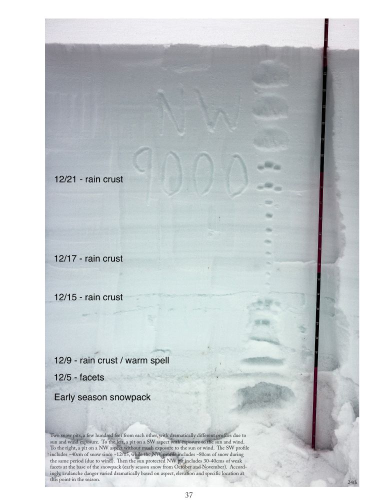
rain crust
rain crust
rain crust
rain crust / warm spell
facets
early season snowpack
COVERAGE
AT 7K
FORMED
ON THE
TREES
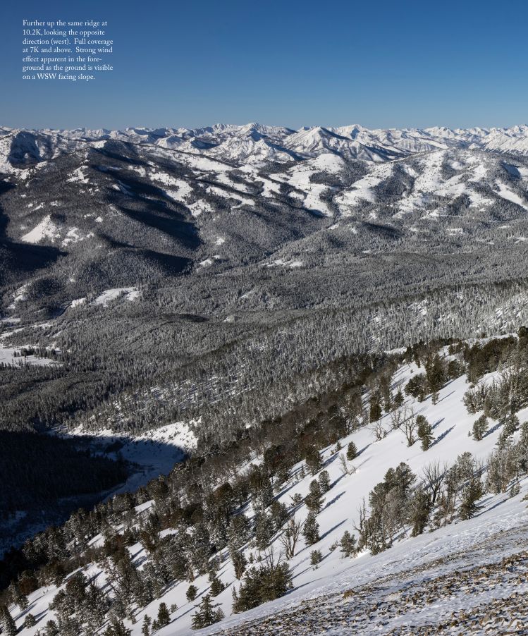
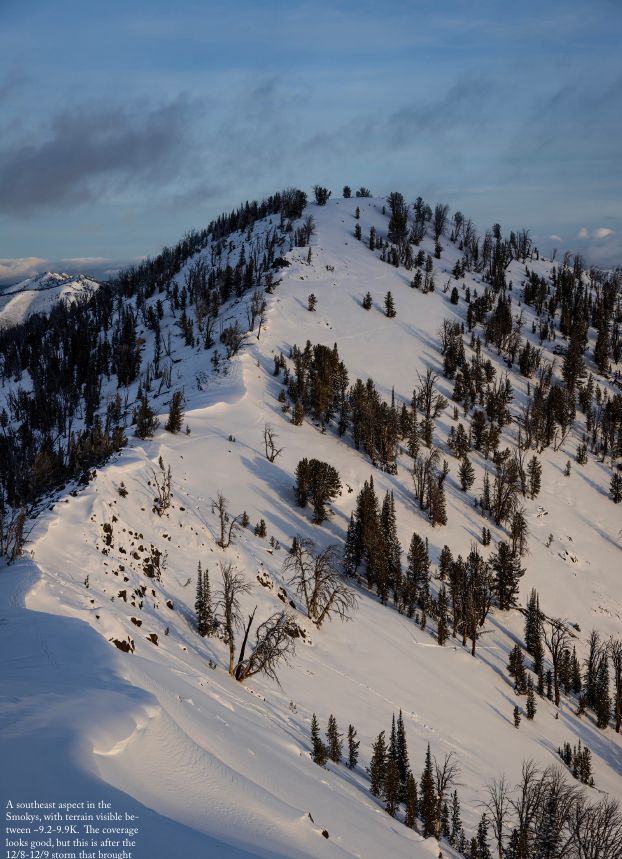
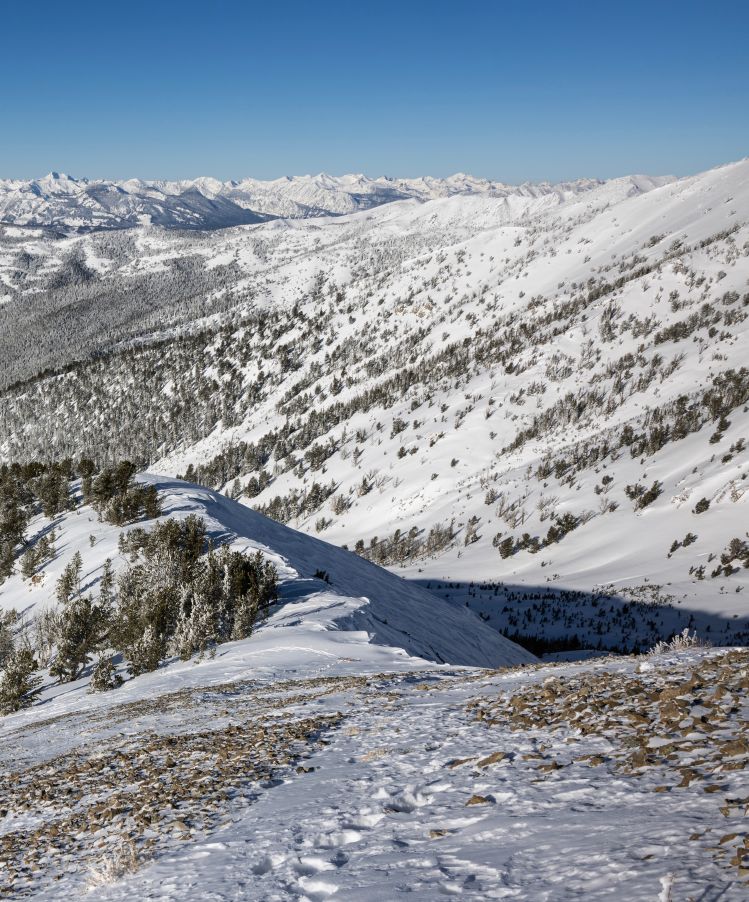
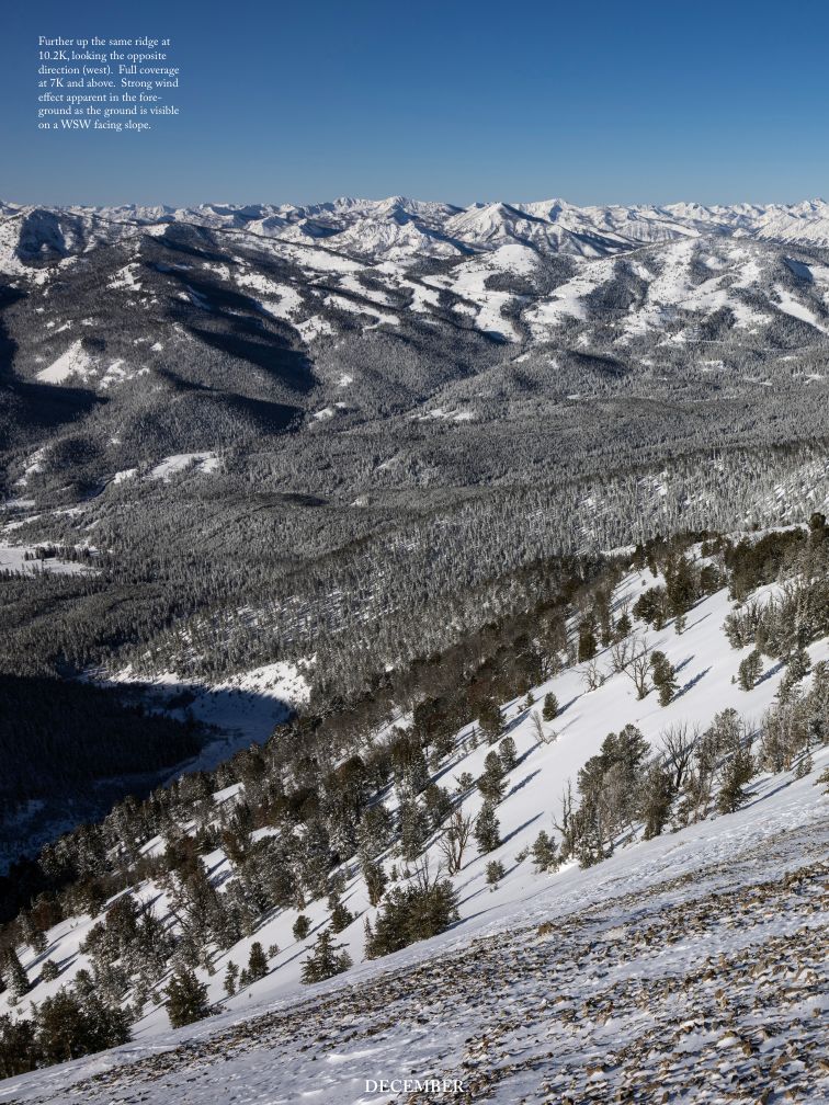
Further up the same ridge at 10.2K, looking the opposite direction (west). Full coverage at 7K and above. Strong wind effect apparent in the foreground as the ground is visible on a WSW facing slope.
Full coverage at 7K and above. Strong wind effect apparent in the foreground as the ground is visible on a WSW facing slope.
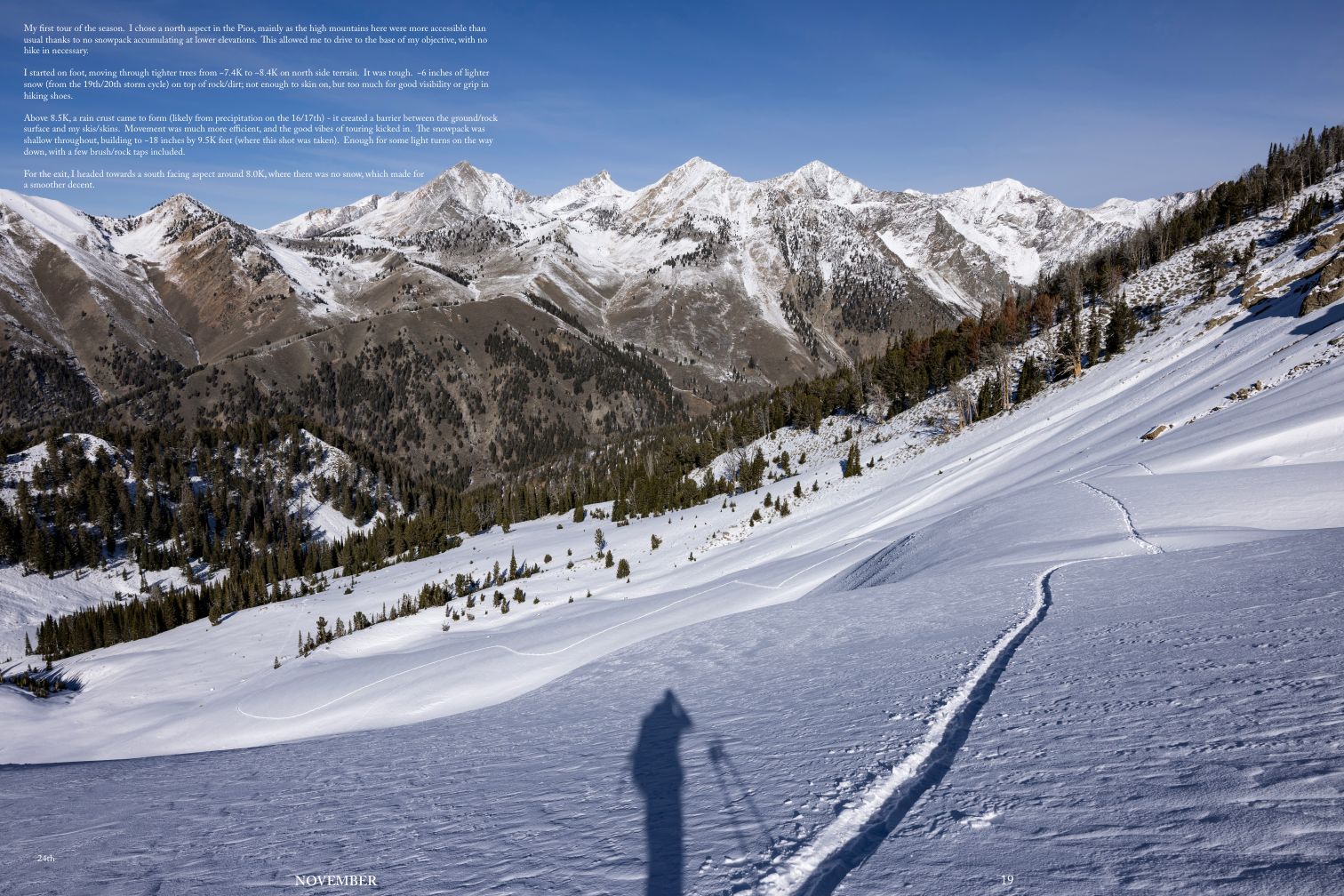
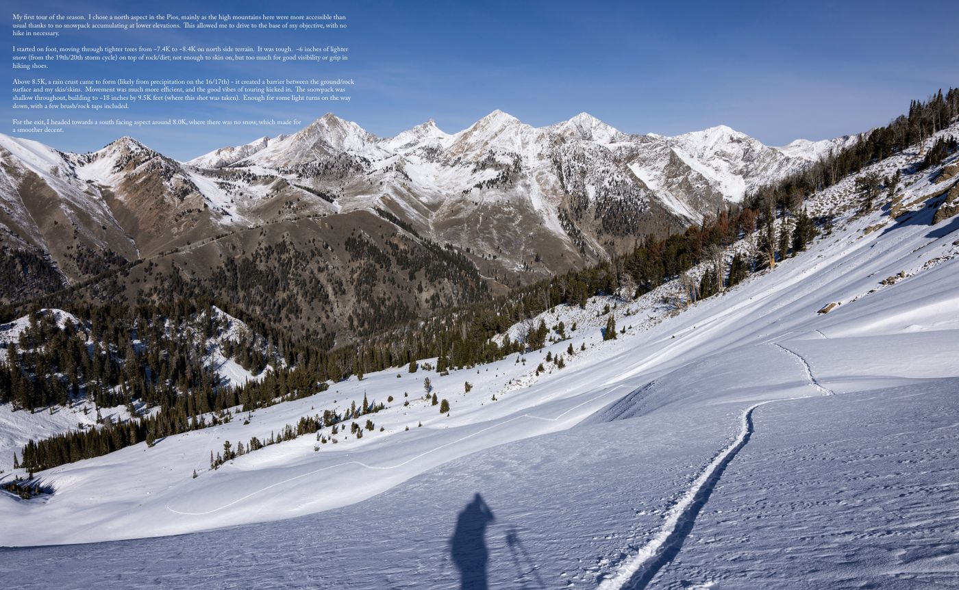
My first tour of the season. I chose a north aspect in the Pios, mainly as the high mountains here were more accessible than usual thanks to no snowpack accumulating at lower elevations. This allowed me to drive to the base of my objective, with no hike in necessary.
I started on foot, moving through tighter trees from ~7.4K to ~8.4K on north side terrain. It was tough. ~6 inches of lighter snow (from the 19th/20th storm cycle) on top of rock/dirt; not enough to skin on, but too much for good visibility or grip in hiking shoes.
TOUR
OF THE
SEASON
My first tour of the season. I chose a north aspect in the Pios, mainly as the high mountains here were more accessible than usual thanks to no snowpack accumulating at lower elevations. This allowed me to drive to the base of my objective, with no hike in necessary.
I started on foot, moving through tighter trees from ~7.4K to ~8.4K on north side terrain. It was tough. ~6 inches of lighter snow (from the 19th/20th storm cycle) on top of rock/dirt; not enough to skin on, but too much for good visibility or grip in hiking shoes.
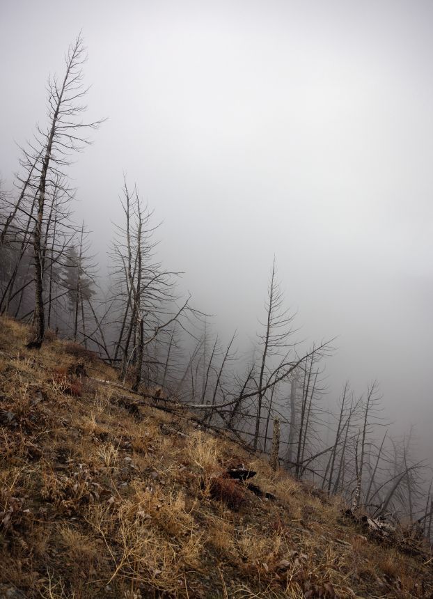
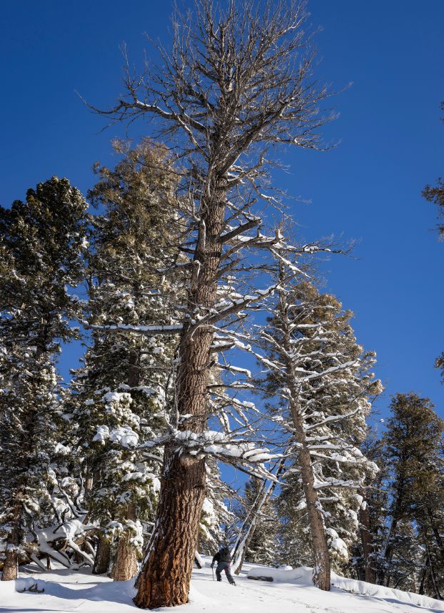
Above 8.5K, a rain crust came to form (likely from precipitation on the 16/17th) – it created a barrier between the ground/rock surface and my skis/skins. Movement was much more efficient, and the good vibes of touring kicked in. The snowpack was shallow throughout, building to ~18 inches by 9.5K feet (where this shot was taken).
My first tour of the season. I chose a north aspect in the Pios, mainly as the high mountains here were more accessible than usual thanks to no snowpack accumulating at lower elevations. This allowed me to drive to the base of my objective, with no hike in necessary.
I started on foot, moving through tighter trees from ~7.4K to ~8.4K on north side terrain. It was tough. ~6 inches of lighter snow (from the 19th/20th storm cycle) on top of rock/dirt; not enough to skin on, but too much for good visibility or grip in hiking shoes.
My first tour of the season. I chose a north aspect in the Pios, mainly as the high mountains here were more accessible than usual thanks to no snowpack accumulating at lower elevations. This allowed me to drive to the base of my objective, with no hike in necessary.
I started on foot, moving through tighter trees from ~7.4K to ~8.4K on north side terrain. It was tough. ~6 inches of lighter snow (from the 19th/20th storm cycle) on top of rock/dirt; not enough to skin on, but too much for good visibility or grip in hiking shoes.
Above 8.5K, a rain crust came to form (likely from precipitation on the 16/17th) – it created a barrier between the ground/rock surface and my skis/skins. Movement was much more efficient, and the good vibes of touring kicked in. The snowpack was shallow throughout, building to ~18 inches by 9.5K feet (where this shot was taken).
I started on foot, moving through tighter trees from ~7.4K to ~8.4K on north side terrain. It was tough. ~6 inches of lighter snow (from the 19th/20th storm cycle) on top of rock/dirt; not enough to skin on, but too much for good visibility or grip in hiking shoes.
I started on foot, moving through tighter trees from ~7.4K to ~8.4K on north side terrain. It was tough. ~6 inches of lighter snow (from the 19th/20th storm cycle) on top of rock/dirt; not enough to skin on, but too much for good visibility or grip in hiking shoes.
Above 8.5K, a rain crust came to form (likely from precipitation on the 16/17th) – it created a barrier between the ground/rock surface and my skis/skins. Movement was much more efficient, and the good vibes of touring kicked in. The snowpack was shallow throughout, building to ~18 inches by 9.5K feet (where this shot was taken).
142 LAYOUTS · 11 TYPES × 10+ · BUILT IN HTML/CSS FROM SAM'S VOLUME 7 PHOTOGRAPHS AND TEXT (CAPTIONS, LETTER, ESSAY, COLOPHON) · COLOUR GROUNDS FROM THE SAMPLED PALETTE · CHARTS ARE DRAWN PLACEHOLDERS · OPEN-LICENSE WEB FONTS · PHOTOGRAPHS UNCHANGED
Final Designs
The opening signature — Steve's seven-spread sequence — carried forward as the working final. The base as pulled from Figma, then twenty typographic iterations: modern sans and serif pairings close to the base but pushed, applied to every spread except the cover, which is held. Mono stays IBM Plex; the numerals and wordmark stay Caslon. Click any spread to view large; tick to shortlist.
Welcome back. As always, thanks for being here.
I’ll start with my present moment - writing is hard. This likely stems from the fact that I don’t practice often. I made a point years back to let go of constantly staying on top of my worldview. It just felt like I spent more time translating my experience, than having and being with the experience itself. I was forgoing an open-mind and more meaningful perspective shifts, in service to concise takes. While this shift has felt just right for me, a cost becomes apparent when the time comes to translate for Local Studies.
Now the easy answer is to stop writing. One of the things I love most about this work is that it shapes my day to day. It is a tool for my continued unfolding. Within that, feeling a sense of balance is part of this equation - I put enough work on my plate to expand, while making space for experiences to settle within me, and space for the most important work of showing up as a good partner and father. With this in mind, if writing stresses me out, if writing makes me chippy with Lynn and the kids, I can let it go.
And I might. I still wonder if the best version of this work would be weather data and pictures, no human angle included. Explicit language often narrows the band of impact for art. Yet also, for the smaller sliver of humans that resonate, it can deepen the impact. Accordingly, I’m still pulled to express with words, to face the writing struggle. I still see room for sharing an alternative way of being than the average of what I find out there today. And I know that most of the things in my life I’m proud of required moving through hardship in the moment.
As I’m reflecting on this on a personal level, I’m attempting to apply it outside myself. I’m always surprised by how good people are when I get to know them. It’s easy to ruminate on a small set of data points in isolation, and to make assumptions. But when face to face, in person, with space to hear someone out, they always surprise me. I quickly realize that my judgments were misplaced - they are not bad, they simply had a challenging moment that I witnessed, often due to a way fuller plate than mine. They are not dumb, they just have a different set of experiences that lead to a valid, opposing belief. Inevitably, they too are evolving through the challenges they face and alternative viewpoints they come across.
With this in mind, for Volume 6, I tried my best to share from a space of optimism. This is in contrast to the hopeless disposition I held for Volume 5. On the personal level, this means trusting that individuals are good people that are doing well and capable of supporting themselves. This feels right in my body compared to the posture of “everyone needs my help (and I have the answers)”. A friend kindly made me aware of how classically white-American-colonizer this framing is. Opening my eyes further to how much I’m not self-made, but merely a product of my DNA, circumstance and upbringing.
On the larger scale, embodying optimism means trusting that we are exactly where we are supposed to be. The Universe is a Green Dragon gave me a story that I needed to find truth in this. In short, our human crafted technological progress, negative externalities included, has allowed for a foundational leap in our understanding of where we come from, and how we can continue to move forward. There’s plenty of work to do, but it’s made tangible and manageable.
With that, as always, thanks to everyone who gives Local Studies their time and attention. I hope this work feels in service to you. Even if it looks fun and sexy, it’s hard. I feel exposed, I struggle with managing physical overuse injuries, I struggle believing in what I’m doing. But this is the path of the artist that I choose. I just need to keep reminding myself that while it can feel like everything in my world, it is also nothing. It can be cherished, and discarded; it can make an impact for some, and be meaningless to others.
Now to those of you that do find value in the work, please do let me know. I’m sensitive. As much as I wish otherwise, I still need your encouragement to have faith and keep going.
and warmth

The first week of December was cold. A moderate atmospheric river came in from the WNW on the 5th. A foot of snow fell in the alpine, with an inch on the valley floor. This kicked off the first avalanche cycle of the season, mostly on the northern half of the compass above 9K feet where there was an existing snow surface for the new snow to slide on.
Another atmospheric river came in from the WNW on the 8th, pulling warmer air and moisture from Hawaii. The rain/snow line was high, between 9K and 10K feet. Once again, avalanches released in the alpine. Warmer temperatures, minimal precipitation and mostly sunshine for the following week burned off most of the snow on the south sides.
Up to this point in the month, there had been a big area of high pressure off the coast of California that was forcing the jet stream (and all low pressure storm systems) to the north of Central Idaho. Accordingly, in Washington, record amounts of precipitation were falling, but much of it as rain due to high temperatures. While in Utah and Colorado, the land was more towards dry. This pattern changed in the middle of the month, as the high pressure region moved south.
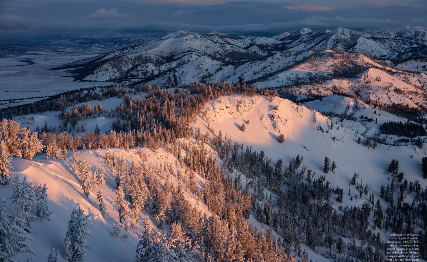
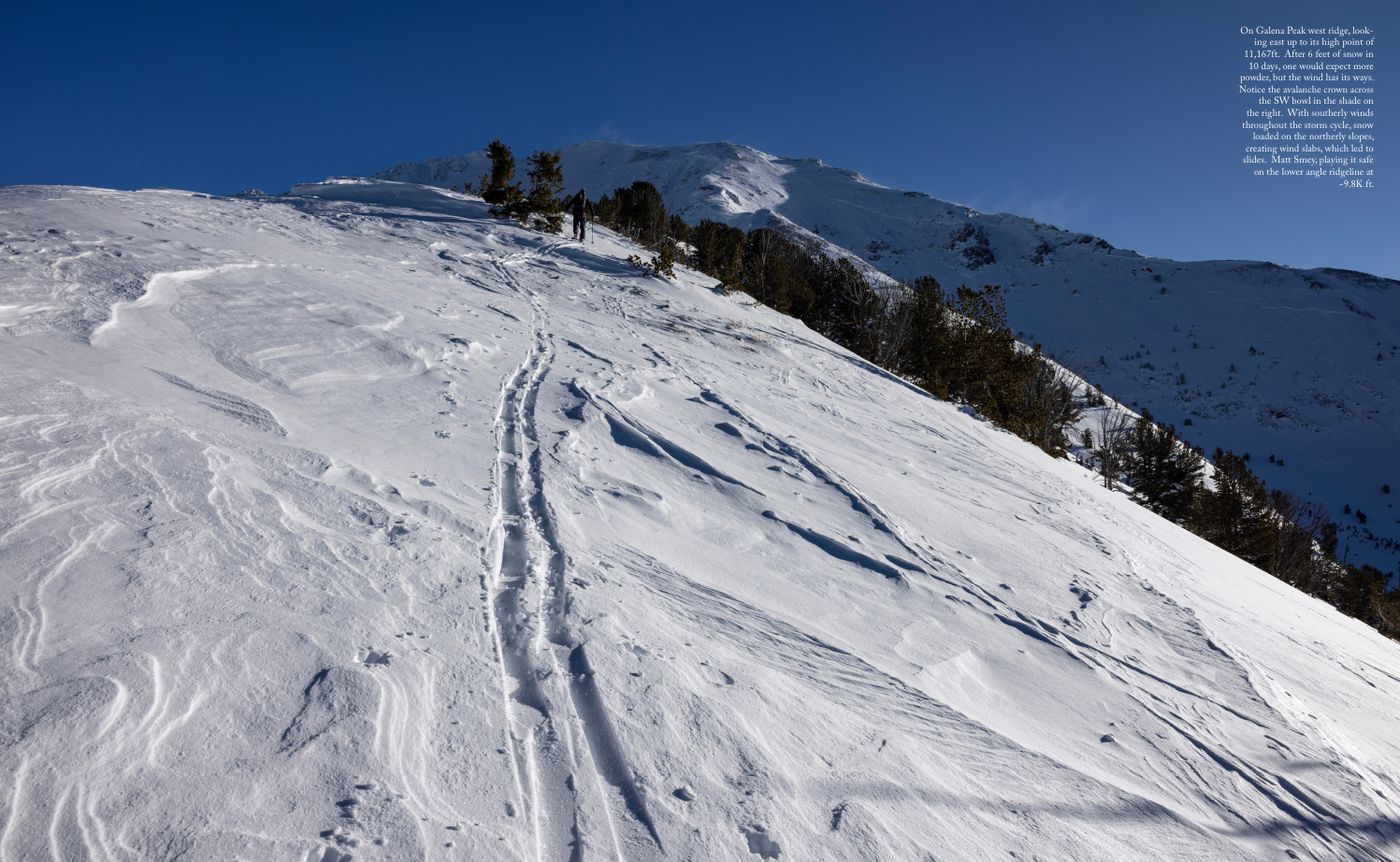
On the 17th, a strong storm from the SW brought significant moisture, colder temps and strong wind (with 100+ mph gusts recorded at 9.5K feet). Another SW-flowing storm followed on the 18th and 19th, bringing over a foot of snow to the valley floor, with feet of snow in the alpine, as well as the first avalanche warning of the season from the Sawtooth Avalanche Center. Snowfall continued through the 27th (with avalanche warnings through the 24th), with the rain/snow line fluctuating between 7.0-9.0K feet. More than 6 feet of snow fell in the high mountains during this time.
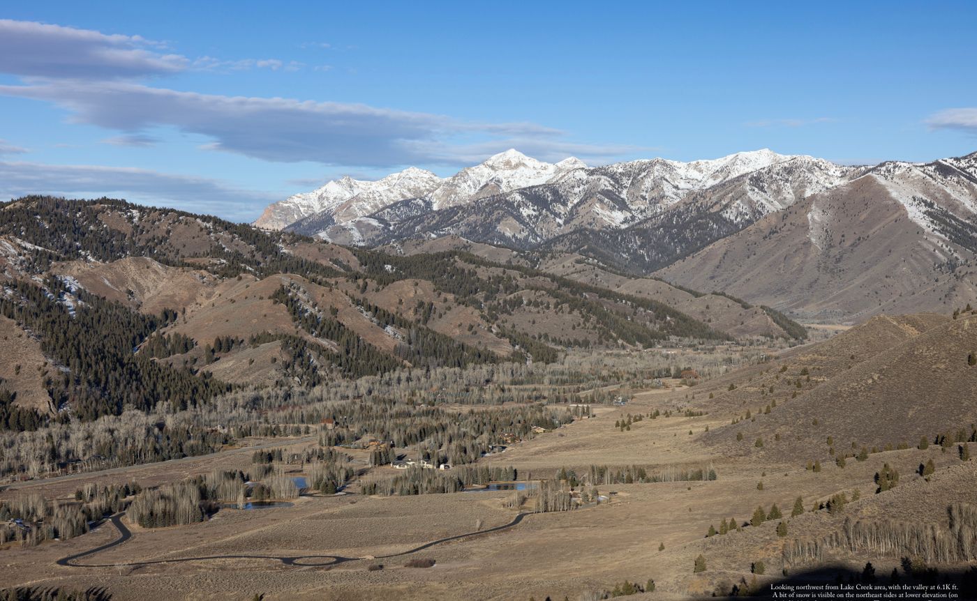
Yet while precipitation was well above average for the month, temperatures continued to be significantly above average as well - 33.5 degrees across December in Idaho compared to a 100-year historical average of 23.9 degrees. In other words, it was the 2nd hottest December on record for the state.
Design by Steve Tam
Weather support from JP at Central Idaho Mountain Weather
Welcome back. As always, thanks for being here.
I’ll start with my present moment - writing is hard. This likely stems from the fact that I don’t practice often. I made a point years back to let go of constantly staying on top of my worldview. It just felt like I spent more time translating my experience, than having and being with the experience itself. I was forgoing an open-mind and more meaningful perspective shifts, in service to concise takes. While this shift has felt just right for me, a cost becomes apparent when the time comes to translate for Local Studies.
Now the easy answer is to stop writing. One of the things I love most about this work is that it shapes my day to day. It is a tool for my continued unfolding. Within that, feeling a sense of balance is part of this equation - I put enough work on my plate to expand, while making space for experiences to settle within me, and space for the most important work of showing up as a good partner and father. With this in mind, if writing stresses me out, if writing makes me chippy with Lynn and the kids, I can let it go.
And I might. I still wonder if the best version of this work would be weather data and pictures, no human angle included. Explicit language often narrows the band of impact for art. Yet also, for the smaller sliver of humans that resonate, it can deepen the impact. Accordingly, I’m still pulled to express with words, to face the writing struggle. I still see room for sharing an alternative way of being than the average of what I find out there today. And I know that most of the things in my life I’m proud of required moving through hardship in the moment.
As I’m reflecting on this on a personal level, I’m attempting to apply it outside myself. I’m always surprised by how good people are when I get to know them. It’s easy to ruminate on a small set of data points in isolation, and to make assumptions. But when face to face, in person, with space to hear someone out, they always surprise me. I quickly realize that my judgments were misplaced - they are not bad, they simply had a challenging moment that I witnessed, often due to a way fuller plate than mine. They are not dumb, they just have a different set of experiences that lead to a valid, opposing belief. Inevitably, they too are evolving through the challenges they face and alternative viewpoints they come across.
With this in mind, for Volume 6, I tried my best to share from a space of optimism. This is in contrast to the hopeless disposition I held for Volume 5. On the personal level, this means trusting that individuals are good people that are doing well and capable of supporting themselves. This feels right in my body compared to the posture of “everyone needs my help (and I have the answers)”. A friend kindly made me aware of how classically white-American-colonizer this framing is. Opening my eyes further to how much I’m not self-made, but merely a product of my DNA, circumstance and upbringing.
On the larger scale, embodying optimism means trusting that we are exactly where we are supposed to be. The Universe is a Green Dragon gave me a story that I needed to find truth in this. In short, our human crafted technological progress, negative externalities included, has allowed for a foundational leap in our understanding of where we come from, and how we can continue to move forward. There’s plenty of work to do, but it’s made tangible and manageable.
With that, as always, thanks to everyone who gives Local Studies their time and attention. I hope this work feels in service to you. Even if it looks fun and sexy, it’s hard. I feel exposed, I struggle with managing physical overuse injuries, I struggle believing in what I’m doing. But this is the path of the artist that I choose. I just need to keep reminding myself that while it can feel like everything in my world, it is also nothing. It can be cherished, and discarded; it can make an impact for some, and be meaningless to others.
Now to those of you that do find value in the work, please do let me know. I’m sensitive. As much as I wish otherwise, I still need your encouragement to have faith and keep going.
Sam

Going into the season, the Earth’s rhythms were set up for an above average snow year in Idaho. The Pacific Ocean was in the midst of its La Niña pattern, meaning cooler surface temperatures, which helps align the jet stream (where most storm systems form) with the state.
This said, Central Idaho in particular has a history of doing its own thing. Previous La Niña seasons were a mixed bag with winter 2024-25 an average snow year, 2022-23 above average, 2021-22 above average and 2020-21 below average.
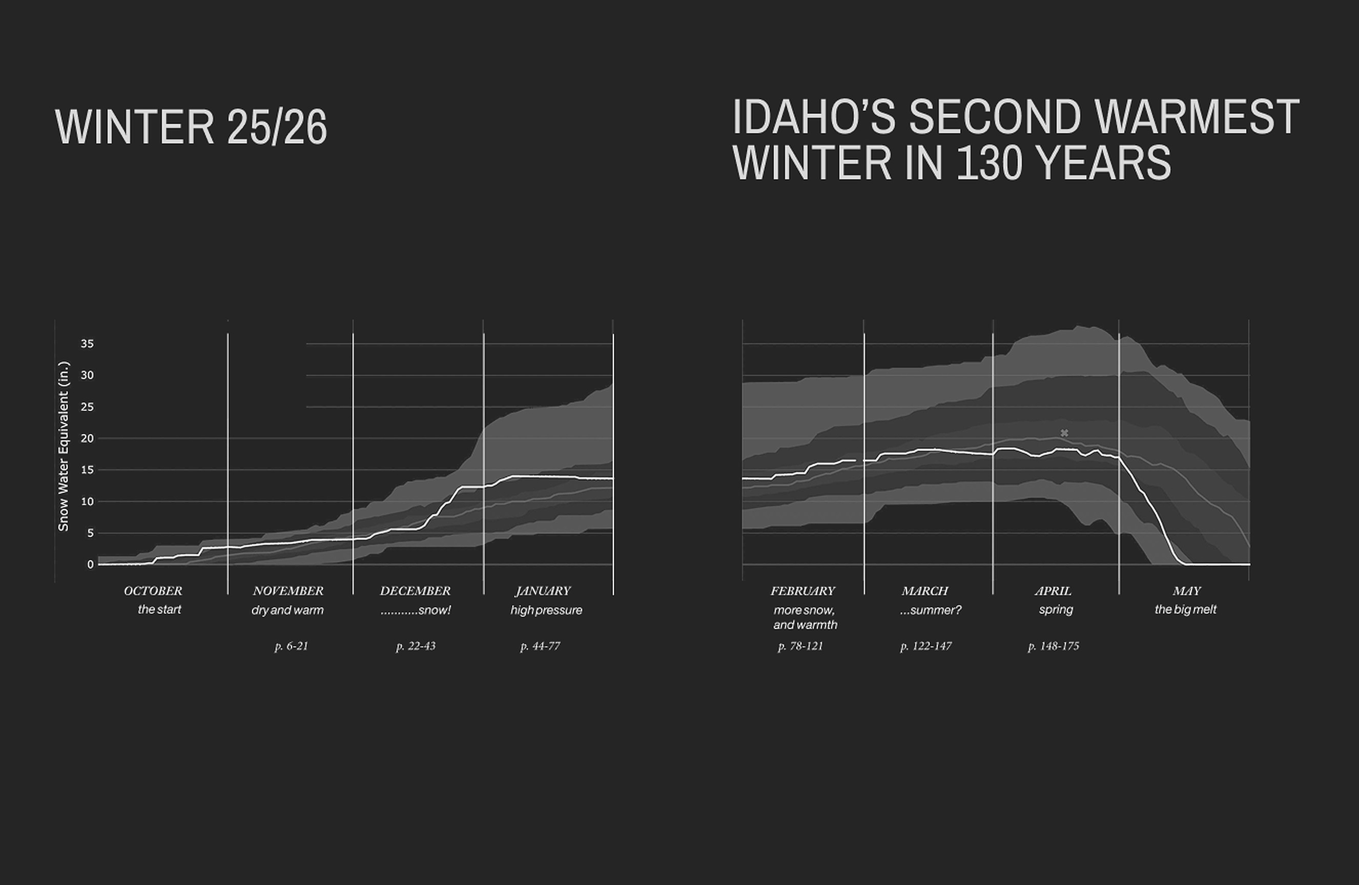
October brought hope to the valley, as two atmospheric river events each deposited a foot of snow in the alpine. Temperatures were warm between these systems, but in line with historical averages. By the end of the month, the south side snowpack had melted, but snow remained on the north side above ~8K ft.
November started warm, but temperatures cooled as a series of storms came through between November 4th and 7th. 8 to 12 inches of snow fell in total, but only above ~9K feet, with rain below.
Temperatures shot right back up on the 9th, and remained unseasonably high through the 15th, with highs just shy of 60 in the valley. Light precipitation fell from the 14th to the 17th, with the rain/snow line staying high, fluctuating between 9K and 10K ft.
For the second half of the month, temperatures lowered. An atmospheric river on the 19th and 20th brought a touch of snow down to 6.5K ft, with ~5 inches falling in the alpine. Then another storm dropped a few inches in the northern and western mountains on the 25th and 26th, with minimal precipitation in the Wood River Valley.
Yet even with this cooler weather, November 2025 ended up being Idaho’s warmest in 130 years of record keeping, with temperatures 7.3 degrees above the 100-year average. By the end of the month, there was minimal opportunity for ski touring, with no snow below 7.5K ft, patchy snow with multiple rain crusts between 7.5K and 9.0K ft on north sides, and ~2 feet of snow above 9.0K on the north sides.
The first week of December was cold. A moderate atmospheric river came in from the WNW on the 5th. A foot of snow fell in the alpine, with an inch on the valley floor. This kicked off the first avalanche cycle of the season, mostly on the northern half of the compass above 9K feet where there was an existing snow surface for the new snow to slide on.
Another atmospheric river came in from the WNW on the 8th, pulling warmer air and moisture from Hawaii. The rain/snow line was high, between 9K and 10K feet. Once again, avalanches released in the alpine. Warmer temperatures, minimal precipitation and mostly sunshine for the following week burned off most of the snow on the south sides.
Up to this point in the month, there had been a big area of high pressure off the coast of California that was forcing the jet stream (and all low pressure storm systems) to the north of Central Idaho. Accordingly, in Washington, record amounts of precipitation were falling, but much of it as rain due to high temperatures. While in Utah and Colorado, the land was more towards dry. This pattern changed in the middle of the month, as the high pressure region moved south.
On the 17th, a strong storm from the SW brought significant moisture, colder temps and strong wind (with 100+ mph gusts recorded at 9.5K feet). Another SW-flowing storm followed on the 18th and 19th, bringing over a foot of snow to the valley floor, with feet of snow in the alpine, as well as the first avalanche warning of the season from the Sawtooth Avalanche Center. Snowfall continued through the 27th (with avalanche warnings through the 24th), with the rain/snow line fluctuating between 7.0-9.0K feet. More than 6 feet of snow fell in the high mountains during this time.
Yet while precipitation was well above average for the month, temperatures continued to be significantly above average as well - 33.5 degrees across December in Idaho compared to a 100-year historical average of 23.9 degrees. In other words, it was the 2nd hottest December on record for the state.
Design by Steve Tam
Weather support from JP at Central Idaho Mountain Weather
Welcome back. As always, thanks for being here.
I’ll start with my present moment - writing is hard. This likely stems from the fact that I don’t practice often. I made a point years back to let go of constantly staying on top of my worldview. It just felt like I spent more time translating my experience, than having and being with the experience itself. I was forgoing an open-mind and more meaningful perspective shifts, in service to concise takes. While this shift has felt just right for me, a cost becomes apparent when the time comes to translate for Local Studies.
Now the easy answer is to stop writing. One of the things I love most about this work is that it shapes my day to day. It is a tool for my continued unfolding. Within that, feeling a sense of balance is part of this equation - I put enough work on my plate to expand, while making space for experiences to settle within me, and space for the most important work of showing up as a good partner and father. With this in mind, if writing stresses me out, if writing makes me chippy with Lynn and the kids, I can let it go.
And I might. I still wonder if the best version of this work would be weather data and pictures, no human angle included. Explicit language often narrows the band of impact for art. Yet also, for the smaller sliver of humans that resonate, it can deepen the impact. Accordingly, I’m still pulled to express with words, to face the writing struggle. I still see room for sharing an alternative way of being than the average of what I find out there today. And I know that most of the things in my life I’m proud of required moving through hardship in the moment.
As I’m reflecting on this on a personal level, I’m attempting to apply it outside myself. I’m always surprised by how good people are when I get to know them. It’s easy to ruminate on a small set of data points in isolation, and to make assumptions. But when face to face, in person, with space to hear someone out, they always surprise me. I quickly realize that my judgments were misplaced - they are not bad, they simply had a challenging moment that I witnessed, often due to a way fuller plate than mine. They are not dumb, they just have a different set of experiences that lead to a valid, opposing belief. Inevitably, they too are evolving through the challenges they face and alternative viewpoints they come across.
With this in mind, for Volume 6, I tried my best to share from a space of optimism. This is in contrast to the hopeless disposition I held for Volume 5. On the personal level, this means trusting that individuals are good people that are doing well and capable of supporting themselves. This feels right in my body compared to the posture of “everyone needs my help (and I have the answers)”. A friend kindly made me aware of how classically white-American-colonizer this framing is. Opening my eyes further to how much I’m not self-made, but merely a product of my DNA, circumstance and upbringing.
On the larger scale, embodying optimism means trusting that we are exactly where we are supposed to be. The Universe is a Green Dragon gave me a story that I needed to find truth in this. In short, our human crafted technological progress, negative externalities included, has allowed for a foundational leap in our understanding of where we come from, and how we can continue to move forward. There’s plenty of work to do, but it’s made tangible and manageable.
With that, as always, thanks to everyone who gives Local Studies their time and attention. I hope this work feels in service to you. Even if it looks fun and sexy, it’s hard. I feel exposed, I struggle with managing physical overuse injuries, I struggle believing in what I’m doing. But this is the path of the artist that I choose. I just need to keep reminding myself that while it can feel like everything in my world, it is also nothing. It can be cherished, and discarded; it can make an impact for some, and be meaningless to others.
Now to those of you that do find value in the work, please do let me know. I’m sensitive. As much as I wish otherwise, I still need your encouragement to have faith and keep going.
Sam
Going into the season, the Earth’s rhythms were set up for an above average snow year in Idaho. The Pacific Ocean was in the midst of its La Niña pattern, meaning cooler surface temperatures, which helps align the jet stream (where most storm systems form) with the state.
This said, Central Idaho in particular has a history of doing its own thing. Previous La Niña seasons were a mixed bag with winter 2024-25 an average snow year, 2022-23 above average, 2021-22 above average and 2020-21 below average.
October brought hope to the valley, as two atmospheric river events each deposited a foot of snow in the alpine. Temperatures were warm between these systems, but in line with historical averages. By the end of the month, the south side snowpack had melted, but snow remained on the north side above ~8K ft.
November started warm, but temperatures cooled as a series of storms came through between November 4th and 7th. 8 to 12 inches of snow fell in total, but only above ~9K feet, with rain below.
Temperatures shot right back up on the 9th, and remained unseasonably high through the 15th, with highs just shy of 60 in the valley. Light precipitation fell from the 14th to the 17th, with the rain/snow line staying high, fluctuating between 9K and 10K ft.
For the second half of the month, temperatures lowered. An atmospheric river on the 19th and 20th brought a touch of snow down to 6.5K ft, with ~5 inches falling in the alpine. Then another storm dropped a few inches in the northern and western mountains on the 25th and 26th, with minimal precipitation in the Wood River Valley.
Yet even with this cooler weather, November 2025 ended up being Idaho’s warmest in 130 years of record keeping, with temperatures 7.3 degrees above the 100-year average. By the end of the month, there was minimal opportunity for ski touring, with no snow below 7.5K ft, patchy snow with multiple rain crusts between 7.5K and 9.0K ft on north sides, and ~2 feet of snow above 9.0K on the north sides.
The first week of December was cold. A moderate atmospheric river came in from the WNW on the 5th. A foot of snow fell in the alpine, with an inch on the valley floor. This kicked off the first avalanche cycle of the season, mostly on the northern half of the compass above 9K feet where there was an existing snow surface for the new snow to slide on.
Another atmospheric river came in from the WNW on the 8th, pulling warmer air and moisture from Hawaii. The rain/snow line was high, between 9K and 10K feet. Once again, avalanches released in the alpine. Warmer temperatures, minimal precipitation and mostly sunshine for the following week burned off most of the snow on the south sides.
Up to this point in the month, there had been a big area of high pressure off the coast of California that was forcing the jet stream (and all low pressure storm systems) to the north of Central Idaho. Accordingly, in Washington, record amounts of precipitation were falling, but much of it as rain due to high temperatures. While in Utah and Colorado, the land was more towards dry. This pattern changed in the middle of the month, as the high pressure region moved south.
On the 17th, a strong storm from the SW brought significant moisture, colder temps and strong wind (with 100+ mph gusts recorded at 9.5K feet). Another SW-flowing storm followed on the 18th and 19th, bringing over a foot of snow to the valley floor, with feet of snow in the alpine, as well as the first avalanche warning of the season from the Sawtooth Avalanche Center. Snowfall continued through the 27th (with avalanche warnings through the 24th), with the rain/snow line fluctuating between 7.0-9.0K feet. More than 6 feet of snow fell in the high mountains during this time.
Yet while precipitation was well above average for the month, temperatures continued to be significantly above average as well - 33.5 degrees across December in Idaho compared to a 100-year historical average of 23.9 degrees. In other words, it was the 2nd hottest December on record for the state.
Design by Steve Tam
Weather support from JP at Central Idaho Mountain Weather
Welcome back. As always, thanks for being here.
I’ll start with my present moment - writing is hard. This likely stems from the fact that I don’t practice often. I made a point years back to let go of constantly staying on top of my worldview. It just felt like I spent more time translating my experience, than having and being with the experience itself. I was forgoing an open-mind and more meaningful perspective shifts, in service to concise takes. While this shift has felt just right for me, a cost becomes apparent when the time comes to translate for Local Studies.
Now the easy answer is to stop writing. One of the things I love most about this work is that it shapes my day to day. It is a tool for my continued unfolding. Within that, feeling a sense of balance is part of this equation - I put enough work on my plate to expand, while making space for experiences to settle within me, and space for the most important work of showing up as a good partner and father. With this in mind, if writing stresses me out, if writing makes me chippy with Lynn and the kids, I can let it go.
And I might. I still wonder if the best version of this work would be weather data and pictures, no human angle included. Explicit language often narrows the band of impact for art. Yet also, for the smaller sliver of humans that resonate, it can deepen the impact. Accordingly, I’m still pulled to express with words, to face the writing struggle. I still see room for sharing an alternative way of being than the average of what I find out there today. And I know that most of the things in my life I’m proud of required moving through hardship in the moment.
As I’m reflecting on this on a personal level, I’m attempting to apply it outside myself. I’m always surprised by how good people are when I get to know them. It’s easy to ruminate on a small set of data points in isolation, and to make assumptions. But when face to face, in person, with space to hear someone out, they always surprise me. I quickly realize that my judgments were misplaced - they are not bad, they simply had a challenging moment that I witnessed, often due to a way fuller plate than mine. They are not dumb, they just have a different set of experiences that lead to a valid, opposing belief. Inevitably, they too are evolving through the challenges they face and alternative viewpoints they come across.
With this in mind, for Volume 6, I tried my best to share from a space of optimism. This is in contrast to the hopeless disposition I held for Volume 5. On the personal level, this means trusting that individuals are good people that are doing well and capable of supporting themselves. This feels right in my body compared to the posture of “everyone needs my help (and I have the answers)”. A friend kindly made me aware of how classically white-American-colonizer this framing is. Opening my eyes further to how much I’m not self-made, but merely a product of my DNA, circumstance and upbringing.
On the larger scale, embodying optimism means trusting that we are exactly where we are supposed to be. The Universe is a Green Dragon gave me a story that I needed to find truth in this. In short, our human crafted technological progress, negative externalities included, has allowed for a foundational leap in our understanding of where we come from, and how we can continue to move forward. There’s plenty of work to do, but it’s made tangible and manageable.
With that, as always, thanks to everyone who gives Local Studies their time and attention. I hope this work feels in service to you. Even if it looks fun and sexy, it’s hard. I feel exposed, I struggle with managing physical overuse injuries, I struggle believing in what I’m doing. But this is the path of the artist that I choose. I just need to keep reminding myself that while it can feel like everything in my world, it is also nothing. It can be cherished, and discarded; it can make an impact for some, and be meaningless to others.
Now to those of you that do find value in the work, please do let me know. I’m sensitive. As much as I wish otherwise, I still need your encouragement to have faith and keep going.
Sam
Going into the season, the Earth’s rhythms were set up for an above average snow year in Idaho. The Pacific Ocean was in the midst of its La Niña pattern, meaning cooler surface temperatures, which helps align the jet stream (where most storm systems form) with the state.
This said, Central Idaho in particular has a history of doing its own thing. Previous La Niña seasons were a mixed bag with winter 2024-25 an average snow year, 2022-23 above average, 2021-22 above average and 2020-21 below average.
October brought hope to the valley, as two atmospheric river events each deposited a foot of snow in the alpine. Temperatures were warm between these systems, but in line with historical averages. By the end of the month, the south side snowpack had melted, but snow remained on the north side above ~8K ft.
November started warm, but temperatures cooled as a series of storms came through between November 4th and 7th. 8 to 12 inches of snow fell in total, but only above ~9K feet, with rain below.
Temperatures shot right back up on the 9th, and remained unseasonably high through the 15th, with highs just shy of 60 in the valley. Light precipitation fell from the 14th to the 17th, with the rain/snow line staying high, fluctuating between 9K and 10K ft.
For the second half of the month, temperatures lowered. An atmospheric river on the 19th and 20th brought a touch of snow down to 6.5K ft, with ~5 inches falling in the alpine. Then another storm dropped a few inches in the northern and western mountains on the 25th and 26th, with minimal precipitation in the Wood River Valley.
Yet even with this cooler weather, November 2025 ended up being Idaho’s warmest in 130 years of record keeping, with temperatures 7.3 degrees above the 100-year average. By the end of the month, there was minimal opportunity for ski touring, with no snow below 7.5K ft, patchy snow with multiple rain crusts between 7.5K and 9.0K ft on north sides, and ~2 feet of snow above 9.0K on the north sides.
The first week of December was cold. A moderate atmospheric river came in from the WNW on the 5th. A foot of snow fell in the alpine, with an inch on the valley floor. This kicked off the first avalanche cycle of the season, mostly on the northern half of the compass above 9K feet where there was an existing snow surface for the new snow to slide on.
Another atmospheric river came in from the WNW on the 8th, pulling warmer air and moisture from Hawaii. The rain/snow line was high, between 9K and 10K feet. Once again, avalanches released in the alpine. Warmer temperatures, minimal precipitation and mostly sunshine for the following week burned off most of the snow on the south sides.
Up to this point in the month, there had been a big area of high pressure off the coast of California that was forcing the jet stream (and all low pressure storm systems) to the north of Central Idaho. Accordingly, in Washington, record amounts of precipitation were falling, but much of it as rain due to high temperatures. While in Utah and Colorado, the land was more towards dry. This pattern changed in the middle of the month, as the high pressure region moved south.
On the 17th, a strong storm from the SW brought significant moisture, colder temps and strong wind (with 100+ mph gusts recorded at 9.5K feet). Another SW-flowing storm followed on the 18th and 19th, bringing over a foot of snow to the valley floor, with feet of snow in the alpine, as well as the first avalanche warning of the season from the Sawtooth Avalanche Center. Snowfall continued through the 27th (with avalanche warnings through the 24th), with the rain/snow line fluctuating between 7.0-9.0K feet. More than 6 feet of snow fell in the high mountains during this time.
Yet while precipitation was well above average for the month, temperatures continued to be significantly above average as well - 33.5 degrees across December in Idaho compared to a 100-year historical average of 23.9 degrees. In other words, it was the 2nd hottest December on record for the state.
Design by Steve Tam
Weather support from JP at Central Idaho Mountain Weather
Welcome back. As always, thanks for being here.
I’ll start with my present moment - writing is hard. This likely stems from the fact that I don’t practice often. I made a point years back to let go of constantly staying on top of my worldview. It just felt like I spent more time translating my experience, than having and being with the experience itself. I was forgoing an open-mind and more meaningful perspective shifts, in service to concise takes. While this shift has felt just right for me, a cost becomes apparent when the time comes to translate for Local Studies.
Now the easy answer is to stop writing. One of the things I love most about this work is that it shapes my day to day. It is a tool for my continued unfolding. Within that, feeling a sense of balance is part of this equation - I put enough work on my plate to expand, while making space for experiences to settle within me, and space for the most important work of showing up as a good partner and father. With this in mind, if writing stresses me out, if writing makes me chippy with Lynn and the kids, I can let it go.
And I might. I still wonder if the best version of this work would be weather data and pictures, no human angle included. Explicit language often narrows the band of impact for art. Yet also, for the smaller sliver of humans that resonate, it can deepen the impact. Accordingly, I’m still pulled to express with words, to face the writing struggle. I still see room for sharing an alternative way of being than the average of what I find out there today. And I know that most of the things in my life I’m proud of required moving through hardship in the moment.
As I’m reflecting on this on a personal level, I’m attempting to apply it outside myself. I’m always surprised by how good people are when I get to know them. It’s easy to ruminate on a small set of data points in isolation, and to make assumptions. But when face to face, in person, with space to hear someone out, they always surprise me. I quickly realize that my judgments were misplaced - they are not bad, they simply had a challenging moment that I witnessed, often due to a way fuller plate than mine. They are not dumb, they just have a different set of experiences that lead to a valid, opposing belief. Inevitably, they too are evolving through the challenges they face and alternative viewpoints they come across.
With this in mind, for Volume 6, I tried my best to share from a space of optimism. This is in contrast to the hopeless disposition I held for Volume 5. On the personal level, this means trusting that individuals are good people that are doing well and capable of supporting themselves. This feels right in my body compared to the posture of “everyone needs my help (and I have the answers)”. A friend kindly made me aware of how classically white-American-colonizer this framing is. Opening my eyes further to how much I’m not self-made, but merely a product of my DNA, circumstance and upbringing.
On the larger scale, embodying optimism means trusting that we are exactly where we are supposed to be. The Universe is a Green Dragon gave me a story that I needed to find truth in this. In short, our human crafted technological progress, negative externalities included, has allowed for a foundational leap in our understanding of where we come from, and how we can continue to move forward. There’s plenty of work to do, but it’s made tangible and manageable.
With that, as always, thanks to everyone who gives Local Studies their time and attention. I hope this work feels in service to you. Even if it looks fun and sexy, it’s hard. I feel exposed, I struggle with managing physical overuse injuries, I struggle believing in what I’m doing. But this is the path of the artist that I choose. I just need to keep reminding myself that while it can feel like everything in my world, it is also nothing. It can be cherished, and discarded; it can make an impact for some, and be meaningless to others.
Now to those of you that do find value in the work, please do let me know. I’m sensitive. As much as I wish otherwise, I still need your encouragement to have faith and keep going.
Sam
Going into the season, the Earth’s rhythms were set up for an above average snow year in Idaho. The Pacific Ocean was in the midst of its La Niña pattern, meaning cooler surface temperatures, which helps align the jet stream (where most storm systems form) with the state.
This said, Central Idaho in particular has a history of doing its own thing. Previous La Niña seasons were a mixed bag with winter 2024-25 an average snow year, 2022-23 above average, 2021-22 above average and 2020-21 below average.
October brought hope to the valley, as two atmospheric river events each deposited a foot of snow in the alpine. Temperatures were warm between these systems, but in line with historical averages. By the end of the month, the south side snowpack had melted, but snow remained on the north side above ~8K ft.
November started warm, but temperatures cooled as a series of storms came through between November 4th and 7th. 8 to 12 inches of snow fell in total, but only above ~9K feet, with rain below.
Temperatures shot right back up on the 9th, and remained unseasonably high through the 15th, with highs just shy of 60 in the valley. Light precipitation fell from the 14th to the 17th, with the rain/snow line staying high, fluctuating between 9K and 10K ft.
For the second half of the month, temperatures lowered. An atmospheric river on the 19th and 20th brought a touch of snow down to 6.5K ft, with ~5 inches falling in the alpine. Then another storm dropped a few inches in the northern and western mountains on the 25th and 26th, with minimal precipitation in the Wood River Valley.
Yet even with this cooler weather, November 2025 ended up being Idaho’s warmest in 130 years of record keeping, with temperatures 7.3 degrees above the 100-year average. By the end of the month, there was minimal opportunity for ski touring, with no snow below 7.5K ft, patchy snow with multiple rain crusts between 7.5K and 9.0K ft on north sides, and ~2 feet of snow above 9.0K on the north sides.
The first week of December was cold. A moderate atmospheric river came in from the WNW on the 5th. A foot of snow fell in the alpine, with an inch on the valley floor. This kicked off the first avalanche cycle of the season, mostly on the northern half of the compass above 9K feet where there was an existing snow surface for the new snow to slide on.
Another atmospheric river came in from the WNW on the 8th, pulling warmer air and moisture from Hawaii. The rain/snow line was high, between 9K and 10K feet. Once again, avalanches released in the alpine. Warmer temperatures, minimal precipitation and mostly sunshine for the following week burned off most of the snow on the south sides.
Up to this point in the month, there had been a big area of high pressure off the coast of California that was forcing the jet stream (and all low pressure storm systems) to the north of Central Idaho. Accordingly, in Washington, record amounts of precipitation were falling, but much of it as rain due to high temperatures. While in Utah and Colorado, the land was more towards dry. This pattern changed in the middle of the month, as the high pressure region moved south.
On the 17th, a strong storm from the SW brought significant moisture, colder temps and strong wind (with 100+ mph gusts recorded at 9.5K feet). Another SW-flowing storm followed on the 18th and 19th, bringing over a foot of snow to the valley floor, with feet of snow in the alpine, as well as the first avalanche warning of the season from the Sawtooth Avalanche Center. Snowfall continued through the 27th (with avalanche warnings through the 24th), with the rain/snow line fluctuating between 7.0-9.0K feet. More than 6 feet of snow fell in the high mountains during this time.
Yet while precipitation was well above average for the month, temperatures continued to be significantly above average as well - 33.5 degrees across December in Idaho compared to a 100-year historical average of 23.9 degrees. In other words, it was the 2nd hottest December on record for the state.
Design by Steve Tam
Weather support from JP at Central Idaho Mountain Weather
Welcome back. As always, thanks for being here.
I’ll start with my present moment - writing is hard. This likely stems from the fact that I don’t practice often. I made a point years back to let go of constantly staying on top of my worldview. It just felt like I spent more time translating my experience, than having and being with the experience itself. I was forgoing an open-mind and more meaningful perspective shifts, in service to concise takes. While this shift has felt just right for me, a cost becomes apparent when the time comes to translate for Local Studies.
Now the easy answer is to stop writing. One of the things I love most about this work is that it shapes my day to day. It is a tool for my continued unfolding. Within that, feeling a sense of balance is part of this equation - I put enough work on my plate to expand, while making space for experiences to settle within me, and space for the most important work of showing up as a good partner and father. With this in mind, if writing stresses me out, if writing makes me chippy with Lynn and the kids, I can let it go.
And I might. I still wonder if the best version of this work would be weather data and pictures, no human angle included. Explicit language often narrows the band of impact for art. Yet also, for the smaller sliver of humans that resonate, it can deepen the impact. Accordingly, I’m still pulled to express with words, to face the writing struggle. I still see room for sharing an alternative way of being than the average of what I find out there today. And I know that most of the things in my life I’m proud of required moving through hardship in the moment.
As I’m reflecting on this on a personal level, I’m attempting to apply it outside myself. I’m always surprised by how good people are when I get to know them. It’s easy to ruminate on a small set of data points in isolation, and to make assumptions. But when face to face, in person, with space to hear someone out, they always surprise me. I quickly realize that my judgments were misplaced - they are not bad, they simply had a challenging moment that I witnessed, often due to a way fuller plate than mine. They are not dumb, they just have a different set of experiences that lead to a valid, opposing belief. Inevitably, they too are evolving through the challenges they face and alternative viewpoints they come across.
With this in mind, for Volume 6, I tried my best to share from a space of optimism. This is in contrast to the hopeless disposition I held for Volume 5. On the personal level, this means trusting that individuals are good people that are doing well and capable of supporting themselves. This feels right in my body compared to the posture of “everyone needs my help (and I have the answers)”. A friend kindly made me aware of how classically white-American-colonizer this framing is. Opening my eyes further to how much I’m not self-made, but merely a product of my DNA, circumstance and upbringing.
On the larger scale, embodying optimism means trusting that we are exactly where we are supposed to be. The Universe is a Green Dragon gave me a story that I needed to find truth in this. In short, our human crafted technological progress, negative externalities included, has allowed for a foundational leap in our understanding of where we come from, and how we can continue to move forward. There’s plenty of work to do, but it’s made tangible and manageable.
With that, as always, thanks to everyone who gives Local Studies their time and attention. I hope this work feels in service to you. Even if it looks fun and sexy, it’s hard. I feel exposed, I struggle with managing physical overuse injuries, I struggle believing in what I’m doing. But this is the path of the artist that I choose. I just need to keep reminding myself that while it can feel like everything in my world, it is also nothing. It can be cherished, and discarded; it can make an impact for some, and be meaningless to others.
Now to those of you that do find value in the work, please do let me know. I’m sensitive. As much as I wish otherwise, I still need your encouragement to have faith and keep going.
Sam
Going into the season, the Earth’s rhythms were set up for an above average snow year in Idaho. The Pacific Ocean was in the midst of its La Niña pattern, meaning cooler surface temperatures, which helps align the jet stream (where most storm systems form) with the state.
This said, Central Idaho in particular has a history of doing its own thing. Previous La Niña seasons were a mixed bag with winter 2024-25 an average snow year, 2022-23 above average, 2021-22 above average and 2020-21 below average.
October brought hope to the valley, as two atmospheric river events each deposited a foot of snow in the alpine. Temperatures were warm between these systems, but in line with historical averages. By the end of the month, the south side snowpack had melted, but snow remained on the north side above ~8K ft.
November started warm, but temperatures cooled as a series of storms came through between November 4th and 7th. 8 to 12 inches of snow fell in total, but only above ~9K feet, with rain below.
Temperatures shot right back up on the 9th, and remained unseasonably high through the 15th, with highs just shy of 60 in the valley. Light precipitation fell from the 14th to the 17th, with the rain/snow line staying high, fluctuating between 9K and 10K ft.
For the second half of the month, temperatures lowered. An atmospheric river on the 19th and 20th brought a touch of snow down to 6.5K ft, with ~5 inches falling in the alpine. Then another storm dropped a few inches in the northern and western mountains on the 25th and 26th, with minimal precipitation in the Wood River Valley.
Yet even with this cooler weather, November 2025 ended up being Idaho’s warmest in 130 years of record keeping, with temperatures 7.3 degrees above the 100-year average. By the end of the month, there was minimal opportunity for ski touring, with no snow below 7.5K ft, patchy snow with multiple rain crusts between 7.5K and 9.0K ft on north sides, and ~2 feet of snow above 9.0K on the north sides.
The first week of December was cold. A moderate atmospheric river came in from the WNW on the 5th. A foot of snow fell in the alpine, with an inch on the valley floor. This kicked off the first avalanche cycle of the season, mostly on the northern half of the compass above 9K feet where there was an existing snow surface for the new snow to slide on.
Another atmospheric river came in from the WNW on the 8th, pulling warmer air and moisture from Hawaii. The rain/snow line was high, between 9K and 10K feet. Once again, avalanches released in the alpine. Warmer temperatures, minimal precipitation and mostly sunshine for the following week burned off most of the snow on the south sides.
Up to this point in the month, there had been a big area of high pressure off the coast of California that was forcing the jet stream (and all low pressure storm systems) to the north of Central Idaho. Accordingly, in Washington, record amounts of precipitation were falling, but much of it as rain due to high temperatures. While in Utah and Colorado, the land was more towards dry. This pattern changed in the middle of the month, as the high pressure region moved south.
On the 17th, a strong storm from the SW brought significant moisture, colder temps and strong wind (with 100+ mph gusts recorded at 9.5K feet). Another SW-flowing storm followed on the 18th and 19th, bringing over a foot of snow to the valley floor, with feet of snow in the alpine, as well as the first avalanche warning of the season from the Sawtooth Avalanche Center. Snowfall continued through the 27th (with avalanche warnings through the 24th), with the rain/snow line fluctuating between 7.0-9.0K feet. More than 6 feet of snow fell in the high mountains during this time.
Yet while precipitation was well above average for the month, temperatures continued to be significantly above average as well - 33.5 degrees across December in Idaho compared to a 100-year historical average of 23.9 degrees. In other words, it was the 2nd hottest December on record for the state.
Design by Steve Tam
Weather support from JP at Central Idaho Mountain Weather
Welcome back. As always, thanks for being here.
I’ll start with my present moment - writing is hard. This likely stems from the fact that I don’t practice often. I made a point years back to let go of constantly staying on top of my worldview. It just felt like I spent more time translating my experience, than having and being with the experience itself. I was forgoing an open-mind and more meaningful perspective shifts, in service to concise takes. While this shift has felt just right for me, a cost becomes apparent when the time comes to translate for Local Studies.
Now the easy answer is to stop writing. One of the things I love most about this work is that it shapes my day to day. It is a tool for my continued unfolding. Within that, feeling a sense of balance is part of this equation - I put enough work on my plate to expand, while making space for experiences to settle within me, and space for the most important work of showing up as a good partner and father. With this in mind, if writing stresses me out, if writing makes me chippy with Lynn and the kids, I can let it go.
And I might. I still wonder if the best version of this work would be weather data and pictures, no human angle included. Explicit language often narrows the band of impact for art. Yet also, for the smaller sliver of humans that resonate, it can deepen the impact. Accordingly, I’m still pulled to express with words, to face the writing struggle. I still see room for sharing an alternative way of being than the average of what I find out there today. And I know that most of the things in my life I’m proud of required moving through hardship in the moment.
As I’m reflecting on this on a personal level, I’m attempting to apply it outside myself. I’m always surprised by how good people are when I get to know them. It’s easy to ruminate on a small set of data points in isolation, and to make assumptions. But when face to face, in person, with space to hear someone out, they always surprise me. I quickly realize that my judgments were misplaced - they are not bad, they simply had a challenging moment that I witnessed, often due to a way fuller plate than mine. They are not dumb, they just have a different set of experiences that lead to a valid, opposing belief. Inevitably, they too are evolving through the challenges they face and alternative viewpoints they come across.
With this in mind, for Volume 6, I tried my best to share from a space of optimism. This is in contrast to the hopeless disposition I held for Volume 5. On the personal level, this means trusting that individuals are good people that are doing well and capable of supporting themselves. This feels right in my body compared to the posture of “everyone needs my help (and I have the answers)”. A friend kindly made me aware of how classically white-American-colonizer this framing is. Opening my eyes further to how much I’m not self-made, but merely a product of my DNA, circumstance and upbringing.
On the larger scale, embodying optimism means trusting that we are exactly where we are supposed to be. The Universe is a Green Dragon gave me a story that I needed to find truth in this. In short, our human crafted technological progress, negative externalities included, has allowed for a foundational leap in our understanding of where we come from, and how we can continue to move forward. There’s plenty of work to do, but it’s made tangible and manageable.
With that, as always, thanks to everyone who gives Local Studies their time and attention. I hope this work feels in service to you. Even if it looks fun and sexy, it’s hard. I feel exposed, I struggle with managing physical overuse injuries, I struggle believing in what I’m doing. But this is the path of the artist that I choose. I just need to keep reminding myself that while it can feel like everything in my world, it is also nothing. It can be cherished, and discarded; it can make an impact for some, and be meaningless to others.
Now to those of you that do find value in the work, please do let me know. I’m sensitive. As much as I wish otherwise, I still need your encouragement to have faith and keep going.
Sam
Going into the season, the Earth’s rhythms were set up for an above average snow year in Idaho. The Pacific Ocean was in the midst of its La Niña pattern, meaning cooler surface temperatures, which helps align the jet stream (where most storm systems form) with the state.
This said, Central Idaho in particular has a history of doing its own thing. Previous La Niña seasons were a mixed bag with winter 2024-25 an average snow year, 2022-23 above average, 2021-22 above average and 2020-21 below average.
October brought hope to the valley, as two atmospheric river events each deposited a foot of snow in the alpine. Temperatures were warm between these systems, but in line with historical averages. By the end of the month, the south side snowpack had melted, but snow remained on the north side above ~8K ft.
November started warm, but temperatures cooled as a series of storms came through between November 4th and 7th. 8 to 12 inches of snow fell in total, but only above ~9K feet, with rain below.
Temperatures shot right back up on the 9th, and remained unseasonably high through the 15th, with highs just shy of 60 in the valley. Light precipitation fell from the 14th to the 17th, with the rain/snow line staying high, fluctuating between 9K and 10K ft.
For the second half of the month, temperatures lowered. An atmospheric river on the 19th and 20th brought a touch of snow down to 6.5K ft, with ~5 inches falling in the alpine. Then another storm dropped a few inches in the northern and western mountains on the 25th and 26th, with minimal precipitation in the Wood River Valley.
Yet even with this cooler weather, November 2025 ended up being Idaho’s warmest in 130 years of record keeping, with temperatures 7.3 degrees above the 100-year average. By the end of the month, there was minimal opportunity for ski touring, with no snow below 7.5K ft, patchy snow with multiple rain crusts between 7.5K and 9.0K ft on north sides, and ~2 feet of snow above 9.0K on the north sides.
The first week of December was cold. A moderate atmospheric river came in from the WNW on the 5th. A foot of snow fell in the alpine, with an inch on the valley floor. This kicked off the first avalanche cycle of the season, mostly on the northern half of the compass above 9K feet where there was an existing snow surface for the new snow to slide on.
Another atmospheric river came in from the WNW on the 8th, pulling warmer air and moisture from Hawaii. The rain/snow line was high, between 9K and 10K feet. Once again, avalanches released in the alpine. Warmer temperatures, minimal precipitation and mostly sunshine for the following week burned off most of the snow on the south sides.
Up to this point in the month, there had been a big area of high pressure off the coast of California that was forcing the jet stream (and all low pressure storm systems) to the north of Central Idaho. Accordingly, in Washington, record amounts of precipitation were falling, but much of it as rain due to high temperatures. While in Utah and Colorado, the land was more towards dry. This pattern changed in the middle of the month, as the high pressure region moved south.
On the 17th, a strong storm from the SW brought significant moisture, colder temps and strong wind (with 100+ mph gusts recorded at 9.5K feet). Another SW-flowing storm followed on the 18th and 19th, bringing over a foot of snow to the valley floor, with feet of snow in the alpine, as well as the first avalanche warning of the season from the Sawtooth Avalanche Center. Snowfall continued through the 27th (with avalanche warnings through the 24th), with the rain/snow line fluctuating between 7.0-9.0K feet. More than 6 feet of snow fell in the high mountains during this time.
Yet while precipitation was well above average for the month, temperatures continued to be significantly above average as well - 33.5 degrees across December in Idaho compared to a 100-year historical average of 23.9 degrees. In other words, it was the 2nd hottest December on record for the state.
Design by Steve Tam
Weather support from JP at Central Idaho Mountain Weather
Welcome back. As always, thanks for being here.
I’ll start with my present moment - writing is hard. This likely stems from the fact that I don’t practice often. I made a point years back to let go of constantly staying on top of my worldview. It just felt like I spent more time translating my experience, than having and being with the experience itself. I was forgoing an open-mind and more meaningful perspective shifts, in service to concise takes. While this shift has felt just right for me, a cost becomes apparent when the time comes to translate for Local Studies.
Now the easy answer is to stop writing. One of the things I love most about this work is that it shapes my day to day. It is a tool for my continued unfolding. Within that, feeling a sense of balance is part of this equation - I put enough work on my plate to expand, while making space for experiences to settle within me, and space for the most important work of showing up as a good partner and father. With this in mind, if writing stresses me out, if writing makes me chippy with Lynn and the kids, I can let it go.
And I might. I still wonder if the best version of this work would be weather data and pictures, no human angle included. Explicit language often narrows the band of impact for art. Yet also, for the smaller sliver of humans that resonate, it can deepen the impact. Accordingly, I’m still pulled to express with words, to face the writing struggle. I still see room for sharing an alternative way of being than the average of what I find out there today. And I know that most of the things in my life I’m proud of required moving through hardship in the moment.
As I’m reflecting on this on a personal level, I’m attempting to apply it outside myself. I’m always surprised by how good people are when I get to know them. It’s easy to ruminate on a small set of data points in isolation, and to make assumptions. But when face to face, in person, with space to hear someone out, they always surprise me. I quickly realize that my judgments were misplaced - they are not bad, they simply had a challenging moment that I witnessed, often due to a way fuller plate than mine. They are not dumb, they just have a different set of experiences that lead to a valid, opposing belief. Inevitably, they too are evolving through the challenges they face and alternative viewpoints they come across.
With this in mind, for Volume 6, I tried my best to share from a space of optimism. This is in contrast to the hopeless disposition I held for Volume 5. On the personal level, this means trusting that individuals are good people that are doing well and capable of supporting themselves. This feels right in my body compared to the posture of “everyone needs my help (and I have the answers)”. A friend kindly made me aware of how classically white-American-colonizer this framing is. Opening my eyes further to how much I’m not self-made, but merely a product of my DNA, circumstance and upbringing.
On the larger scale, embodying optimism means trusting that we are exactly where we are supposed to be. The Universe is a Green Dragon gave me a story that I needed to find truth in this. In short, our human crafted technological progress, negative externalities included, has allowed for a foundational leap in our understanding of where we come from, and how we can continue to move forward. There’s plenty of work to do, but it’s made tangible and manageable.
With that, as always, thanks to everyone who gives Local Studies their time and attention. I hope this work feels in service to you. Even if it looks fun and sexy, it’s hard. I feel exposed, I struggle with managing physical overuse injuries, I struggle believing in what I’m doing. But this is the path of the artist that I choose. I just need to keep reminding myself that while it can feel like everything in my world, it is also nothing. It can be cherished, and discarded; it can make an impact for some, and be meaningless to others.
Now to those of you that do find value in the work, please do let me know. I’m sensitive. As much as I wish otherwise, I still need your encouragement to have faith and keep going.
Sam
Going into the season, the Earth’s rhythms were set up for an above average snow year in Idaho. The Pacific Ocean was in the midst of its La Niña pattern, meaning cooler surface temperatures, which helps align the jet stream (where most storm systems form) with the state.
This said, Central Idaho in particular has a history of doing its own thing. Previous La Niña seasons were a mixed bag with winter 2024-25 an average snow year, 2022-23 above average, 2021-22 above average and 2020-21 below average.
October brought hope to the valley, as two atmospheric river events each deposited a foot of snow in the alpine. Temperatures were warm between these systems, but in line with historical averages. By the end of the month, the south side snowpack had melted, but snow remained on the north side above ~8K ft.
November started warm, but temperatures cooled as a series of storms came through between November 4th and 7th. 8 to 12 inches of snow fell in total, but only above ~9K feet, with rain below.
Temperatures shot right back up on the 9th, and remained unseasonably high through the 15th, with highs just shy of 60 in the valley. Light precipitation fell from the 14th to the 17th, with the rain/snow line staying high, fluctuating between 9K and 10K ft.
For the second half of the month, temperatures lowered. An atmospheric river on the 19th and 20th brought a touch of snow down to 6.5K ft, with ~5 inches falling in the alpine. Then another storm dropped a few inches in the northern and western mountains on the 25th and 26th, with minimal precipitation in the Wood River Valley.
Yet even with this cooler weather, November 2025 ended up being Idaho’s warmest in 130 years of record keeping, with temperatures 7.3 degrees above the 100-year average. By the end of the month, there was minimal opportunity for ski touring, with no snow below 7.5K ft, patchy snow with multiple rain crusts between 7.5K and 9.0K ft on north sides, and ~2 feet of snow above 9.0K on the north sides.
The first week of December was cold. A moderate atmospheric river came in from the WNW on the 5th. A foot of snow fell in the alpine, with an inch on the valley floor. This kicked off the first avalanche cycle of the season, mostly on the northern half of the compass above 9K feet where there was an existing snow surface for the new snow to slide on.
Another atmospheric river came in from the WNW on the 8th, pulling warmer air and moisture from Hawaii. The rain/snow line was high, between 9K and 10K feet. Once again, avalanches released in the alpine. Warmer temperatures, minimal precipitation and mostly sunshine for the following week burned off most of the snow on the south sides.
Up to this point in the month, there had been a big area of high pressure off the coast of California that was forcing the jet stream (and all low pressure storm systems) to the north of Central Idaho. Accordingly, in Washington, record amounts of precipitation were falling, but much of it as rain due to high temperatures. While in Utah and Colorado, the land was more towards dry. This pattern changed in the middle of the month, as the high pressure region moved south.
On the 17th, a strong storm from the SW brought significant moisture, colder temps and strong wind (with 100+ mph gusts recorded at 9.5K feet). Another SW-flowing storm followed on the 18th and 19th, bringing over a foot of snow to the valley floor, with feet of snow in the alpine, as well as the first avalanche warning of the season from the Sawtooth Avalanche Center. Snowfall continued through the 27th (with avalanche warnings through the 24th), with the rain/snow line fluctuating between 7.0-9.0K feet. More than 6 feet of snow fell in the high mountains during this time.
Yet while precipitation was well above average for the month, temperatures continued to be significantly above average as well - 33.5 degrees across December in Idaho compared to a 100-year historical average of 23.9 degrees. In other words, it was the 2nd hottest December on record for the state.
Design by Steve Tam
Weather support from JP at Central Idaho Mountain Weather
Welcome back. As always, thanks for being here.
I’ll start with my present moment - writing is hard. This likely stems from the fact that I don’t practice often. I made a point years back to let go of constantly staying on top of my worldview. It just felt like I spent more time translating my experience, than having and being with the experience itself. I was forgoing an open-mind and more meaningful perspective shifts, in service to concise takes. While this shift has felt just right for me, a cost becomes apparent when the time comes to translate for Local Studies.
Now the easy answer is to stop writing. One of the things I love most about this work is that it shapes my day to day. It is a tool for my continued unfolding. Within that, feeling a sense of balance is part of this equation - I put enough work on my plate to expand, while making space for experiences to settle within me, and space for the most important work of showing up as a good partner and father. With this in mind, if writing stresses me out, if writing makes me chippy with Lynn and the kids, I can let it go.
And I might. I still wonder if the best version of this work would be weather data and pictures, no human angle included. Explicit language often narrows the band of impact for art. Yet also, for the smaller sliver of humans that resonate, it can deepen the impact. Accordingly, I’m still pulled to express with words, to face the writing struggle. I still see room for sharing an alternative way of being than the average of what I find out there today. And I know that most of the things in my life I’m proud of required moving through hardship in the moment.
As I’m reflecting on this on a personal level, I’m attempting to apply it outside myself. I’m always surprised by how good people are when I get to know them. It’s easy to ruminate on a small set of data points in isolation, and to make assumptions. But when face to face, in person, with space to hear someone out, they always surprise me. I quickly realize that my judgments were misplaced - they are not bad, they simply had a challenging moment that I witnessed, often due to a way fuller plate than mine. They are not dumb, they just have a different set of experiences that lead to a valid, opposing belief. Inevitably, they too are evolving through the challenges they face and alternative viewpoints they come across.
With this in mind, for Volume 6, I tried my best to share from a space of optimism. This is in contrast to the hopeless disposition I held for Volume 5. On the personal level, this means trusting that individuals are good people that are doing well and capable of supporting themselves. This feels right in my body compared to the posture of “everyone needs my help (and I have the answers)”. A friend kindly made me aware of how classically white-American-colonizer this framing is. Opening my eyes further to how much I’m not self-made, but merely a product of my DNA, circumstance and upbringing.
On the larger scale, embodying optimism means trusting that we are exactly where we are supposed to be. The Universe is a Green Dragon gave me a story that I needed to find truth in this. In short, our human crafted technological progress, negative externalities included, has allowed for a foundational leap in our understanding of where we come from, and how we can continue to move forward. There’s plenty of work to do, but it’s made tangible and manageable.
With that, as always, thanks to everyone who gives Local Studies their time and attention. I hope this work feels in service to you. Even if it looks fun and sexy, it’s hard. I feel exposed, I struggle with managing physical overuse injuries, I struggle believing in what I’m doing. But this is the path of the artist that I choose. I just need to keep reminding myself that while it can feel like everything in my world, it is also nothing. It can be cherished, and discarded; it can make an impact for some, and be meaningless to others.
Now to those of you that do find value in the work, please do let me know. I’m sensitive. As much as I wish otherwise, I still need your encouragement to have faith and keep going.
Sam
Going into the season, the Earth’s rhythms were set up for an above average snow year in Idaho. The Pacific Ocean was in the midst of its La Niña pattern, meaning cooler surface temperatures, which helps align the jet stream (where most storm systems form) with the state.
This said, Central Idaho in particular has a history of doing its own thing. Previous La Niña seasons were a mixed bag with winter 2024-25 an average snow year, 2022-23 above average, 2021-22 above average and 2020-21 below average.
October brought hope to the valley, as two atmospheric river events each deposited a foot of snow in the alpine. Temperatures were warm between these systems, but in line with historical averages. By the end of the month, the south side snowpack had melted, but snow remained on the north side above ~8K ft.
November started warm, but temperatures cooled as a series of storms came through between November 4th and 7th. 8 to 12 inches of snow fell in total, but only above ~9K feet, with rain below.
Temperatures shot right back up on the 9th, and remained unseasonably high through the 15th, with highs just shy of 60 in the valley. Light precipitation fell from the 14th to the 17th, with the rain/snow line staying high, fluctuating between 9K and 10K ft.
For the second half of the month, temperatures lowered. An atmospheric river on the 19th and 20th brought a touch of snow down to 6.5K ft, with ~5 inches falling in the alpine. Then another storm dropped a few inches in the northern and western mountains on the 25th and 26th, with minimal precipitation in the Wood River Valley.
Yet even with this cooler weather, November 2025 ended up being Idaho’s warmest in 130 years of record keeping, with temperatures 7.3 degrees above the 100-year average. By the end of the month, there was minimal opportunity for ski touring, with no snow below 7.5K ft, patchy snow with multiple rain crusts between 7.5K and 9.0K ft on north sides, and ~2 feet of snow above 9.0K on the north sides.
The first week of December was cold. A moderate atmospheric river came in from the WNW on the 5th. A foot of snow fell in the alpine, with an inch on the valley floor. This kicked off the first avalanche cycle of the season, mostly on the northern half of the compass above 9K feet where there was an existing snow surface for the new snow to slide on.
Another atmospheric river came in from the WNW on the 8th, pulling warmer air and moisture from Hawaii. The rain/snow line was high, between 9K and 10K feet. Once again, avalanches released in the alpine. Warmer temperatures, minimal precipitation and mostly sunshine for the following week burned off most of the snow on the south sides.
Up to this point in the month, there had been a big area of high pressure off the coast of California that was forcing the jet stream (and all low pressure storm systems) to the north of Central Idaho. Accordingly, in Washington, record amounts of precipitation were falling, but much of it as rain due to high temperatures. While in Utah and Colorado, the land was more towards dry. This pattern changed in the middle of the month, as the high pressure region moved south.
On the 17th, a strong storm from the SW brought significant moisture, colder temps and strong wind (with 100+ mph gusts recorded at 9.5K feet). Another SW-flowing storm followed on the 18th and 19th, bringing over a foot of snow to the valley floor, with feet of snow in the alpine, as well as the first avalanche warning of the season from the Sawtooth Avalanche Center. Snowfall continued through the 27th (with avalanche warnings through the 24th), with the rain/snow line fluctuating between 7.0-9.0K feet. More than 6 feet of snow fell in the high mountains during this time.
Yet while precipitation was well above average for the month, temperatures continued to be significantly above average as well - 33.5 degrees across December in Idaho compared to a 100-year historical average of 23.9 degrees. In other words, it was the 2nd hottest December on record for the state.
Design by Steve Tam
Weather support from JP at Central Idaho Mountain Weather
Welcome back. As always, thanks for being here.
I’ll start with my present moment - writing is hard. This likely stems from the fact that I don’t practice often. I made a point years back to let go of constantly staying on top of my worldview. It just felt like I spent more time translating my experience, than having and being with the experience itself. I was forgoing an open-mind and more meaningful perspective shifts, in service to concise takes. While this shift has felt just right for me, a cost becomes apparent when the time comes to translate for Local Studies.
Now the easy answer is to stop writing. One of the things I love most about this work is that it shapes my day to day. It is a tool for my continued unfolding. Within that, feeling a sense of balance is part of this equation - I put enough work on my plate to expand, while making space for experiences to settle within me, and space for the most important work of showing up as a good partner and father. With this in mind, if writing stresses me out, if writing makes me chippy with Lynn and the kids, I can let it go.
And I might. I still wonder if the best version of this work would be weather data and pictures, no human angle included. Explicit language often narrows the band of impact for art. Yet also, for the smaller sliver of humans that resonate, it can deepen the impact. Accordingly, I’m still pulled to express with words, to face the writing struggle. I still see room for sharing an alternative way of being than the average of what I find out there today. And I know that most of the things in my life I’m proud of required moving through hardship in the moment.
As I’m reflecting on this on a personal level, I’m attempting to apply it outside myself. I’m always surprised by how good people are when I get to know them. It’s easy to ruminate on a small set of data points in isolation, and to make assumptions. But when face to face, in person, with space to hear someone out, they always surprise me. I quickly realize that my judgments were misplaced - they are not bad, they simply had a challenging moment that I witnessed, often due to a way fuller plate than mine. They are not dumb, they just have a different set of experiences that lead to a valid, opposing belief. Inevitably, they too are evolving through the challenges they face and alternative viewpoints they come across.
With this in mind, for Volume 6, I tried my best to share from a space of optimism. This is in contrast to the hopeless disposition I held for Volume 5. On the personal level, this means trusting that individuals are good people that are doing well and capable of supporting themselves. This feels right in my body compared to the posture of “everyone needs my help (and I have the answers)”. A friend kindly made me aware of how classically white-American-colonizer this framing is. Opening my eyes further to how much I’m not self-made, but merely a product of my DNA, circumstance and upbringing.
On the larger scale, embodying optimism means trusting that we are exactly where we are supposed to be. The Universe is a Green Dragon gave me a story that I needed to find truth in this. In short, our human crafted technological progress, negative externalities included, has allowed for a foundational leap in our understanding of where we come from, and how we can continue to move forward. There’s plenty of work to do, but it’s made tangible and manageable.
With that, as always, thanks to everyone who gives Local Studies their time and attention. I hope this work feels in service to you. Even if it looks fun and sexy, it’s hard. I feel exposed, I struggle with managing physical overuse injuries, I struggle believing in what I’m doing. But this is the path of the artist that I choose. I just need to keep reminding myself that while it can feel like everything in my world, it is also nothing. It can be cherished, and discarded; it can make an impact for some, and be meaningless to others.
Now to those of you that do find value in the work, please do let me know. I’m sensitive. As much as I wish otherwise, I still need your encouragement to have faith and keep going.
Sam
Going into the season, the Earth’s rhythms were set up for an above average snow year in Idaho. The Pacific Ocean was in the midst of its La Niña pattern, meaning cooler surface temperatures, which helps align the jet stream (where most storm systems form) with the state.
This said, Central Idaho in particular has a history of doing its own thing. Previous La Niña seasons were a mixed bag with winter 2024-25 an average snow year, 2022-23 above average, 2021-22 above average and 2020-21 below average.
October brought hope to the valley, as two atmospheric river events each deposited a foot of snow in the alpine. Temperatures were warm between these systems, but in line with historical averages. By the end of the month, the south side snowpack had melted, but snow remained on the north side above ~8K ft.
November started warm, but temperatures cooled as a series of storms came through between November 4th and 7th. 8 to 12 inches of snow fell in total, but only above ~9K feet, with rain below.
Temperatures shot right back up on the 9th, and remained unseasonably high through the 15th, with highs just shy of 60 in the valley. Light precipitation fell from the 14th to the 17th, with the rain/snow line staying high, fluctuating between 9K and 10K ft.
For the second half of the month, temperatures lowered. An atmospheric river on the 19th and 20th brought a touch of snow down to 6.5K ft, with ~5 inches falling in the alpine. Then another storm dropped a few inches in the northern and western mountains on the 25th and 26th, with minimal precipitation in the Wood River Valley.
Yet even with this cooler weather, November 2025 ended up being Idaho’s warmest in 130 years of record keeping, with temperatures 7.3 degrees above the 100-year average. By the end of the month, there was minimal opportunity for ski touring, with no snow below 7.5K ft, patchy snow with multiple rain crusts between 7.5K and 9.0K ft on north sides, and ~2 feet of snow above 9.0K on the north sides.
The first week of December was cold. A moderate atmospheric river came in from the WNW on the 5th. A foot of snow fell in the alpine, with an inch on the valley floor. This kicked off the first avalanche cycle of the season, mostly on the northern half of the compass above 9K feet where there was an existing snow surface for the new snow to slide on.
Another atmospheric river came in from the WNW on the 8th, pulling warmer air and moisture from Hawaii. The rain/snow line was high, between 9K and 10K feet. Once again, avalanches released in the alpine. Warmer temperatures, minimal precipitation and mostly sunshine for the following week burned off most of the snow on the south sides.
Up to this point in the month, there had been a big area of high pressure off the coast of California that was forcing the jet stream (and all low pressure storm systems) to the north of Central Idaho. Accordingly, in Washington, record amounts of precipitation were falling, but much of it as rain due to high temperatures. While in Utah and Colorado, the land was more towards dry. This pattern changed in the middle of the month, as the high pressure region moved south.
On the 17th, a strong storm from the SW brought significant moisture, colder temps and strong wind (with 100+ mph gusts recorded at 9.5K feet). Another SW-flowing storm followed on the 18th and 19th, bringing over a foot of snow to the valley floor, with feet of snow in the alpine, as well as the first avalanche warning of the season from the Sawtooth Avalanche Center. Snowfall continued through the 27th (with avalanche warnings through the 24th), with the rain/snow line fluctuating between 7.0-9.0K feet. More than 6 feet of snow fell in the high mountains during this time.
Yet while precipitation was well above average for the month, temperatures continued to be significantly above average as well - 33.5 degrees across December in Idaho compared to a 100-year historical average of 23.9 degrees. In other words, it was the 2nd hottest December on record for the state.
Design by Steve Tam
Weather support from JP at Central Idaho Mountain Weather
Welcome back. As always, thanks for being here.
I’ll start with my present moment - writing is hard. This likely stems from the fact that I don’t practice often. I made a point years back to let go of constantly staying on top of my worldview. It just felt like I spent more time translating my experience, than having and being with the experience itself. I was forgoing an open-mind and more meaningful perspective shifts, in service to concise takes. While this shift has felt just right for me, a cost becomes apparent when the time comes to translate for Local Studies.
Now the easy answer is to stop writing. One of the things I love most about this work is that it shapes my day to day. It is a tool for my continued unfolding. Within that, feeling a sense of balance is part of this equation - I put enough work on my plate to expand, while making space for experiences to settle within me, and space for the most important work of showing up as a good partner and father. With this in mind, if writing stresses me out, if writing makes me chippy with Lynn and the kids, I can let it go.
And I might. I still wonder if the best version of this work would be weather data and pictures, no human angle included. Explicit language often narrows the band of impact for art. Yet also, for the smaller sliver of humans that resonate, it can deepen the impact. Accordingly, I’m still pulled to express with words, to face the writing struggle. I still see room for sharing an alternative way of being than the average of what I find out there today. And I know that most of the things in my life I’m proud of required moving through hardship in the moment.
As I’m reflecting on this on a personal level, I’m attempting to apply it outside myself. I’m always surprised by how good people are when I get to know them. It’s easy to ruminate on a small set of data points in isolation, and to make assumptions. But when face to face, in person, with space to hear someone out, they always surprise me. I quickly realize that my judgments were misplaced - they are not bad, they simply had a challenging moment that I witnessed, often due to a way fuller plate than mine. They are not dumb, they just have a different set of experiences that lead to a valid, opposing belief. Inevitably, they too are evolving through the challenges they face and alternative viewpoints they come across.
With this in mind, for Volume 6, I tried my best to share from a space of optimism. This is in contrast to the hopeless disposition I held for Volume 5. On the personal level, this means trusting that individuals are good people that are doing well and capable of supporting themselves. This feels right in my body compared to the posture of “everyone needs my help (and I have the answers)”. A friend kindly made me aware of how classically white-American-colonizer this framing is. Opening my eyes further to how much I’m not self-made, but merely a product of my DNA, circumstance and upbringing.
On the larger scale, embodying optimism means trusting that we are exactly where we are supposed to be. The Universe is a Green Dragon gave me a story that I needed to find truth in this. In short, our human crafted technological progress, negative externalities included, has allowed for a foundational leap in our understanding of where we come from, and how we can continue to move forward. There’s plenty of work to do, but it’s made tangible and manageable.
With that, as always, thanks to everyone who gives Local Studies their time and attention. I hope this work feels in service to you. Even if it looks fun and sexy, it’s hard. I feel exposed, I struggle with managing physical overuse injuries, I struggle believing in what I’m doing. But this is the path of the artist that I choose. I just need to keep reminding myself that while it can feel like everything in my world, it is also nothing. It can be cherished, and discarded; it can make an impact for some, and be meaningless to others.
Now to those of you that do find value in the work, please do let me know. I’m sensitive. As much as I wish otherwise, I still need your encouragement to have faith and keep going.
Sam
Going into the season, the Earth’s rhythms were set up for an above average snow year in Idaho. The Pacific Ocean was in the midst of its La Niña pattern, meaning cooler surface temperatures, which helps align the jet stream (where most storm systems form) with the state.
This said, Central Idaho in particular has a history of doing its own thing. Previous La Niña seasons were a mixed bag with winter 2024-25 an average snow year, 2022-23 above average, 2021-22 above average and 2020-21 below average.
October brought hope to the valley, as two atmospheric river events each deposited a foot of snow in the alpine. Temperatures were warm between these systems, but in line with historical averages. By the end of the month, the south side snowpack had melted, but snow remained on the north side above ~8K ft.
November started warm, but temperatures cooled as a series of storms came through between November 4th and 7th. 8 to 12 inches of snow fell in total, but only above ~9K feet, with rain below.
Temperatures shot right back up on the 9th, and remained unseasonably high through the 15th, with highs just shy of 60 in the valley. Light precipitation fell from the 14th to the 17th, with the rain/snow line staying high, fluctuating between 9K and 10K ft.
For the second half of the month, temperatures lowered. An atmospheric river on the 19th and 20th brought a touch of snow down to 6.5K ft, with ~5 inches falling in the alpine. Then another storm dropped a few inches in the northern and western mountains on the 25th and 26th, with minimal precipitation in the Wood River Valley.
Yet even with this cooler weather, November 2025 ended up being Idaho’s warmest in 130 years of record keeping, with temperatures 7.3 degrees above the 100-year average. By the end of the month, there was minimal opportunity for ski touring, with no snow below 7.5K ft, patchy snow with multiple rain crusts between 7.5K and 9.0K ft on north sides, and ~2 feet of snow above 9.0K on the north sides.
The first week of December was cold. A moderate atmospheric river came in from the WNW on the 5th. A foot of snow fell in the alpine, with an inch on the valley floor. This kicked off the first avalanche cycle of the season, mostly on the northern half of the compass above 9K feet where there was an existing snow surface for the new snow to slide on.
Another atmospheric river came in from the WNW on the 8th, pulling warmer air and moisture from Hawaii. The rain/snow line was high, between 9K and 10K feet. Once again, avalanches released in the alpine. Warmer temperatures, minimal precipitation and mostly sunshine for the following week burned off most of the snow on the south sides.
Up to this point in the month, there had been a big area of high pressure off the coast of California that was forcing the jet stream (and all low pressure storm systems) to the north of Central Idaho. Accordingly, in Washington, record amounts of precipitation were falling, but much of it as rain due to high temperatures. While in Utah and Colorado, the land was more towards dry. This pattern changed in the middle of the month, as the high pressure region moved south.
On the 17th, a strong storm from the SW brought significant moisture, colder temps and strong wind (with 100+ mph gusts recorded at 9.5K feet). Another SW-flowing storm followed on the 18th and 19th, bringing over a foot of snow to the valley floor, with feet of snow in the alpine, as well as the first avalanche warning of the season from the Sawtooth Avalanche Center. Snowfall continued through the 27th (with avalanche warnings through the 24th), with the rain/snow line fluctuating between 7.0-9.0K feet. More than 6 feet of snow fell in the high mountains during this time.
Yet while precipitation was well above average for the month, temperatures continued to be significantly above average as well - 33.5 degrees across December in Idaho compared to a 100-year historical average of 23.9 degrees. In other words, it was the 2nd hottest December on record for the state.
Design by Steve Tam
Weather support from JP at Central Idaho Mountain Weather
Welcome back. As always, thanks for being here.
I’ll start with my present moment - writing is hard. This likely stems from the fact that I don’t practice often. I made a point years back to let go of constantly staying on top of my worldview. It just felt like I spent more time translating my experience, than having and being with the experience itself. I was forgoing an open-mind and more meaningful perspective shifts, in service to concise takes. While this shift has felt just right for me, a cost becomes apparent when the time comes to translate for Local Studies.
Now the easy answer is to stop writing. One of the things I love most about this work is that it shapes my day to day. It is a tool for my continued unfolding. Within that, feeling a sense of balance is part of this equation - I put enough work on my plate to expand, while making space for experiences to settle within me, and space for the most important work of showing up as a good partner and father. With this in mind, if writing stresses me out, if writing makes me chippy with Lynn and the kids, I can let it go.
And I might. I still wonder if the best version of this work would be weather data and pictures, no human angle included. Explicit language often narrows the band of impact for art. Yet also, for the smaller sliver of humans that resonate, it can deepen the impact. Accordingly, I’m still pulled to express with words, to face the writing struggle. I still see room for sharing an alternative way of being than the average of what I find out there today. And I know that most of the things in my life I’m proud of required moving through hardship in the moment.
As I’m reflecting on this on a personal level, I’m attempting to apply it outside myself. I’m always surprised by how good people are when I get to know them. It’s easy to ruminate on a small set of data points in isolation, and to make assumptions. But when face to face, in person, with space to hear someone out, they always surprise me. I quickly realize that my judgments were misplaced - they are not bad, they simply had a challenging moment that I witnessed, often due to a way fuller plate than mine. They are not dumb, they just have a different set of experiences that lead to a valid, opposing belief. Inevitably, they too are evolving through the challenges they face and alternative viewpoints they come across.
With this in mind, for Volume 6, I tried my best to share from a space of optimism. This is in contrast to the hopeless disposition I held for Volume 5. On the personal level, this means trusting that individuals are good people that are doing well and capable of supporting themselves. This feels right in my body compared to the posture of “everyone needs my help (and I have the answers)”. A friend kindly made me aware of how classically white-American-colonizer this framing is. Opening my eyes further to how much I’m not self-made, but merely a product of my DNA, circumstance and upbringing.
On the larger scale, embodying optimism means trusting that we are exactly where we are supposed to be. The Universe is a Green Dragon gave me a story that I needed to find truth in this. In short, our human crafted technological progress, negative externalities included, has allowed for a foundational leap in our understanding of where we come from, and how we can continue to move forward. There’s plenty of work to do, but it’s made tangible and manageable.
With that, as always, thanks to everyone who gives Local Studies their time and attention. I hope this work feels in service to you. Even if it looks fun and sexy, it’s hard. I feel exposed, I struggle with managing physical overuse injuries, I struggle believing in what I’m doing. But this is the path of the artist that I choose. I just need to keep reminding myself that while it can feel like everything in my world, it is also nothing. It can be cherished, and discarded; it can make an impact for some, and be meaningless to others.
Now to those of you that do find value in the work, please do let me know. I’m sensitive. As much as I wish otherwise, I still need your encouragement to have faith and keep going.
Sam
Going into the season, the Earth’s rhythms were set up for an above average snow year in Idaho. The Pacific Ocean was in the midst of its La Niña pattern, meaning cooler surface temperatures, which helps align the jet stream (where most storm systems form) with the state.
This said, Central Idaho in particular has a history of doing its own thing. Previous La Niña seasons were a mixed bag with winter 2024-25 an average snow year, 2022-23 above average, 2021-22 above average and 2020-21 below average.
October brought hope to the valley, as two atmospheric river events each deposited a foot of snow in the alpine. Temperatures were warm between these systems, but in line with historical averages. By the end of the month, the south side snowpack had melted, but snow remained on the north side above ~8K ft.
November started warm, but temperatures cooled as a series of storms came through between November 4th and 7th. 8 to 12 inches of snow fell in total, but only above ~9K feet, with rain below.
Temperatures shot right back up on the 9th, and remained unseasonably high through the 15th, with highs just shy of 60 in the valley. Light precipitation fell from the 14th to the 17th, with the rain/snow line staying high, fluctuating between 9K and 10K ft.
For the second half of the month, temperatures lowered. An atmospheric river on the 19th and 20th brought a touch of snow down to 6.5K ft, with ~5 inches falling in the alpine. Then another storm dropped a few inches in the northern and western mountains on the 25th and 26th, with minimal precipitation in the Wood River Valley.
Yet even with this cooler weather, November 2025 ended up being Idaho’s warmest in 130 years of record keeping, with temperatures 7.3 degrees above the 100-year average. By the end of the month, there was minimal opportunity for ski touring, with no snow below 7.5K ft, patchy snow with multiple rain crusts between 7.5K and 9.0K ft on north sides, and ~2 feet of snow above 9.0K on the north sides.
The first week of December was cold. A moderate atmospheric river came in from the WNW on the 5th. A foot of snow fell in the alpine, with an inch on the valley floor. This kicked off the first avalanche cycle of the season, mostly on the northern half of the compass above 9K feet where there was an existing snow surface for the new snow to slide on.
Another atmospheric river came in from the WNW on the 8th, pulling warmer air and moisture from Hawaii. The rain/snow line was high, between 9K and 10K feet. Once again, avalanches released in the alpine. Warmer temperatures, minimal precipitation and mostly sunshine for the following week burned off most of the snow on the south sides.
Up to this point in the month, there had been a big area of high pressure off the coast of California that was forcing the jet stream (and all low pressure storm systems) to the north of Central Idaho. Accordingly, in Washington, record amounts of precipitation were falling, but much of it as rain due to high temperatures. While in Utah and Colorado, the land was more towards dry. This pattern changed in the middle of the month, as the high pressure region moved south.
On the 17th, a strong storm from the SW brought significant moisture, colder temps and strong wind (with 100+ mph gusts recorded at 9.5K feet). Another SW-flowing storm followed on the 18th and 19th, bringing over a foot of snow to the valley floor, with feet of snow in the alpine, as well as the first avalanche warning of the season from the Sawtooth Avalanche Center. Snowfall continued through the 27th (with avalanche warnings through the 24th), with the rain/snow line fluctuating between 7.0-9.0K feet. More than 6 feet of snow fell in the high mountains during this time.
Yet while precipitation was well above average for the month, temperatures continued to be significantly above average as well - 33.5 degrees across December in Idaho compared to a 100-year historical average of 23.9 degrees. In other words, it was the 2nd hottest December on record for the state.
Design by Steve Tam
Weather support from JP at Central Idaho Mountain Weather
Welcome back. As always, thanks for being here.
I’ll start with my present moment - writing is hard. This likely stems from the fact that I don’t practice often. I made a point years back to let go of constantly staying on top of my worldview. It just felt like I spent more time translating my experience, than having and being with the experience itself. I was forgoing an open-mind and more meaningful perspective shifts, in service to concise takes. While this shift has felt just right for me, a cost becomes apparent when the time comes to translate for Local Studies.
Now the easy answer is to stop writing. One of the things I love most about this work is that it shapes my day to day. It is a tool for my continued unfolding. Within that, feeling a sense of balance is part of this equation - I put enough work on my plate to expand, while making space for experiences to settle within me, and space for the most important work of showing up as a good partner and father. With this in mind, if writing stresses me out, if writing makes me chippy with Lynn and the kids, I can let it go.
And I might. I still wonder if the best version of this work would be weather data and pictures, no human angle included. Explicit language often narrows the band of impact for art. Yet also, for the smaller sliver of humans that resonate, it can deepen the impact. Accordingly, I’m still pulled to express with words, to face the writing struggle. I still see room for sharing an alternative way of being than the average of what I find out there today. And I know that most of the things in my life I’m proud of required moving through hardship in the moment.
As I’m reflecting on this on a personal level, I’m attempting to apply it outside myself. I’m always surprised by how good people are when I get to know them. It’s easy to ruminate on a small set of data points in isolation, and to make assumptions. But when face to face, in person, with space to hear someone out, they always surprise me. I quickly realize that my judgments were misplaced - they are not bad, they simply had a challenging moment that I witnessed, often due to a way fuller plate than mine. They are not dumb, they just have a different set of experiences that lead to a valid, opposing belief. Inevitably, they too are evolving through the challenges they face and alternative viewpoints they come across.
With this in mind, for Volume 6, I tried my best to share from a space of optimism. This is in contrast to the hopeless disposition I held for Volume 5. On the personal level, this means trusting that individuals are good people that are doing well and capable of supporting themselves. This feels right in my body compared to the posture of “everyone needs my help (and I have the answers)”. A friend kindly made me aware of how classically white-American-colonizer this framing is. Opening my eyes further to how much I’m not self-made, but merely a product of my DNA, circumstance and upbringing.
On the larger scale, embodying optimism means trusting that we are exactly where we are supposed to be. The Universe is a Green Dragon gave me a story that I needed to find truth in this. In short, our human crafted technological progress, negative externalities included, has allowed for a foundational leap in our understanding of where we come from, and how we can continue to move forward. There’s plenty of work to do, but it’s made tangible and manageable.
With that, as always, thanks to everyone who gives Local Studies their time and attention. I hope this work feels in service to you. Even if it looks fun and sexy, it’s hard. I feel exposed, I struggle with managing physical overuse injuries, I struggle believing in what I’m doing. But this is the path of the artist that I choose. I just need to keep reminding myself that while it can feel like everything in my world, it is also nothing. It can be cherished, and discarded; it can make an impact for some, and be meaningless to others.
Now to those of you that do find value in the work, please do let me know. I’m sensitive. As much as I wish otherwise, I still need your encouragement to have faith and keep going.
Sam
Going into the season, the Earth’s rhythms were set up for an above average snow year in Idaho. The Pacific Ocean was in the midst of its La Niña pattern, meaning cooler surface temperatures, which helps align the jet stream (where most storm systems form) with the state.
This said, Central Idaho in particular has a history of doing its own thing. Previous La Niña seasons were a mixed bag with winter 2024-25 an average snow year, 2022-23 above average, 2021-22 above average and 2020-21 below average.
October brought hope to the valley, as two atmospheric river events each deposited a foot of snow in the alpine. Temperatures were warm between these systems, but in line with historical averages. By the end of the month, the south side snowpack had melted, but snow remained on the north side above ~8K ft.
November started warm, but temperatures cooled as a series of storms came through between November 4th and 7th. 8 to 12 inches of snow fell in total, but only above ~9K feet, with rain below.
Temperatures shot right back up on the 9th, and remained unseasonably high through the 15th, with highs just shy of 60 in the valley. Light precipitation fell from the 14th to the 17th, with the rain/snow line staying high, fluctuating between 9K and 10K ft.
For the second half of the month, temperatures lowered. An atmospheric river on the 19th and 20th brought a touch of snow down to 6.5K ft, with ~5 inches falling in the alpine. Then another storm dropped a few inches in the northern and western mountains on the 25th and 26th, with minimal precipitation in the Wood River Valley.
Yet even with this cooler weather, November 2025 ended up being Idaho’s warmest in 130 years of record keeping, with temperatures 7.3 degrees above the 100-year average. By the end of the month, there was minimal opportunity for ski touring, with no snow below 7.5K ft, patchy snow with multiple rain crusts between 7.5K and 9.0K ft on north sides, and ~2 feet of snow above 9.0K on the north sides.
The first week of December was cold. A moderate atmospheric river came in from the WNW on the 5th. A foot of snow fell in the alpine, with an inch on the valley floor. This kicked off the first avalanche cycle of the season, mostly on the northern half of the compass above 9K feet where there was an existing snow surface for the new snow to slide on.
Another atmospheric river came in from the WNW on the 8th, pulling warmer air and moisture from Hawaii. The rain/snow line was high, between 9K and 10K feet. Once again, avalanches released in the alpine. Warmer temperatures, minimal precipitation and mostly sunshine for the following week burned off most of the snow on the south sides.
Up to this point in the month, there had been a big area of high pressure off the coast of California that was forcing the jet stream (and all low pressure storm systems) to the north of Central Idaho. Accordingly, in Washington, record amounts of precipitation were falling, but much of it as rain due to high temperatures. While in Utah and Colorado, the land was more towards dry. This pattern changed in the middle of the month, as the high pressure region moved south.
On the 17th, a strong storm from the SW brought significant moisture, colder temps and strong wind (with 100+ mph gusts recorded at 9.5K feet). Another SW-flowing storm followed on the 18th and 19th, bringing over a foot of snow to the valley floor, with feet of snow in the alpine, as well as the first avalanche warning of the season from the Sawtooth Avalanche Center. Snowfall continued through the 27th (with avalanche warnings through the 24th), with the rain/snow line fluctuating between 7.0-9.0K feet. More than 6 feet of snow fell in the high mountains during this time.
Yet while precipitation was well above average for the month, temperatures continued to be significantly above average as well - 33.5 degrees across December in Idaho compared to a 100-year historical average of 23.9 degrees. In other words, it was the 2nd hottest December on record for the state.
Design by Steve Tam
Weather support from JP at Central Idaho Mountain Weather
Welcome back. As always, thanks for being here.
I’ll start with my present moment - writing is hard. This likely stems from the fact that I don’t practice often. I made a point years back to let go of constantly staying on top of my worldview. It just felt like I spent more time translating my experience, than having and being with the experience itself. I was forgoing an open-mind and more meaningful perspective shifts, in service to concise takes. While this shift has felt just right for me, a cost becomes apparent when the time comes to translate for Local Studies.
Now the easy answer is to stop writing. One of the things I love most about this work is that it shapes my day to day. It is a tool for my continued unfolding. Within that, feeling a sense of balance is part of this equation - I put enough work on my plate to expand, while making space for experiences to settle within me, and space for the most important work of showing up as a good partner and father. With this in mind, if writing stresses me out, if writing makes me chippy with Lynn and the kids, I can let it go.
And I might. I still wonder if the best version of this work would be weather data and pictures, no human angle included. Explicit language often narrows the band of impact for art. Yet also, for the smaller sliver of humans that resonate, it can deepen the impact. Accordingly, I’m still pulled to express with words, to face the writing struggle. I still see room for sharing an alternative way of being than the average of what I find out there today. And I know that most of the things in my life I’m proud of required moving through hardship in the moment.
As I’m reflecting on this on a personal level, I’m attempting to apply it outside myself. I’m always surprised by how good people are when I get to know them. It’s easy to ruminate on a small set of data points in isolation, and to make assumptions. But when face to face, in person, with space to hear someone out, they always surprise me. I quickly realize that my judgments were misplaced - they are not bad, they simply had a challenging moment that I witnessed, often due to a way fuller plate than mine. They are not dumb, they just have a different set of experiences that lead to a valid, opposing belief. Inevitably, they too are evolving through the challenges they face and alternative viewpoints they come across.
With this in mind, for Volume 6, I tried my best to share from a space of optimism. This is in contrast to the hopeless disposition I held for Volume 5. On the personal level, this means trusting that individuals are good people that are doing well and capable of supporting themselves. This feels right in my body compared to the posture of “everyone needs my help (and I have the answers)”. A friend kindly made me aware of how classically white-American-colonizer this framing is. Opening my eyes further to how much I’m not self-made, but merely a product of my DNA, circumstance and upbringing.
On the larger scale, embodying optimism means trusting that we are exactly where we are supposed to be. The Universe is a Green Dragon gave me a story that I needed to find truth in this. In short, our human crafted technological progress, negative externalities included, has allowed for a foundational leap in our understanding of where we come from, and how we can continue to move forward. There’s plenty of work to do, but it’s made tangible and manageable.
With that, as always, thanks to everyone who gives Local Studies their time and attention. I hope this work feels in service to you. Even if it looks fun and sexy, it’s hard. I feel exposed, I struggle with managing physical overuse injuries, I struggle believing in what I’m doing. But this is the path of the artist that I choose. I just need to keep reminding myself that while it can feel like everything in my world, it is also nothing. It can be cherished, and discarded; it can make an impact for some, and be meaningless to others.
Now to those of you that do find value in the work, please do let me know. I’m sensitive. As much as I wish otherwise, I still need your encouragement to have faith and keep going.
Sam
Going into the season, the Earth’s rhythms were set up for an above average snow year in Idaho. The Pacific Ocean was in the midst of its La Niña pattern, meaning cooler surface temperatures, which helps align the jet stream (where most storm systems form) with the state.
This said, Central Idaho in particular has a history of doing its own thing. Previous La Niña seasons were a mixed bag with winter 2024-25 an average snow year, 2022-23 above average, 2021-22 above average and 2020-21 below average.
October brought hope to the valley, as two atmospheric river events each deposited a foot of snow in the alpine. Temperatures were warm between these systems, but in line with historical averages. By the end of the month, the south side snowpack had melted, but snow remained on the north side above ~8K ft.
November started warm, but temperatures cooled as a series of storms came through between November 4th and 7th. 8 to 12 inches of snow fell in total, but only above ~9K feet, with rain below.
Temperatures shot right back up on the 9th, and remained unseasonably high through the 15th, with highs just shy of 60 in the valley. Light precipitation fell from the 14th to the 17th, with the rain/snow line staying high, fluctuating between 9K and 10K ft.
For the second half of the month, temperatures lowered. An atmospheric river on the 19th and 20th brought a touch of snow down to 6.5K ft, with ~5 inches falling in the alpine. Then another storm dropped a few inches in the northern and western mountains on the 25th and 26th, with minimal precipitation in the Wood River Valley.
Yet even with this cooler weather, November 2025 ended up being Idaho’s warmest in 130 years of record keeping, with temperatures 7.3 degrees above the 100-year average. By the end of the month, there was minimal opportunity for ski touring, with no snow below 7.5K ft, patchy snow with multiple rain crusts between 7.5K and 9.0K ft on north sides, and ~2 feet of snow above 9.0K on the north sides.
The first week of December was cold. A moderate atmospheric river came in from the WNW on the 5th. A foot of snow fell in the alpine, with an inch on the valley floor. This kicked off the first avalanche cycle of the season, mostly on the northern half of the compass above 9K feet where there was an existing snow surface for the new snow to slide on.
Another atmospheric river came in from the WNW on the 8th, pulling warmer air and moisture from Hawaii. The rain/snow line was high, between 9K and 10K feet. Once again, avalanches released in the alpine. Warmer temperatures, minimal precipitation and mostly sunshine for the following week burned off most of the snow on the south sides.
Up to this point in the month, there had been a big area of high pressure off the coast of California that was forcing the jet stream (and all low pressure storm systems) to the north of Central Idaho. Accordingly, in Washington, record amounts of precipitation were falling, but much of it as rain due to high temperatures. While in Utah and Colorado, the land was more towards dry. This pattern changed in the middle of the month, as the high pressure region moved south.
On the 17th, a strong storm from the SW brought significant moisture, colder temps and strong wind (with 100+ mph gusts recorded at 9.5K feet). Another SW-flowing storm followed on the 18th and 19th, bringing over a foot of snow to the valley floor, with feet of snow in the alpine, as well as the first avalanche warning of the season from the Sawtooth Avalanche Center. Snowfall continued through the 27th (with avalanche warnings through the 24th), with the rain/snow line fluctuating between 7.0-9.0K feet. More than 6 feet of snow fell in the high mountains during this time.
Yet while precipitation was well above average for the month, temperatures continued to be significantly above average as well - 33.5 degrees across December in Idaho compared to a 100-year historical average of 23.9 degrees. In other words, it was the 2nd hottest December on record for the state.
Design by Steve Tam
Weather support from JP at Central Idaho Mountain Weather
Welcome back. As always, thanks for being here.
I’ll start with my present moment - writing is hard. This likely stems from the fact that I don’t practice often. I made a point years back to let go of constantly staying on top of my worldview. It just felt like I spent more time translating my experience, than having and being with the experience itself. I was forgoing an open-mind and more meaningful perspective shifts, in service to concise takes. While this shift has felt just right for me, a cost becomes apparent when the time comes to translate for Local Studies.
Now the easy answer is to stop writing. One of the things I love most about this work is that it shapes my day to day. It is a tool for my continued unfolding. Within that, feeling a sense of balance is part of this equation - I put enough work on my plate to expand, while making space for experiences to settle within me, and space for the most important work of showing up as a good partner and father. With this in mind, if writing stresses me out, if writing makes me chippy with Lynn and the kids, I can let it go.
And I might. I still wonder if the best version of this work would be weather data and pictures, no human angle included. Explicit language often narrows the band of impact for art. Yet also, for the smaller sliver of humans that resonate, it can deepen the impact. Accordingly, I’m still pulled to express with words, to face the writing struggle. I still see room for sharing an alternative way of being than the average of what I find out there today. And I know that most of the things in my life I’m proud of required moving through hardship in the moment.
As I’m reflecting on this on a personal level, I’m attempting to apply it outside myself. I’m always surprised by how good people are when I get to know them. It’s easy to ruminate on a small set of data points in isolation, and to make assumptions. But when face to face, in person, with space to hear someone out, they always surprise me. I quickly realize that my judgments were misplaced - they are not bad, they simply had a challenging moment that I witnessed, often due to a way fuller plate than mine. They are not dumb, they just have a different set of experiences that lead to a valid, opposing belief. Inevitably, they too are evolving through the challenges they face and alternative viewpoints they come across.
With this in mind, for Volume 6, I tried my best to share from a space of optimism. This is in contrast to the hopeless disposition I held for Volume 5. On the personal level, this means trusting that individuals are good people that are doing well and capable of supporting themselves. This feels right in my body compared to the posture of “everyone needs my help (and I have the answers)”. A friend kindly made me aware of how classically white-American-colonizer this framing is. Opening my eyes further to how much I’m not self-made, but merely a product of my DNA, circumstance and upbringing.
On the larger scale, embodying optimism means trusting that we are exactly where we are supposed to be. The Universe is a Green Dragon gave me a story that I needed to find truth in this. In short, our human crafted technological progress, negative externalities included, has allowed for a foundational leap in our understanding of where we come from, and how we can continue to move forward. There’s plenty of work to do, but it’s made tangible and manageable.
With that, as always, thanks to everyone who gives Local Studies their time and attention. I hope this work feels in service to you. Even if it looks fun and sexy, it’s hard. I feel exposed, I struggle with managing physical overuse injuries, I struggle believing in what I’m doing. But this is the path of the artist that I choose. I just need to keep reminding myself that while it can feel like everything in my world, it is also nothing. It can be cherished, and discarded; it can make an impact for some, and be meaningless to others.
Now to those of you that do find value in the work, please do let me know. I’m sensitive. As much as I wish otherwise, I still need your encouragement to have faith and keep going.
Sam
Going into the season, the Earth’s rhythms were set up for an above average snow year in Idaho. The Pacific Ocean was in the midst of its La Niña pattern, meaning cooler surface temperatures, which helps align the jet stream (where most storm systems form) with the state.
This said, Central Idaho in particular has a history of doing its own thing. Previous La Niña seasons were a mixed bag with winter 2024-25 an average snow year, 2022-23 above average, 2021-22 above average and 2020-21 below average.
October brought hope to the valley, as two atmospheric river events each deposited a foot of snow in the alpine. Temperatures were warm between these systems, but in line with historical averages. By the end of the month, the south side snowpack had melted, but snow remained on the north side above ~8K ft.
November started warm, but temperatures cooled as a series of storms came through between November 4th and 7th. 8 to 12 inches of snow fell in total, but only above ~9K feet, with rain below.
Temperatures shot right back up on the 9th, and remained unseasonably high through the 15th, with highs just shy of 60 in the valley. Light precipitation fell from the 14th to the 17th, with the rain/snow line staying high, fluctuating between 9K and 10K ft.
For the second half of the month, temperatures lowered. An atmospheric river on the 19th and 20th brought a touch of snow down to 6.5K ft, with ~5 inches falling in the alpine. Then another storm dropped a few inches in the northern and western mountains on the 25th and 26th, with minimal precipitation in the Wood River Valley.
Yet even with this cooler weather, November 2025 ended up being Idaho’s warmest in 130 years of record keeping, with temperatures 7.3 degrees above the 100-year average. By the end of the month, there was minimal opportunity for ski touring, with no snow below 7.5K ft, patchy snow with multiple rain crusts between 7.5K and 9.0K ft on north sides, and ~2 feet of snow above 9.0K on the north sides.
The first week of December was cold. A moderate atmospheric river came in from the WNW on the 5th. A foot of snow fell in the alpine, with an inch on the valley floor. This kicked off the first avalanche cycle of the season, mostly on the northern half of the compass above 9K feet where there was an existing snow surface for the new snow to slide on.
Another atmospheric river came in from the WNW on the 8th, pulling warmer air and moisture from Hawaii. The rain/snow line was high, between 9K and 10K feet. Once again, avalanches released in the alpine. Warmer temperatures, minimal precipitation and mostly sunshine for the following week burned off most of the snow on the south sides.
Up to this point in the month, there had been a big area of high pressure off the coast of California that was forcing the jet stream (and all low pressure storm systems) to the north of Central Idaho. Accordingly, in Washington, record amounts of precipitation were falling, but much of it as rain due to high temperatures. While in Utah and Colorado, the land was more towards dry. This pattern changed in the middle of the month, as the high pressure region moved south.
On the 17th, a strong storm from the SW brought significant moisture, colder temps and strong wind (with 100+ mph gusts recorded at 9.5K feet). Another SW-flowing storm followed on the 18th and 19th, bringing over a foot of snow to the valley floor, with feet of snow in the alpine, as well as the first avalanche warning of the season from the Sawtooth Avalanche Center. Snowfall continued through the 27th (with avalanche warnings through the 24th), with the rain/snow line fluctuating between 7.0-9.0K feet. More than 6 feet of snow fell in the high mountains during this time.
Yet while precipitation was well above average for the month, temperatures continued to be significantly above average as well - 33.5 degrees across December in Idaho compared to a 100-year historical average of 23.9 degrees. In other words, it was the 2nd hottest December on record for the state.
Design by Steve Tam
Weather support from JP at Central Idaho Mountain Weather
Welcome back. As always, thanks for being here.
I’ll start with my present moment - writing is hard. This likely stems from the fact that I don’t practice often. I made a point years back to let go of constantly staying on top of my worldview. It just felt like I spent more time translating my experience, than having and being with the experience itself. I was forgoing an open-mind and more meaningful perspective shifts, in service to concise takes. While this shift has felt just right for me, a cost becomes apparent when the time comes to translate for Local Studies.
Now the easy answer is to stop writing. One of the things I love most about this work is that it shapes my day to day. It is a tool for my continued unfolding. Within that, feeling a sense of balance is part of this equation - I put enough work on my plate to expand, while making space for experiences to settle within me, and space for the most important work of showing up as a good partner and father. With this in mind, if writing stresses me out, if writing makes me chippy with Lynn and the kids, I can let it go.
And I might. I still wonder if the best version of this work would be weather data and pictures, no human angle included. Explicit language often narrows the band of impact for art. Yet also, for the smaller sliver of humans that resonate, it can deepen the impact. Accordingly, I’m still pulled to express with words, to face the writing struggle. I still see room for sharing an alternative way of being than the average of what I find out there today. And I know that most of the things in my life I’m proud of required moving through hardship in the moment.
As I’m reflecting on this on a personal level, I’m attempting to apply it outside myself. I’m always surprised by how good people are when I get to know them. It’s easy to ruminate on a small set of data points in isolation, and to make assumptions. But when face to face, in person, with space to hear someone out, they always surprise me. I quickly realize that my judgments were misplaced - they are not bad, they simply had a challenging moment that I witnessed, often due to a way fuller plate than mine. They are not dumb, they just have a different set of experiences that lead to a valid, opposing belief. Inevitably, they too are evolving through the challenges they face and alternative viewpoints they come across.
With this in mind, for Volume 6, I tried my best to share from a space of optimism. This is in contrast to the hopeless disposition I held for Volume 5. On the personal level, this means trusting that individuals are good people that are doing well and capable of supporting themselves. This feels right in my body compared to the posture of “everyone needs my help (and I have the answers)”. A friend kindly made me aware of how classically white-American-colonizer this framing is. Opening my eyes further to how much I’m not self-made, but merely a product of my DNA, circumstance and upbringing.
On the larger scale, embodying optimism means trusting that we are exactly where we are supposed to be. The Universe is a Green Dragon gave me a story that I needed to find truth in this. In short, our human crafted technological progress, negative externalities included, has allowed for a foundational leap in our understanding of where we come from, and how we can continue to move forward. There’s plenty of work to do, but it’s made tangible and manageable.
With that, as always, thanks to everyone who gives Local Studies their time and attention. I hope this work feels in service to you. Even if it looks fun and sexy, it’s hard. I feel exposed, I struggle with managing physical overuse injuries, I struggle believing in what I’m doing. But this is the path of the artist that I choose. I just need to keep reminding myself that while it can feel like everything in my world, it is also nothing. It can be cherished, and discarded; it can make an impact for some, and be meaningless to others.
Now to those of you that do find value in the work, please do let me know. I’m sensitive. As much as I wish otherwise, I still need your encouragement to have faith and keep going.
Sam
Going into the season, the Earth’s rhythms were set up for an above average snow year in Idaho. The Pacific Ocean was in the midst of its La Niña pattern, meaning cooler surface temperatures, which helps align the jet stream (where most storm systems form) with the state.
This said, Central Idaho in particular has a history of doing its own thing. Previous La Niña seasons were a mixed bag with winter 2024-25 an average snow year, 2022-23 above average, 2021-22 above average and 2020-21 below average.
October brought hope to the valley, as two atmospheric river events each deposited a foot of snow in the alpine. Temperatures were warm between these systems, but in line with historical averages. By the end of the month, the south side snowpack had melted, but snow remained on the north side above ~8K ft.
November started warm, but temperatures cooled as a series of storms came through between November 4th and 7th. 8 to 12 inches of snow fell in total, but only above ~9K feet, with rain below.
Temperatures shot right back up on the 9th, and remained unseasonably high through the 15th, with highs just shy of 60 in the valley. Light precipitation fell from the 14th to the 17th, with the rain/snow line staying high, fluctuating between 9K and 10K ft.
For the second half of the month, temperatures lowered. An atmospheric river on the 19th and 20th brought a touch of snow down to 6.5K ft, with ~5 inches falling in the alpine. Then another storm dropped a few inches in the northern and western mountains on the 25th and 26th, with minimal precipitation in the Wood River Valley.
Yet even with this cooler weather, November 2025 ended up being Idaho’s warmest in 130 years of record keeping, with temperatures 7.3 degrees above the 100-year average. By the end of the month, there was minimal opportunity for ski touring, with no snow below 7.5K ft, patchy snow with multiple rain crusts between 7.5K and 9.0K ft on north sides, and ~2 feet of snow above 9.0K on the north sides.
The first week of December was cold. A moderate atmospheric river came in from the WNW on the 5th. A foot of snow fell in the alpine, with an inch on the valley floor. This kicked off the first avalanche cycle of the season, mostly on the northern half of the compass above 9K feet where there was an existing snow surface for the new snow to slide on.
Another atmospheric river came in from the WNW on the 8th, pulling warmer air and moisture from Hawaii. The rain/snow line was high, between 9K and 10K feet. Once again, avalanches released in the alpine. Warmer temperatures, minimal precipitation and mostly sunshine for the following week burned off most of the snow on the south sides.
Up to this point in the month, there had been a big area of high pressure off the coast of California that was forcing the jet stream (and all low pressure storm systems) to the north of Central Idaho. Accordingly, in Washington, record amounts of precipitation were falling, but much of it as rain due to high temperatures. While in Utah and Colorado, the land was more towards dry. This pattern changed in the middle of the month, as the high pressure region moved south.
On the 17th, a strong storm from the SW brought significant moisture, colder temps and strong wind (with 100+ mph gusts recorded at 9.5K feet). Another SW-flowing storm followed on the 18th and 19th, bringing over a foot of snow to the valley floor, with feet of snow in the alpine, as well as the first avalanche warning of the season from the Sawtooth Avalanche Center. Snowfall continued through the 27th (with avalanche warnings through the 24th), with the rain/snow line fluctuating between 7.0-9.0K feet. More than 6 feet of snow fell in the high mountains during this time.
Yet while precipitation was well above average for the month, temperatures continued to be significantly above average as well - 33.5 degrees across December in Idaho compared to a 100-year historical average of 23.9 degrees. In other words, it was the 2nd hottest December on record for the state.
Design by Steve Tam
Weather support from JP at Central Idaho Mountain Weather
Welcome back. As always, thanks for being here.
I’ll start with my present moment - writing is hard. This likely stems from the fact that I don’t practice often. I made a point years back to let go of constantly staying on top of my worldview. It just felt like I spent more time translating my experience, than having and being with the experience itself. I was forgoing an open-mind and more meaningful perspective shifts, in service to concise takes. While this shift has felt just right for me, a cost becomes apparent when the time comes to translate for Local Studies.
Now the easy answer is to stop writing. One of the things I love most about this work is that it shapes my day to day. It is a tool for my continued unfolding. Within that, feeling a sense of balance is part of this equation - I put enough work on my plate to expand, while making space for experiences to settle within me, and space for the most important work of showing up as a good partner and father. With this in mind, if writing stresses me out, if writing makes me chippy with Lynn and the kids, I can let it go.
And I might. I still wonder if the best version of this work would be weather data and pictures, no human angle included. Explicit language often narrows the band of impact for art. Yet also, for the smaller sliver of humans that resonate, it can deepen the impact. Accordingly, I’m still pulled to express with words, to face the writing struggle. I still see room for sharing an alternative way of being than the average of what I find out there today. And I know that most of the things in my life I’m proud of required moving through hardship in the moment.
As I’m reflecting on this on a personal level, I’m attempting to apply it outside myself. I’m always surprised by how good people are when I get to know them. It’s easy to ruminate on a small set of data points in isolation, and to make assumptions. But when face to face, in person, with space to hear someone out, they always surprise me. I quickly realize that my judgments were misplaced - they are not bad, they simply had a challenging moment that I witnessed, often due to a way fuller plate than mine. They are not dumb, they just have a different set of experiences that lead to a valid, opposing belief. Inevitably, they too are evolving through the challenges they face and alternative viewpoints they come across.
With this in mind, for Volume 6, I tried my best to share from a space of optimism. This is in contrast to the hopeless disposition I held for Volume 5. On the personal level, this means trusting that individuals are good people that are doing well and capable of supporting themselves. This feels right in my body compared to the posture of “everyone needs my help (and I have the answers)”. A friend kindly made me aware of how classically white-American-colonizer this framing is. Opening my eyes further to how much I’m not self-made, but merely a product of my DNA, circumstance and upbringing.
On the larger scale, embodying optimism means trusting that we are exactly where we are supposed to be. The Universe is a Green Dragon gave me a story that I needed to find truth in this. In short, our human crafted technological progress, negative externalities included, has allowed for a foundational leap in our understanding of where we come from, and how we can continue to move forward. There’s plenty of work to do, but it’s made tangible and manageable.
With that, as always, thanks to everyone who gives Local Studies their time and attention. I hope this work feels in service to you. Even if it looks fun and sexy, it’s hard. I feel exposed, I struggle with managing physical overuse injuries, I struggle believing in what I’m doing. But this is the path of the artist that I choose. I just need to keep reminding myself that while it can feel like everything in my world, it is also nothing. It can be cherished, and discarded; it can make an impact for some, and be meaningless to others.
Now to those of you that do find value in the work, please do let me know. I’m sensitive. As much as I wish otherwise, I still need your encouragement to have faith and keep going.
Sam
Going into the season, the Earth’s rhythms were set up for an above average snow year in Idaho. The Pacific Ocean was in the midst of its La Niña pattern, meaning cooler surface temperatures, which helps align the jet stream (where most storm systems form) with the state.
This said, Central Idaho in particular has a history of doing its own thing. Previous La Niña seasons were a mixed bag with winter 2024-25 an average snow year, 2022-23 above average, 2021-22 above average and 2020-21 below average.
October brought hope to the valley, as two atmospheric river events each deposited a foot of snow in the alpine. Temperatures were warm between these systems, but in line with historical averages. By the end of the month, the south side snowpack had melted, but snow remained on the north side above ~8K ft.
November started warm, but temperatures cooled as a series of storms came through between November 4th and 7th. 8 to 12 inches of snow fell in total, but only above ~9K feet, with rain below.
Temperatures shot right back up on the 9th, and remained unseasonably high through the 15th, with highs just shy of 60 in the valley. Light precipitation fell from the 14th to the 17th, with the rain/snow line staying high, fluctuating between 9K and 10K ft.
For the second half of the month, temperatures lowered. An atmospheric river on the 19th and 20th brought a touch of snow down to 6.5K ft, with ~5 inches falling in the alpine. Then another storm dropped a few inches in the northern and western mountains on the 25th and 26th, with minimal precipitation in the Wood River Valley.
Yet even with this cooler weather, November 2025 ended up being Idaho’s warmest in 130 years of record keeping, with temperatures 7.3 degrees above the 100-year average. By the end of the month, there was minimal opportunity for ski touring, with no snow below 7.5K ft, patchy snow with multiple rain crusts between 7.5K and 9.0K ft on north sides, and ~2 feet of snow above 9.0K on the north sides.
The first week of December was cold. A moderate atmospheric river came in from the WNW on the 5th. A foot of snow fell in the alpine, with an inch on the valley floor. This kicked off the first avalanche cycle of the season, mostly on the northern half of the compass above 9K feet where there was an existing snow surface for the new snow to slide on.
Another atmospheric river came in from the WNW on the 8th, pulling warmer air and moisture from Hawaii. The rain/snow line was high, between 9K and 10K feet. Once again, avalanches released in the alpine. Warmer temperatures, minimal precipitation and mostly sunshine for the following week burned off most of the snow on the south sides.
Up to this point in the month, there had been a big area of high pressure off the coast of California that was forcing the jet stream (and all low pressure storm systems) to the north of Central Idaho. Accordingly, in Washington, record amounts of precipitation were falling, but much of it as rain due to high temperatures. While in Utah and Colorado, the land was more towards dry. This pattern changed in the middle of the month, as the high pressure region moved south.
On the 17th, a strong storm from the SW brought significant moisture, colder temps and strong wind (with 100+ mph gusts recorded at 9.5K feet). Another SW-flowing storm followed on the 18th and 19th, bringing over a foot of snow to the valley floor, with feet of snow in the alpine, as well as the first avalanche warning of the season from the Sawtooth Avalanche Center. Snowfall continued through the 27th (with avalanche warnings through the 24th), with the rain/snow line fluctuating between 7.0-9.0K feet. More than 6 feet of snow fell in the high mountains during this time.
Yet while precipitation was well above average for the month, temperatures continued to be significantly above average as well - 33.5 degrees across December in Idaho compared to a 100-year historical average of 23.9 degrees. In other words, it was the 2nd hottest December on record for the state.
Design by Steve Tam
Weather support from JP at Central Idaho Mountain Weather
Welcome back. As always, thanks for being here.
I’ll start with my present moment - writing is hard. This likely stems from the fact that I don’t practice often. I made a point years back to let go of constantly staying on top of my worldview. It just felt like I spent more time translating my experience, than having and being with the experience itself. I was forgoing an open-mind and more meaningful perspective shifts, in service to concise takes. While this shift has felt just right for me, a cost becomes apparent when the time comes to translate for Local Studies.
Now the easy answer is to stop writing. One of the things I love most about this work is that it shapes my day to day. It is a tool for my continued unfolding. Within that, feeling a sense of balance is part of this equation - I put enough work on my plate to expand, while making space for experiences to settle within me, and space for the most important work of showing up as a good partner and father. With this in mind, if writing stresses me out, if writing makes me chippy with Lynn and the kids, I can let it go.
And I might. I still wonder if the best version of this work would be weather data and pictures, no human angle included. Explicit language often narrows the band of impact for art. Yet also, for the smaller sliver of humans that resonate, it can deepen the impact. Accordingly, I’m still pulled to express with words, to face the writing struggle. I still see room for sharing an alternative way of being than the average of what I find out there today. And I know that most of the things in my life I’m proud of required moving through hardship in the moment.
As I’m reflecting on this on a personal level, I’m attempting to apply it outside myself. I’m always surprised by how good people are when I get to know them. It’s easy to ruminate on a small set of data points in isolation, and to make assumptions. But when face to face, in person, with space to hear someone out, they always surprise me. I quickly realize that my judgments were misplaced - they are not bad, they simply had a challenging moment that I witnessed, often due to a way fuller plate than mine. They are not dumb, they just have a different set of experiences that lead to a valid, opposing belief. Inevitably, they too are evolving through the challenges they face and alternative viewpoints they come across.
With this in mind, for Volume 6, I tried my best to share from a space of optimism. This is in contrast to the hopeless disposition I held for Volume 5. On the personal level, this means trusting that individuals are good people that are doing well and capable of supporting themselves. This feels right in my body compared to the posture of “everyone needs my help (and I have the answers)”. A friend kindly made me aware of how classically white-American-colonizer this framing is. Opening my eyes further to how much I’m not self-made, but merely a product of my DNA, circumstance and upbringing.
On the larger scale, embodying optimism means trusting that we are exactly where we are supposed to be. The Universe is a Green Dragon gave me a story that I needed to find truth in this. In short, our human crafted technological progress, negative externalities included, has allowed for a foundational leap in our understanding of where we come from, and how we can continue to move forward. There’s plenty of work to do, but it’s made tangible and manageable.
With that, as always, thanks to everyone who gives Local Studies their time and attention. I hope this work feels in service to you. Even if it looks fun and sexy, it’s hard. I feel exposed, I struggle with managing physical overuse injuries, I struggle believing in what I’m doing. But this is the path of the artist that I choose. I just need to keep reminding myself that while it can feel like everything in my world, it is also nothing. It can be cherished, and discarded; it can make an impact for some, and be meaningless to others.
Now to those of you that do find value in the work, please do let me know. I’m sensitive. As much as I wish otherwise, I still need your encouragement to have faith and keep going.
Sam
Going into the season, the Earth’s rhythms were set up for an above average snow year in Idaho. The Pacific Ocean was in the midst of its La Niña pattern, meaning cooler surface temperatures, which helps align the jet stream (where most storm systems form) with the state.
This said, Central Idaho in particular has a history of doing its own thing. Previous La Niña seasons were a mixed bag with winter 2024-25 an average snow year, 2022-23 above average, 2021-22 above average and 2020-21 below average.
October brought hope to the valley, as two atmospheric river events each deposited a foot of snow in the alpine. Temperatures were warm between these systems, but in line with historical averages. By the end of the month, the south side snowpack had melted, but snow remained on the north side above ~8K ft.
November started warm, but temperatures cooled as a series of storms came through between November 4th and 7th. 8 to 12 inches of snow fell in total, but only above ~9K feet, with rain below.
Temperatures shot right back up on the 9th, and remained unseasonably high through the 15th, with highs just shy of 60 in the valley. Light precipitation fell from the 14th to the 17th, with the rain/snow line staying high, fluctuating between 9K and 10K ft.
For the second half of the month, temperatures lowered. An atmospheric river on the 19th and 20th brought a touch of snow down to 6.5K ft, with ~5 inches falling in the alpine. Then another storm dropped a few inches in the northern and western mountains on the 25th and 26th, with minimal precipitation in the Wood River Valley.
Yet even with this cooler weather, November 2025 ended up being Idaho’s warmest in 130 years of record keeping, with temperatures 7.3 degrees above the 100-year average. By the end of the month, there was minimal opportunity for ski touring, with no snow below 7.5K ft, patchy snow with multiple rain crusts between 7.5K and 9.0K ft on north sides, and ~2 feet of snow above 9.0K on the north sides.
The first week of December was cold. A moderate atmospheric river came in from the WNW on the 5th. A foot of snow fell in the alpine, with an inch on the valley floor. This kicked off the first avalanche cycle of the season, mostly on the northern half of the compass above 9K feet where there was an existing snow surface for the new snow to slide on.
Another atmospheric river came in from the WNW on the 8th, pulling warmer air and moisture from Hawaii. The rain/snow line was high, between 9K and 10K feet. Once again, avalanches released in the alpine. Warmer temperatures, minimal precipitation and mostly sunshine for the following week burned off most of the snow on the south sides.
Up to this point in the month, there had been a big area of high pressure off the coast of California that was forcing the jet stream (and all low pressure storm systems) to the north of Central Idaho. Accordingly, in Washington, record amounts of precipitation were falling, but much of it as rain due to high temperatures. While in Utah and Colorado, the land was more towards dry. This pattern changed in the middle of the month, as the high pressure region moved south.
On the 17th, a strong storm from the SW brought significant moisture, colder temps and strong wind (with 100+ mph gusts recorded at 9.5K feet). Another SW-flowing storm followed on the 18th and 19th, bringing over a foot of snow to the valley floor, with feet of snow in the alpine, as well as the first avalanche warning of the season from the Sawtooth Avalanche Center. Snowfall continued through the 27th (with avalanche warnings through the 24th), with the rain/snow line fluctuating between 7.0-9.0K feet. More than 6 feet of snow fell in the high mountains during this time.
Yet while precipitation was well above average for the month, temperatures continued to be significantly above average as well - 33.5 degrees across December in Idaho compared to a 100-year historical average of 23.9 degrees. In other words, it was the 2nd hottest December on record for the state.
Design by Steve Tam
Weather support from JP at Central Idaho Mountain Weather
Welcome back. As always, thanks for being here.
I’ll start with my present moment - writing is hard. This likely stems from the fact that I don’t practice often. I made a point years back to let go of constantly staying on top of my worldview. It just felt like I spent more time translating my experience, than having and being with the experience itself. I was forgoing an open-mind and more meaningful perspective shifts, in service to concise takes. While this shift has felt just right for me, a cost becomes apparent when the time comes to translate for Local Studies.
Now the easy answer is to stop writing. One of the things I love most about this work is that it shapes my day to day. It is a tool for my continued unfolding. Within that, feeling a sense of balance is part of this equation - I put enough work on my plate to expand, while making space for experiences to settle within me, and space for the most important work of showing up as a good partner and father. With this in mind, if writing stresses me out, if writing makes me chippy with Lynn and the kids, I can let it go.
And I might. I still wonder if the best version of this work would be weather data and pictures, no human angle included. Explicit language often narrows the band of impact for art. Yet also, for the smaller sliver of humans that resonate, it can deepen the impact. Accordingly, I’m still pulled to express with words, to face the writing struggle. I still see room for sharing an alternative way of being than the average of what I find out there today. And I know that most of the things in my life I’m proud of required moving through hardship in the moment.
As I’m reflecting on this on a personal level, I’m attempting to apply it outside myself. I’m always surprised by how good people are when I get to know them. It’s easy to ruminate on a small set of data points in isolation, and to make assumptions. But when face to face, in person, with space to hear someone out, they always surprise me. I quickly realize that my judgments were misplaced - they are not bad, they simply had a challenging moment that I witnessed, often due to a way fuller plate than mine. They are not dumb, they just have a different set of experiences that lead to a valid, opposing belief. Inevitably, they too are evolving through the challenges they face and alternative viewpoints they come across.
With this in mind, for Volume 6, I tried my best to share from a space of optimism. This is in contrast to the hopeless disposition I held for Volume 5. On the personal level, this means trusting that individuals are good people that are doing well and capable of supporting themselves. This feels right in my body compared to the posture of “everyone needs my help (and I have the answers)”. A friend kindly made me aware of how classically white-American-colonizer this framing is. Opening my eyes further to how much I’m not self-made, but merely a product of my DNA, circumstance and upbringing.
On the larger scale, embodying optimism means trusting that we are exactly where we are supposed to be. The Universe is a Green Dragon gave me a story that I needed to find truth in this. In short, our human crafted technological progress, negative externalities included, has allowed for a foundational leap in our understanding of where we come from, and how we can continue to move forward. There’s plenty of work to do, but it’s made tangible and manageable.
With that, as always, thanks to everyone who gives Local Studies their time and attention. I hope this work feels in service to you. Even if it looks fun and sexy, it’s hard. I feel exposed, I struggle with managing physical overuse injuries, I struggle believing in what I’m doing. But this is the path of the artist that I choose. I just need to keep reminding myself that while it can feel like everything in my world, it is also nothing. It can be cherished, and discarded; it can make an impact for some, and be meaningless to others.
Now to those of you that do find value in the work, please do let me know. I’m sensitive. As much as I wish otherwise, I still need your encouragement to have faith and keep going.
Sam
Going into the season, the Earth’s rhythms were set up for an above average snow year in Idaho. The Pacific Ocean was in the midst of its La Niña pattern, meaning cooler surface temperatures, which helps align the jet stream (where most storm systems form) with the state.
This said, Central Idaho in particular has a history of doing its own thing. Previous La Niña seasons were a mixed bag with winter 2024-25 an average snow year, 2022-23 above average, 2021-22 above average and 2020-21 below average.
October brought hope to the valley, as two atmospheric river events each deposited a foot of snow in the alpine. Temperatures were warm between these systems, but in line with historical averages. By the end of the month, the south side snowpack had melted, but snow remained on the north side above ~8K ft.
November started warm, but temperatures cooled as a series of storms came through between November 4th and 7th. 8 to 12 inches of snow fell in total, but only above ~9K feet, with rain below.
Temperatures shot right back up on the 9th, and remained unseasonably high through the 15th, with highs just shy of 60 in the valley. Light precipitation fell from the 14th to the 17th, with the rain/snow line staying high, fluctuating between 9K and 10K ft.
For the second half of the month, temperatures lowered. An atmospheric river on the 19th and 20th brought a touch of snow down to 6.5K ft, with ~5 inches falling in the alpine. Then another storm dropped a few inches in the northern and western mountains on the 25th and 26th, with minimal precipitation in the Wood River Valley.
Yet even with this cooler weather, November 2025 ended up being Idaho’s warmest in 130 years of record keeping, with temperatures 7.3 degrees above the 100-year average. By the end of the month, there was minimal opportunity for ski touring, with no snow below 7.5K ft, patchy snow with multiple rain crusts between 7.5K and 9.0K ft on north sides, and ~2 feet of snow above 9.0K on the north sides.
The first week of December was cold. A moderate atmospheric river came in from the WNW on the 5th. A foot of snow fell in the alpine, with an inch on the valley floor. This kicked off the first avalanche cycle of the season, mostly on the northern half of the compass above 9K feet where there was an existing snow surface for the new snow to slide on.
Another atmospheric river came in from the WNW on the 8th, pulling warmer air and moisture from Hawaii. The rain/snow line was high, between 9K and 10K feet. Once again, avalanches released in the alpine. Warmer temperatures, minimal precipitation and mostly sunshine for the following week burned off most of the snow on the south sides.
Up to this point in the month, there had been a big area of high pressure off the coast of California that was forcing the jet stream (and all low pressure storm systems) to the north of Central Idaho. Accordingly, in Washington, record amounts of precipitation were falling, but much of it as rain due to high temperatures. While in Utah and Colorado, the land was more towards dry. This pattern changed in the middle of the month, as the high pressure region moved south.
On the 17th, a strong storm from the SW brought significant moisture, colder temps and strong wind (with 100+ mph gusts recorded at 9.5K feet). Another SW-flowing storm followed on the 18th and 19th, bringing over a foot of snow to the valley floor, with feet of snow in the alpine, as well as the first avalanche warning of the season from the Sawtooth Avalanche Center. Snowfall continued through the 27th (with avalanche warnings through the 24th), with the rain/snow line fluctuating between 7.0-9.0K feet. More than 6 feet of snow fell in the high mountains during this time.
Yet while precipitation was well above average for the month, temperatures continued to be significantly above average as well - 33.5 degrees across December in Idaho compared to a 100-year historical average of 23.9 degrees. In other words, it was the 2nd hottest December on record for the state.
Design by Steve Tam
Weather support from JP at Central Idaho Mountain Weather
Welcome back. As always, thanks for being here.
I’ll start with my present moment - writing is hard. This likely stems from the fact that I don’t practice often. I made a point years back to let go of constantly staying on top of my worldview. It just felt like I spent more time translating my experience, than having and being with the experience itself. I was forgoing an open-mind and more meaningful perspective shifts, in service to concise takes. While this shift has felt just right for me, a cost becomes apparent when the time comes to translate for Local Studies.
Now the easy answer is to stop writing. One of the things I love most about this work is that it shapes my day to day. It is a tool for my continued unfolding. Within that, feeling a sense of balance is part of this equation - I put enough work on my plate to expand, while making space for experiences to settle within me, and space for the most important work of showing up as a good partner and father. With this in mind, if writing stresses me out, if writing makes me chippy with Lynn and the kids, I can let it go.
And I might. I still wonder if the best version of this work would be weather data and pictures, no human angle included. Explicit language often narrows the band of impact for art. Yet also, for the smaller sliver of humans that resonate, it can deepen the impact. Accordingly, I’m still pulled to express with words, to face the writing struggle. I still see room for sharing an alternative way of being than the average of what I find out there today. And I know that most of the things in my life I’m proud of required moving through hardship in the moment.
As I’m reflecting on this on a personal level, I’m attempting to apply it outside myself. I’m always surprised by how good people are when I get to know them. It’s easy to ruminate on a small set of data points in isolation, and to make assumptions. But when face to face, in person, with space to hear someone out, they always surprise me. I quickly realize that my judgments were misplaced - they are not bad, they simply had a challenging moment that I witnessed, often due to a way fuller plate than mine. They are not dumb, they just have a different set of experiences that lead to a valid, opposing belief. Inevitably, they too are evolving through the challenges they face and alternative viewpoints they come across.
With this in mind, for Volume 6, I tried my best to share from a space of optimism. This is in contrast to the hopeless disposition I held for Volume 5. On the personal level, this means trusting that individuals are good people that are doing well and capable of supporting themselves. This feels right in my body compared to the posture of “everyone needs my help (and I have the answers)”. A friend kindly made me aware of how classically white-American-colonizer this framing is. Opening my eyes further to how much I’m not self-made, but merely a product of my DNA, circumstance and upbringing.
On the larger scale, embodying optimism means trusting that we are exactly where we are supposed to be. The Universe is a Green Dragon gave me a story that I needed to find truth in this. In short, our human crafted technological progress, negative externalities included, has allowed for a foundational leap in our understanding of where we come from, and how we can continue to move forward. There’s plenty of work to do, but it’s made tangible and manageable.
With that, as always, thanks to everyone who gives Local Studies their time and attention. I hope this work feels in service to you. Even if it looks fun and sexy, it’s hard. I feel exposed, I struggle with managing physical overuse injuries, I struggle believing in what I’m doing. But this is the path of the artist that I choose. I just need to keep reminding myself that while it can feel like everything in my world, it is also nothing. It can be cherished, and discarded; it can make an impact for some, and be meaningless to others.
Now to those of you that do find value in the work, please do let me know. I’m sensitive. As much as I wish otherwise, I still need your encouragement to have faith and keep going.
Sam
Going into the season, the Earth’s rhythms were set up for an above average snow year in Idaho. The Pacific Ocean was in the midst of its La Niña pattern, meaning cooler surface temperatures, which helps align the jet stream (where most storm systems form) with the state.
This said, Central Idaho in particular has a history of doing its own thing. Previous La Niña seasons were a mixed bag with winter 2024-25 an average snow year, 2022-23 above average, 2021-22 above average and 2020-21 below average.
October brought hope to the valley, as two atmospheric river events each deposited a foot of snow in the alpine. Temperatures were warm between these systems, but in line with historical averages. By the end of the month, the south side snowpack had melted, but snow remained on the north side above ~8K ft.
November started warm, but temperatures cooled as a series of storms came through between November 4th and 7th. 8 to 12 inches of snow fell in total, but only above ~9K feet, with rain below.
Temperatures shot right back up on the 9th, and remained unseasonably high through the 15th, with highs just shy of 60 in the valley. Light precipitation fell from the 14th to the 17th, with the rain/snow line staying high, fluctuating between 9K and 10K ft.
For the second half of the month, temperatures lowered. An atmospheric river on the 19th and 20th brought a touch of snow down to 6.5K ft, with ~5 inches falling in the alpine. Then another storm dropped a few inches in the northern and western mountains on the 25th and 26th, with minimal precipitation in the Wood River Valley.
Yet even with this cooler weather, November 2025 ended up being Idaho’s warmest in 130 years of record keeping, with temperatures 7.3 degrees above the 100-year average. By the end of the month, there was minimal opportunity for ski touring, with no snow below 7.5K ft, patchy snow with multiple rain crusts between 7.5K and 9.0K ft on north sides, and ~2 feet of snow above 9.0K on the north sides.
The first week of December was cold. A moderate atmospheric river came in from the WNW on the 5th. A foot of snow fell in the alpine, with an inch on the valley floor. This kicked off the first avalanche cycle of the season, mostly on the northern half of the compass above 9K feet where there was an existing snow surface for the new snow to slide on.
Another atmospheric river came in from the WNW on the 8th, pulling warmer air and moisture from Hawaii. The rain/snow line was high, between 9K and 10K feet. Once again, avalanches released in the alpine. Warmer temperatures, minimal precipitation and mostly sunshine for the following week burned off most of the snow on the south sides.
Up to this point in the month, there had been a big area of high pressure off the coast of California that was forcing the jet stream (and all low pressure storm systems) to the north of Central Idaho. Accordingly, in Washington, record amounts of precipitation were falling, but much of it as rain due to high temperatures. While in Utah and Colorado, the land was more towards dry. This pattern changed in the middle of the month, as the high pressure region moved south.
On the 17th, a strong storm from the SW brought significant moisture, colder temps and strong wind (with 100+ mph gusts recorded at 9.5K feet). Another SW-flowing storm followed on the 18th and 19th, bringing over a foot of snow to the valley floor, with feet of snow in the alpine, as well as the first avalanche warning of the season from the Sawtooth Avalanche Center. Snowfall continued through the 27th (with avalanche warnings through the 24th), with the rain/snow line fluctuating between 7.0-9.0K feet. More than 6 feet of snow fell in the high mountains during this time.
Yet while precipitation was well above average for the month, temperatures continued to be significantly above average as well - 33.5 degrees across December in Idaho compared to a 100-year historical average of 23.9 degrees. In other words, it was the 2nd hottest December on record for the state.
7 SPREADS × THE BASE + 20 TYPE SYSTEMS · COVER CONSTANT · ALL COPY VERBATIM SAM (LETTER, ESSAY, COLOPHON, CAPTIONS) + STEVE'S IMPRINT AND HEADLINES · OPEN-LICENSE FACES THROUGHOUT (HELVETICA NEUE SYSTEM)